在 R 的 X 轴上绘制带有日期标签的时间序列
在本文中,我们将讨论如何在 R 编程语言支持示例中绘制 x 轴上带有日期标签的时间序列。
方法 1:使用 plot() 方法
基础 R 中的 plot() 方法是一个通用的绘图函数。它分别绘制了 x 轴和 y 轴的相应坐标。可以自定义绘图以在绘图中添加线型、线宽。
Syntax:
plot(x, y, …)
Parameter :
x, y – The coordinates to plot.
输入数据帧包含COL1作为日期和COL2作为相应的时间戳。
例子:
R
# defining a data frame
data_frame <- data.frame( col1 = c("6/7/2021","7/7/2021","8/7/2021",
                                   "9/7/2021","10/7/2021"),
                          col2 = c(799355, 805800,701262,531579,
                                   690068)
)

print ("Original Dataframe")
print (data_frame)

# describing new column in date class
data_frame$col3 <- as.Date(data_frame$col1, "%m/%d/%Y",)

# plotting the data
plot(data_frame$col3, data_frame$col2 ,
     cex = 0.9,type = "l" ,xaxt = "n"  )

# Add dates to x-axis
axis(1,
     data_frame$col3,
     format(data_frame$col3, "%d-%m-%Y"))
R
library("ggplot2")
# defining a data frame
data_frame <- data.frame( col1 = c("1/6/2021","1/7/2021","1/8/2021",
"1/9/2021","1/10/2021"),
col2 = c(799355, 805800,701262,531579,
690068)
)
print ("Original Dataframe")
print (data_frame)
# describing new column in date class
data_frame$col3 <- as.Date(data_frame$col1, "%m/%d/%Y")
# plotting the data
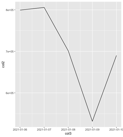
ggplot( data = data_frame, aes( col3, col2 )) + geom_line() +
scale_x_date(date_labels = "%Y-%m-%d")输出
[1] "Original Dataframe"
col1   col2
1  6/7/2021 799355
2  7/7/2021 805800
3  8/7/2021 701262
4  9/7/2021 531579
5 10/7/2021 690068
方法 2:使用 ggplot() 方法
ggplot2 库用于在 R 编程语言工作空间窗口中显示描述性复图。
ggplot() 方法用于绘制指定数据框的数据点并指定绘图美学的集合。它用于创建美学映射并添加特定的几何函数映射。
Syntax:
ggplot(data = NULL, mapping = aes(c1, c2 )) + geom_line()
Parameters :
data – The default data set to plot
mapping – The aesthetic mapping to use
geom_line() 用于以线和点的形式添加几何体。它用于绘制时间序列以及图中的线。
例子:
电阻
library("ggplot2")

# defining a data frame
data_frame <- data.frame( col1 = c("1/6/2021","1/7/2021","1/8/2021",
                                   "1/9/2021","1/10/2021"),
                          col2 = c(799355, 805800,701262,531579,
                                   690068)
)

print ("Original Dataframe")
print (data_frame)

# describing new column in date class
data_frame$col3 <- as.Date(data_frame$col1, "%m/%d/%Y")

# plotting the data
ggplot( data = data_frame, aes( col3, col2 )) + geom_line() +
scale_x_date(date_labels = "%Y-%m-%d")
输出
[1] "Original Dataframe"
col1   col2
1  6/7/2021 799355
2  7/7/2021 805800
3  8/7/2021 701262
4  9/7/2021 531579
5 10/7/2021 690068