📌 相关文章
- Excel数据分析-数据可视化(1)
- Excel数据分析-数据可视化
- 数据可视化和数据分析之间的区别(1)
- 数据可视化和数据分析之间的区别
- 数据可视化和数据分析之间的区别
- 数据可视化和数据分析之间的区别(1)
- 使用Python进行数据分析和可视化2
- 使用Python进行数据分析和可视化
- 使用Python进行数据分析和可视化2(1)
- 为什么数据可视化在数据分析中很重要?
- R中的数据可视化
- R中的数据可视化(1)
- R数据可视化
- R数据可视化(1)
- 使用Python进行数据分析和可视化 |设置 2(1)
- 使用Python进行数据分析和可视化 |设置 2
- 使用Python Pandas进行数据分析和可视化
- 使用Python Pandas进行数据分析和可视化(1)
- 大数据和数据分析之间的区别
- 大数据与数据分析之间的区别(1)
- 大数据和数据分析之间的区别(1)
- 大数据和数据分析之间的区别
- 大数据与数据分析之间的区别
- 大数据和数据分析之间的区别(1)
- 数据分析和数据分析的区别
- 数据分析和数据分析的区别(1)
- Excel 中的数据可视化(1)
- Excel 中的数据可视化
- 大数据分析-数据分析工具
📜 大数据分析-数据可视化
📅 最后修改于: 2020-12-02 06:40:35 🧑 作者: Mango
为了理解数据,通常将其可视化很有用。通常在大数据应用程序中,人们的兴趣在于寻找见识,而不仅仅是做出漂亮的图。以下是使用图解理解数据的不同方法的示例。
要开始分析航班数据,我们可以先检查数字变量之间是否存在相关性。此代码也可在bda / part1 / data_visualization / data_visualization.R文件中找到。
# Install the package corrplot by running
install.packages('corrplot')

# then load the library
library(corrplot)

# Load the following libraries
library(nycflights13)
library(ggplot2)
library(data.table)
library(reshape2)

# We will continue working with the flights data
DT
此代码生成以下相关矩阵可视化-
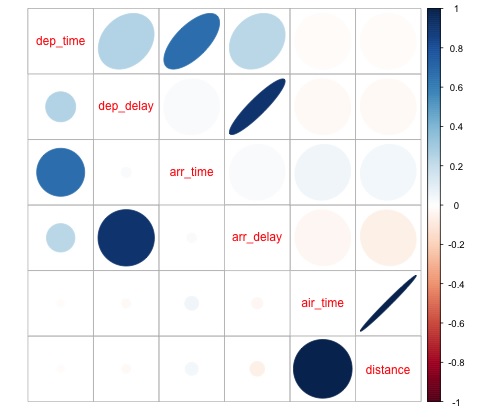
在图中可以看到,数据集中的某些变量之间存在很强的相关性。例如,到达延迟和离开延迟似乎高度相关。我们可以看到这一点,因为椭圆显示出两个变量之间几乎呈线性关系,但是,从该结果中查找因果关系并不容易。
我们不能说因为两个变量是相关的,所以一个对另一个有影响。我们还可以在图中发现空中时间与距离之间有很强的相关性,这是可以合理预期的,因为随着距离的增加,飞行时间会增加。
我们还可以对数据进行单变量分析。可视化分布的一种简单有效的方法是箱形图。以下代码演示了如何使用ggplot2库生成箱形图和格子图。此代码也可在bda / part1 / data_visualization / boxplots.R文件中找到。
source('data_visualization.R')
### Analyzing Distributions using box-plots
# The following shows the distance as a function of the carrier

p = ggplot(DT, aes(x = carrier, y = distance, fill = carrier)) + # Define the carrier
   in the x axis and distance in the y axis
   geom_box-plot() + # Use the box-plot geom
   theme_bw() + # Leave a white background - More in line with tufte's
      principles than the default
   guides(fill = FALSE) + # Remove legend
   labs(list(title = 'Distance as a function of carrier', # Add labels
      x = 'Carrier', y = 'Distance'))
p
# Save to disk
png(‘boxplot_carrier.png’)
print(p)
dev.off()

# Let's add now another variable, the month of each flight
# We will be using facet_wrap for this
p = ggplot(DT, aes(carrier, distance, fill = carrier)) +
   geom_box-plot() +
   theme_bw() +
   guides(fill = FALSE) +
   facet_wrap(~month) + # This creates the trellis plot with the by month variable
   labs(list(title = 'Distance as a function of carrier by month',
      x = 'Carrier', y = 'Distance'))
p
# The plot shows there aren't clear differences between distance in different months

# Save to disk
png('boxplot_carrier_by_month.png')
print(p)
dev.off()