如何通过 R ggplot2 中的变量用圆/椭圆注释集群
在本文中,我们将讨论如何使用 ggplot2 包在 R 编程语言中通过分类变量用圆形/椭圆注释集群。
要在一组数据点周围添加一个圆或椭圆,我们使用 ggforce 包的 geom_mark_circle() 和 geom_mark_ellipse()函数。此函数自动计算圆/椭圆半径以通过分类数据围绕点簇绘制。
首先,我们将使用 ggplot2 包的 geom_point函数在散点图中绘制数据。我们将使用 aes()函数的颜色参数按分类变量组为绘图着色。
句法:
ggplot(df, aes( x, y ) ) + geom_point( aes( color ))论据:
- df:确定要使用的数据框。
- x 和 y:分别确定 x 轴和 y 轴变量。
- 颜色:确定为数据点簇着色的分类变量。
例子:
这是使用 ggplot2 包的 geom_point()函数制作的基本散点图。我们用分类变量组为图着色。
R
# load library tidyverse
library(tidyverse)

# set theme
theme_set(theme_bw(16))

# create x and y vector
xAxis <- rnorm(1000)
yAxis <- rnorm(1000) + xAxis + 10

# create groups in variable using conditional
# statements
group <- rep(1, 1000)
group[xAxis > -1.5] <- 2
group[xAxis > -0.5] <- 3
group[xAxis > 0.5] <- 4
group[xAxis > 1.5] <- 5

# create sample data frame
sample_data <- data.frame(xAxis, yAxis, group)

# create a scatter plot with points colored by
# group
ggplot(sample_data, aes(x = xAxis,
             y = yAxis))+
  geom_point(aes(color = as.factor(group)))
R
# load library tidyverse
library(tidyverse)
library(ggforce)

# set theme
theme_set(theme_bw(16))

# create x and y vector
xAxis <- rnorm(500)
yAxis <- rnorm(1000) + xAxis + 10

# create groups in variable using conditional
# statements
group <- rep(1, 500)
group[xAxis > -1.5] <- 2
group[xAxis > -0.5] <- 3
group[xAxis > 0.5] <- 4
group[xAxis > 1.5] <- 5

# create sample data frame
sample_data <- data.frame(xAxis, yAxis, group)

# create a scatter plot with points colored by group
# circles are annotated using geom_mark_circle() function
ggplot(sample_data, aes(x = xAxis,
             y = yAxis))+
  geom_point(aes(color = as.factor(group)))+
  geom_mark_circle(aes(color = as.factor(group)), expand = unit(0.5,"mm"))+
  theme(legend.position = "none")
R
# load library tidyverse
library(tidyverse)
library(ggforce)

# set theme
theme_set(theme_bw(16))

# create x and y vector
xAxis <- rnorm(500)
yAxis <- rnorm(1000) + xAxis + 10

# create groups in variable using conditional
# statements
group <- rep(1, 500)
group[xAxis > -1.5] <- 2
group[xAxis > -0.5] <- 3
group[xAxis > 0.5] <- 4
group[xAxis > 1.5] <- 5

# create sample data frame
sample_data <- data.frame(xAxis, yAxis, group)

# create a scatter plot with points colored by group
# ellipses are annotated using geom_mark_ellipse() function
ggplot(sample_data, aes(x = xAxis,
             y = yAxis))+
  geom_point(aes(color = as.factor(group)))+
  geom_mark_ellipse(aes(color = as.factor(group)), expand = unit(0.5,"mm"))+
  theme(legend.position = "none")
R
# load library tidyverse
library(tidyverse)
library(ggforce)

# set theme
theme_set(theme_bw(16))

# create x and y vector
xAxis <- rnorm(500)
yAxis <- rnorm(1000) + xAxis + 10

# create groups in variable using conditional
# statements
group <- rep(1, 500)
group[xAxis > -1.5] <- 2
group[xAxis > -0.5] <- 3
group[xAxis > 0.5] <- 4
group[xAxis > 1.5] <- 5

# create sample data frame
sample_data <- data.frame(xAxis, yAxis, group)

# create a scatter plot with points colored by group
# ellipses are annotated using geom_mark_ellipse() function
ggplot(sample_data, aes(x = xAxis,
             y = yAxis))+
  geom_point(aes(color = as.factor(group)))+
  geom_mark_ellipse(aes(fill = as.factor(group)), expand = unit(0.5,"mm"))+
  theme(legend.position = "none")
输出:

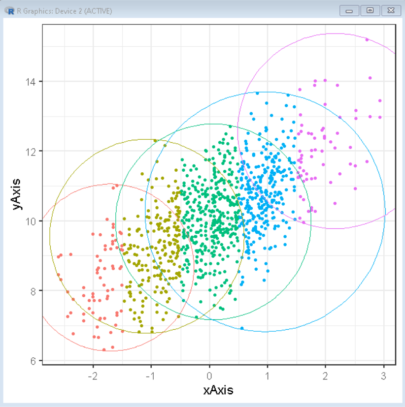
在集群周围标注圆圈:
要按组注释围绕一组点的圆,我们使用 ggforce 包的 geom_mark_circle()函数。要使用此函数,我们首先使用以下命令安装和导入 ggforce 包:
install. packages('ggforce')
library(ggforce)
现在,我们将使用 geom_mark_circle()函数对一组数据点周围的圆进行注释。
句法:
ggplot(df, aes( x, y ) ) + geom_point( aes( color )) + geom_mark_circle( aes(color) )
例子:
这是一个基本散点图,圆圈围绕由分类变量组着色的一组数据点。
R
# load library tidyverse
library(tidyverse)
library(ggforce)

# set theme
theme_set(theme_bw(16))

# create x and y vector
xAxis <- rnorm(500)
yAxis <- rnorm(1000) + xAxis + 10

# create groups in variable using conditional
# statements
group <- rep(1, 500)
group[xAxis > -1.5] <- 2
group[xAxis > -0.5] <- 3
group[xAxis > 0.5] <- 4
group[xAxis > 1.5] <- 5

# create sample data frame
sample_data <- data.frame(xAxis, yAxis, group)

# create a scatter plot with points colored by group
# circles are annotated using geom_mark_circle() function
ggplot(sample_data, aes(x = xAxis,
             y = yAxis))+
  geom_point(aes(color = as.factor(group)))+
  geom_mark_circle(aes(color = as.factor(group)), expand = unit(0.5,"mm"))+
  theme(legend.position = "none")
输出:
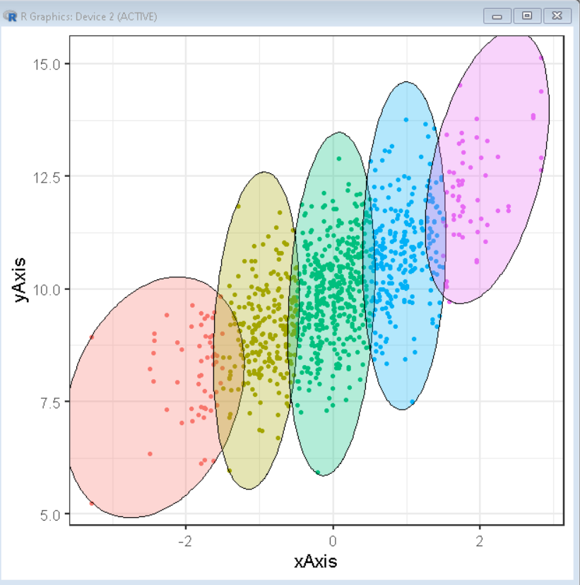
注释簇周围的椭圆:
要按组注释围绕一组点的椭圆,我们使用 ggforce 包的 geom_mark_ellipse()函数。此函数自动计算椭圆的尺寸并将其覆盖在散点图的顶部。
句法:
ggplot(df, aes( x, y ) ) + geom_point( aes( color )) + geom_mark_ellipse( aes(color) )
例子:
这是一个基本散点图,椭圆围绕由分类变量组着色的一组数据点。
R
# load library tidyverse
library(tidyverse)
library(ggforce)

# set theme
theme_set(theme_bw(16))

# create x and y vector
xAxis <- rnorm(500)
yAxis <- rnorm(1000) + xAxis + 10

# create groups in variable using conditional
# statements
group <- rep(1, 500)
group[xAxis > -1.5] <- 2
group[xAxis > -0.5] <- 3
group[xAxis > 0.5] <- 4
group[xAxis > 1.5] <- 5

# create sample data frame
sample_data <- data.frame(xAxis, yAxis, group)

# create a scatter plot with points colored by group
# ellipses are annotated using geom_mark_ellipse() function
ggplot(sample_data, aes(x = xAxis,
             y = yAxis))+
  geom_point(aes(color = as.factor(group)))+
  geom_mark_ellipse(aes(color = as.factor(group)), expand = unit(0.5,"mm"))+
  theme(legend.position = "none")
输出:
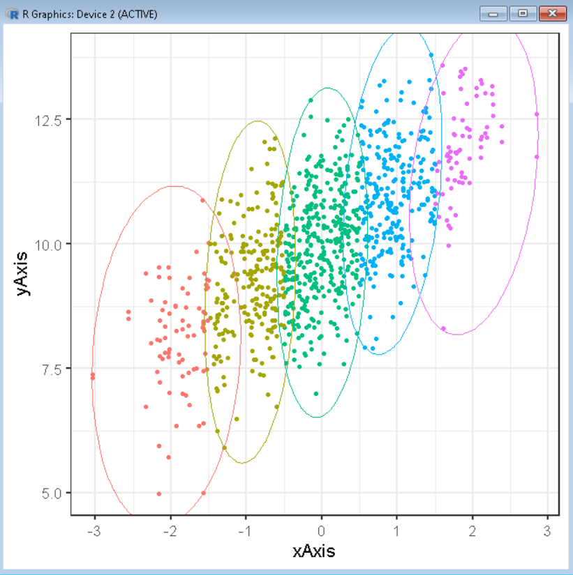
定制美学
我们可以通过使用 aes()函数的颜色、填充和 alpha 属性来自定义 geom_mark_*函数的美感。
句法:
ggplot(df, aes( x, y ) ) + geom_point( aes( color )) + geom_mark_ellipse( aes(color, fill, alpha) )
在哪里,
- color:决定圆形或椭圆边界的颜色。
- 填充:确定圆形或椭圆的背景颜色。
- alpha:决定圆形或椭圆的透明度。
例子:
在此示例中,我们将绘制一个由椭圆覆盖的散点图,其背景由组分类变量着色。
R
# load library tidyverse
library(tidyverse)
library(ggforce)

# set theme
theme_set(theme_bw(16))

# create x and y vector
xAxis <- rnorm(500)
yAxis <- rnorm(1000) + xAxis + 10

# create groups in variable using conditional
# statements
group <- rep(1, 500)
group[xAxis > -1.5] <- 2
group[xAxis > -0.5] <- 3
group[xAxis > 0.5] <- 4
group[xAxis > 1.5] <- 5

# create sample data frame
sample_data <- data.frame(xAxis, yAxis, group)

# create a scatter plot with points colored by group
# ellipses are annotated using geom_mark_ellipse() function
ggplot(sample_data, aes(x = xAxis,
             y = yAxis))+
  geom_point(aes(color = as.factor(group)))+
  geom_mark_ellipse(aes(fill = as.factor(group)), expand = unit(0.5,"mm"))+
  theme(legend.position = "none")
输出: