使用 NumPy 针对 bin 计算 nums 的直方图
在本文中,我们将讨论如何使用 NumPy 计算针对 bin 的 nums 模块。直方图是可视化数据集频率分布的最佳方式,将数据集拆分为大小相等的小区间,称为 bins。 Numpy histogram函数类似于matplotlib库的hist()函数,唯一的区别是 NumPy histogram 给出了数据集的数值表示,而hist()给出了数据集的图形表示。
在创建直方图时,最好不要从 bin 的角度考虑,而不是找出每个值出现的次数,即频率表。为此, Python字典非常适合。下面是纯Python中直方图的简单实现:
Python3
# Dataset
a = (1, 3, 7, 7, 2, 3, 4, 7, 6, 6, 3, 5, 2)

# Creating empty dictionary
hist = {}

# Counting the number of occurences
for i in a:
    hist[i] = hist.get(i, 0) + 1

# Printing the frequency table i.e histogram
print(hist)
Python3
# Import libraries
import numpy as np

# Creating dataset
a = np.random.randint(100, size =(50))

# Creating histogram
np.histogram(a, bins = [0, 10, 20, 30, 40,
                        50, 60, 70, 80, 90,
                        100])

hist, bins = np.histogram(a, bins = [0, 10,
                                     20, 30,
                                     40, 50,
                                     60, 70,
                                     80, 90,
                                     100])

# Displaying histogram
print (hist)
print (bins)
Python3
# Import libraries
from matplotlib import pyplot as plt
import numpy as np


# Creating dataset
a = np.random.randint(100, size=(50))

# Creating plot
fig = plt.figure(figsize=(10, 7))

plt.hist(a, bins=[0, 10, 20, 30,
                  40, 50, 60, 70,
                  80, 90, 100])

plt.title("Numpy Histogram")

# show plot
plt.show()
Python3
# Import libraries
from matplotlib import pyplot as plt
import numpy as np

# Creating dataset
l = [i for i in range(50)]

# Creating plot
plt.hist(l, bins=[1, 2, 3, 4, 5],
         color='green')

# show plot
plt.show()
Python3
# Import libraries
from matplotlib import pyplot as plt
import numpy as np

# Creating dataset
l = np.random.randint(150)

# Creating plot
plt.hist(l, bins=l,
         color='lime')

# show plot
plt.show()
输出:
{1: 1, 3: 3, 7: 3, 2: 2, 4: 1, 6: 2, 5: 1}Numpy有一个内置的numpy.histogram()函数,它以图形形式表示数据分布的频率。具有相等水平尺寸的矩形对应于称为 bin 的类间隔和对应于频率的可变高度。
Syntax: numpy.histogram(data, bins=10, range=None, normed=None, weights=None, density=None)
Parameters:
- data: array or aequence of array to be plotted.
- bins: int or sequence of str defines number of equal width bins in a range, default is 10.
- range: optional parameter sets lower and upper range of bins.
- normed: optional parameter same as density attribute, gives incorrect result for unequal bin width.
- weights: optional parameter defines array of weights having same dimensions as data.
- density: optional parameter if False result contain number of sample in each bin, if True result contain probability density function at bin.
执行:
蟒蛇3
# Import libraries
import numpy as np

# Creating dataset
a = np.random.randint(100, size =(50))

# Creating histogram
np.histogram(a, bins = [0, 10, 20, 30, 40,
                        50, 60, 70, 80, 90,
                        100])

hist, bins = np.histogram(a, bins = [0, 10,
                                     20, 30,
                                     40, 50,
                                     60, 70,
                                     80, 90,
                                     100])

# Displaying histogram
print (hist)
print (bins)
输出:
[5 7 4 7 4 5 1 6 4 7]
[  0  10  20  30  40  50  60  70  80  90 100]
这里, np.histogram()函数有两个返回值hist ,它给出了直方图的值数组, edge_bin是一个浮点数据类型数组,包含长度比 hist 大一的 bin 边缘。
直方图的上述数字表示可以转换为图形形式。 plt()函数存在于 Matplotlib的pyplot子模块以数据集数组和 bin 数组为参数,并创建相应数据值的直方图。下面是一些计算 nums 对 bin 的直方图的示例:
示例 1:
蟒蛇3
# Import libraries
from matplotlib import pyplot as plt
import numpy as np


# Creating dataset
a = np.random.randint(100, size=(50))

# Creating plot
fig = plt.figure(figsize=(10, 7))

plt.hist(a, bins=[0, 10, 20, 30,
                  40, 50, 60, 70,
                  80, 90, 100])

plt.title("Numpy Histogram")

# show plot
plt.show()
输出:

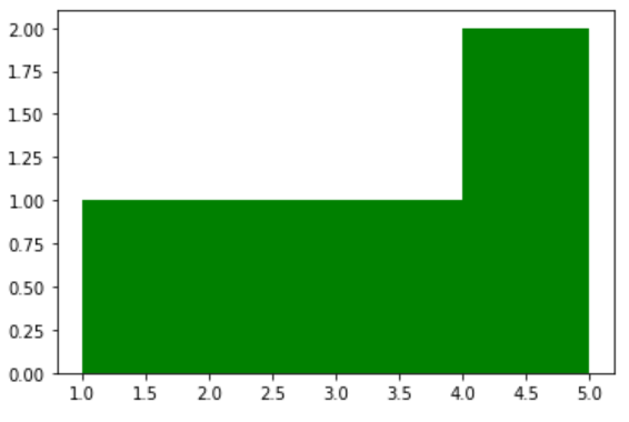
示例 2:
蟒蛇3
# Import libraries
from matplotlib import pyplot as plt
import numpy as np

# Creating dataset
l = [i for i in range(50)]

# Creating plot
plt.hist(l, bins=[1, 2, 3, 4, 5],
         color='green')

# show plot
plt.show()
输出:
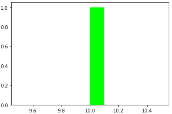
示例 3:
蟒蛇3
# Import libraries
from matplotlib import pyplot as plt
import numpy as np

# Creating dataset
l = np.random.randint(150)

# Creating plot
plt.hist(l, bins=l,
         color='lime')

# show plot
plt.show()
输出: