在 R 中的同一图中绘制多个时间序列
R 编程语言中的时间序列用于查看对象在一段时间内的行为。在 R 中,它可以通过带有一些参数的ts()函数轻松完成。时间序列采用数据向量,每个数据都与用户给出的时间戳值相关联。
方法 1:使用基本的 R 方法
首先,我们创建一个数据向量,其中包含必须绘制的所有时间序列的数据。然后我们使用第一个数据集和 plot()函数绘制时间序列。然后使用 line()函数将其他时间序列添加到现有图中。然后我们可以在顶部添加一个图例来显示图中的哪条线代表哪个时间序列。
例子:
R
# Create sample data
set.seed(1023)

sample_data <- round(data.frame(year = 1997:2021,
                     time_data1 = 1:25 + rnorm(25),
                     time_data2  = 30:6 + runif(25, 0, 10),
                     time_data3  = rnorm(25, 5, 5)))

# Plot a graph with time_data1
plot(sample_data$year,
     sample_data$time_data1,
     type = "l",
     col = 2,
     ylim = c(- 15, 40),
     xlab = "Year",
     ylab = "Values")

# Add line graphs of other two dataset
lines(sample_data$year,
      sample_data$time_data2,
      type = "l",
      col = 3)

lines(sample_data$year,
      sample_data$time_data3,
      type = "l",
      col = 4)

# Add legend in top right corner
legend("topright",
       c("Geeksforgeeks", "technical-scripter", "geek-i-knack"),
       lty = 1,
       col = 2:4)
R
# Create sample data
set.seed(1023)

sample_data <- round(data.frame(year = 1997:2021,
                     time_data1 = 1:25 + rnorm(25),
                     time_data2  = 30:6 + runif(25, 0, 10),
                     time_data3  = rnorm(25, 5, 5)))

# Load packages reshape2 and ggplot2
library("reshape2")
library("ggplot2")

# Convert sample_data from wide form to long form
data_final <- melt(sample_data, id.vars = "year")

# Plot the dinal data
ggplot(data_final,
       aes(x = year,
           y = value,
           col = variable)) + geom_line()
输出:
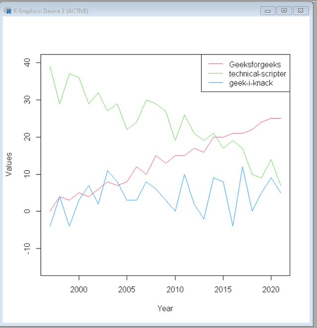
一个图中的多个时间序列
方法二:使用ggplot2
在 ggplot2 中,我们可以直接使用 geom_line() 来绘制绘图。
我们首先创建一个样本数据向量。 ggplot2 将用于绘制绘图,reshape 会将数据从宽格式融化为长格式。将数据从宽格式转换为长格式。
句法:
melt(sample_data, id.vars = variable)
借助 ggplot2 和 geom_line() 绘制绘图,
例子:
电阻
# Create sample data
set.seed(1023)

sample_data <- round(data.frame(year = 1997:2021,
                     time_data1 = 1:25 + rnorm(25),
                     time_data2  = 30:6 + runif(25, 0, 10),
                     time_data3  = rnorm(25, 5, 5)))

# Load packages reshape2 and ggplot2
library("reshape2")
library("ggplot2")

# Convert sample_data from wide form to long form
data_final <- melt(sample_data, id.vars = "year")

# Plot the dinal data
ggplot(data_final,
       aes(x = year,
           y = value,
           col = variable)) + geom_line()
输出:
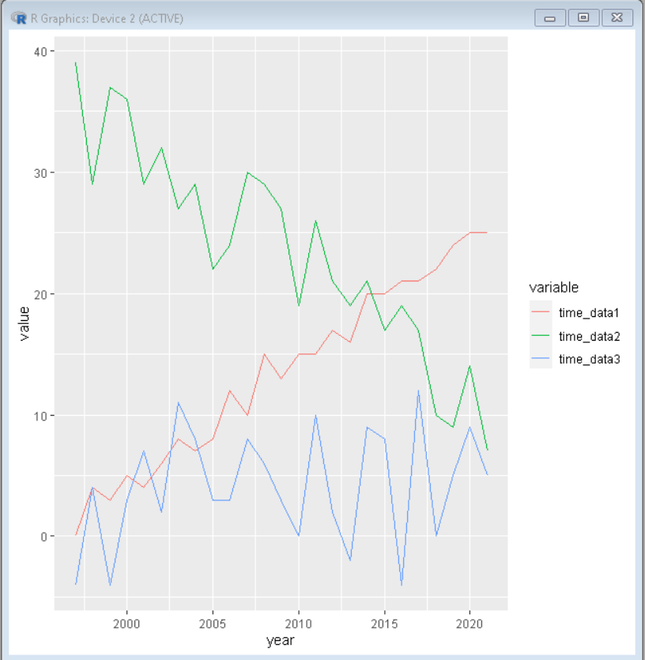
使用 ggplot2 的多个时间序列