Pandas – 将多个时间序列 DataFrame 绘制成一个图
在本文中,我们将看到如何将多个时间序列 Dataframe 绘制成单个图。
如果单个 DataFrame 中有多个时间序列,您仍然可以使用plot()方法绘制所有时间序列的折线图。要将多个时间序列绘制成一个图,首先我们必须确保所有 DataFrame 的索引对齐。因此,让我们先举两个例子,其中索引是对齐的,一个是我们必须在绘图之前对齐所有 DataFrame 的索引。
绘制具有相同日期时间索引的数据帧:
步骤 1:导入库
Python3
# importing Libraries

# import pandas as pd
import pandas as pd

# importing matplotlib module
import matplotlib.pyplot as plt
plt.style.use('default')

# %matplotlib inline: only draw static
# images in the notebook
%matplotlib inline
Python3
# code
# importing Data
tesla = pd.read_csv('Tesla_Stock.csv',
                    index_col='Date',
                    parse_dates=True)
tesla.head(10)
Python3
# code
# importing data
ford = pd.read_csv('Ford_Stock.csv',
                   index_col='Date',
                   parse_dates=True)
ford.head(10)
Python3
# code
# importing data
gm = pd.read_csv('GM_Stock.csv',
                 index_col='Date',
                 parse_dates=True)
# printing 10 entries of the data
gm.head(10)
Python3
# code
# Visualizing The Open Price of all the stocks

# to set the plot size
plt.figure(figsize=(16, 8), dpi=150)

# using plot method to plot open prices.
# in plot method we set the label and color of the curve.
tesla['Open'].plot(label='Tesla', color='orange')
gm['Open'].plot(label='GM')
ford['Open'].plot(label='Ford')

# adding title to the plot
plt.title('Open Price Plot')

# adding Label to the x-axis
plt.xlabel('Years')

# adding legend to the curve
plt.legend()
Python3
# importing Libraries

# import pandas as pd
import pandas as pd

# importing matplotlib module
import matplotlib.pyplot as plt
plt.style.use('default')

# %matplotlib inline: only draw static images in the notebook
%matplotlib inline
Python3
# code
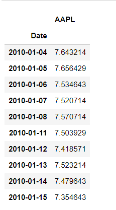
aapl = pd.read_csv('aapl.csv',
index_col='Date',
parse_dates=True)
# printing 10 entries of the data
aapl.head(10)Python3
# importing Data
msft = pd.read_csv('msft.csv',
                   index_col='Date',
                   parse_dates=True)
# printing 10 entries of the data
msft.head(10)
Python3
# Aligning index
aapl["MSFT"] = msft.MSFT

# removing Missing Values
aapl.dropna(inplace=True)

aapl.head(10)
Python3
# Visualizing The Price of the stocks
# to set the plot size
plt.figure(figsize=(16, 8), dpi=150)

# using .plot method to plot stock prices.
# we have passed colors as a list
aapl.plot(label='aapl', color=['orange', 'green'])

# adding title
plt.title('Price Plot')

# adding label to x-axis
plt.xlabel('Years')

# adding legend.
plt.legend()
步骤 2:导入数据
我们将绘制特斯拉、福特和通用汽车三只股票的开盘价,您可以从这里或 yfinance 库下载数据。
特斯拉文件:
蟒蛇3
# code
# importing Data
tesla = pd.read_csv('Tesla_Stock.csv',
                    index_col='Date',
                    parse_dates=True)
tesla.head(10)
输出:
福特股票:
蟒蛇3
# code
# importing data
ford = pd.read_csv('Ford_Stock.csv',
                   index_col='Date',
                   parse_dates=True)
ford.head(10)
输出:
GM_股票:
蟒蛇3
# code
# importing data
gm = pd.read_csv('GM_Stock.csv',
                 index_col='Date',
                 parse_dates=True)
# printing 10 entries of the data
gm.head(10)
输出:
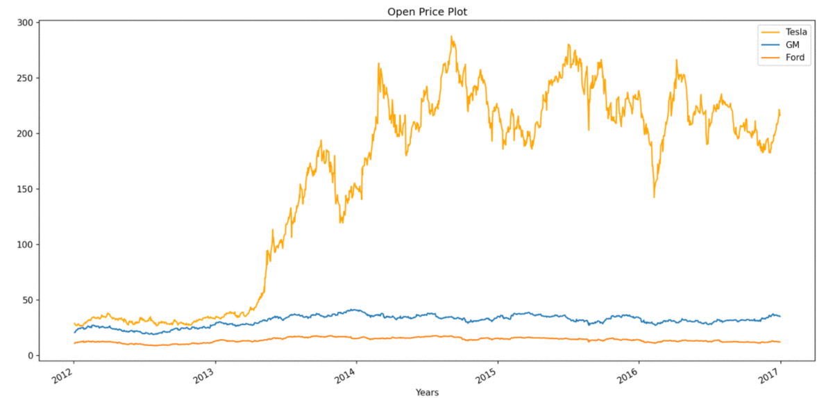
第 3 步:现在绘制股票的开盘价
蟒蛇3
# code
# Visualizing The Open Price of all the stocks

# to set the plot size
plt.figure(figsize=(16, 8), dpi=150)

# using plot method to plot open prices.
# in plot method we set the label and color of the curve.
tesla['Open'].plot(label='Tesla', color='orange')
gm['Open'].plot(label='GM')
ford['Open'].plot(label='Ford')

# adding title to the plot
plt.title('Open Price Plot')

# adding Label to the x-axis
plt.xlabel('Years')

# adding legend to the curve
plt.legend()
输出:
绘制具有不同日期时间索引的数据帧:
在第二个例子中,我们将从不同时期的苹果(AAPL)和微软(MSFT)的股价数据中提取出来。我们的第一个任务是重新索引任何一个 dataFrame 以与另一个 dataFrame 对齐,然后我们可以将它们绘制在一个图中。
步骤 1:导入库
蟒蛇3
# importing Libraries

# import pandas as pd
import pandas as pd

# importing matplotlib module
import matplotlib.pyplot as plt
plt.style.use('default')

# %matplotlib inline: only draw static images in the notebook
%matplotlib inline
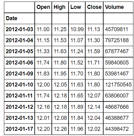
步骤 2:导入数据
蟒蛇3
# code
aapl = pd.read_csv('aapl.csv',
                   index_col='Date',
                   parse_dates=True)
# printing 10 entries of the data
aapl.head(10)
输出:
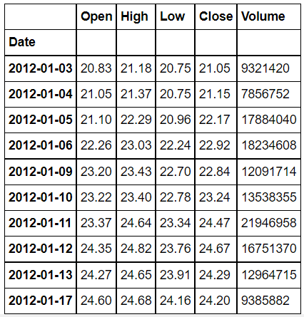
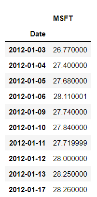
msft 文件:
蟒蛇3
# importing Data
msft = pd.read_csv('msft.csv',
                   index_col='Date',
                   parse_dates=True)
# printing 10 entries of the data
msft.head(10)
输出:
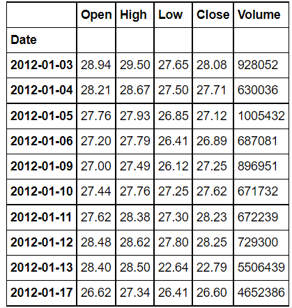
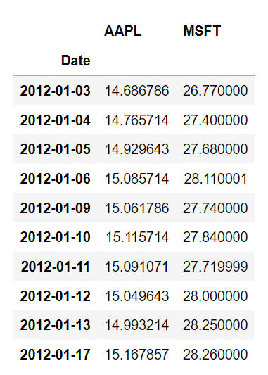
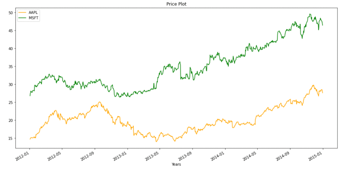
如您所见,两个 DataFrame 的 DateTime 索引并不相同,因此首先我们必须对齐它们。当我们将 msft 的 DateTime 索引与所有的相同时,那么我们将在 2010-01-04 到 2012-01-02 期间有一些缺失值,在绘图之前删除缺失值非常重要。
蟒蛇3
# Aligning index
aapl["MSFT"] = msft.MSFT

# removing Missing Values
aapl.dropna(inplace=True)

aapl.head(10)
输出:
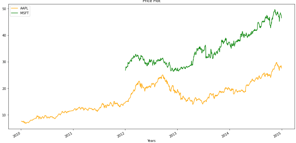
我们已经将两个 DataFrame 合并为一个 DataFrame,现在我们可以简单地绘制它,
蟒蛇3
# Visualizing The Price of the stocks
# to set the plot size
plt.figure(figsize=(16, 8), dpi=150)

# using .plot method to plot stock prices.
# we have passed colors as a list
aapl.plot(label='aapl', color=['orange', 'green'])

# adding title
plt.title('Price Plot')

# adding label to x-axis
plt.xlabel('Years')

# adding legend.
plt.legend()
输出:
在某些情况下,我们无法承受丢失数据,因此我们也可以在不删除缺失值的情况下进行绘图,相同的绘图将如下所示: