R – 帕累托图
帕累托图是用于可视化的条形图和折线图的组合。
在帕累托图中,右纵轴用于累积频率,而左纵轴表示频率。他们基本上使用帕累托原理,即 80% 的结果是由 20% 的系统原因产生的。
在这里,我们有一个条形图,以递减顺序(从左到右)指示不同类别中事件的发生频率,叠加折线图指示发生的累积百分比。
Syntax:
pareto.chart(x, ylab = “Frequency”, ylab2 = “Cumulative Percentage”, xlab, cumperc = seq(0, 100, by = 25), ylim, main, col = heat.colors(length(x)))
Parameters:
x: a vector of values. names(x) are used for labelling the bars.
ylab: a string specifying the label for the y-axis.
ylab2: a string specifying the label for the second y-axis on the right side.
xlab: a string specifying the label for the x-axis.
cumperc: a vector of percentage values to be used as tickmarks for the second y-axis on the right side.
ylim: a numeric vector specifying the limits for the y-axis.
main: a string specifying the main title to appear on the plot.
col: a value for the color, a vector of colors, or a palette for the bars. See the help for colors and palette.
绘制帕累托图
以下是绘制帕累托图所需的步骤:
- 采用一个向量 (defect <- c(Values…)) 来保存不同类别的计数值。
- 采用一个向量 (names(defect) <- c(Values...)) 来保存指定的字符串值
不同类别的名称。 - 这个向量“缺陷”是使用 pareto.chart() 绘制的。
示例 1:
# x axis numbers
defect <- c(27, 789, 9, 65, 12, 109, 30, 15, 45, 621)

# x axis titles
names(defect) <- c("Too noisy", "Overpriced", "Food not fresh",
                   "Food is tasteless", "Unfriendly staff",
                   "Wait time", "Not clean", "Food is too salty",
                   "No atmosphere", "Small portions")

pareto.chart(defect, xlab = "Categories", # x-axis label
                     ylab="Frequency",  # label y left

# colors of the chart
col=heat.colors(length(defect)),

# ranges of the percentages at the right
cumperc = seq(0, 100, by = 20),

# label y right
ylab2 = "Cumulative Percentage",

# title of the chart
main = "Complaints of different customers"
)
输出 : 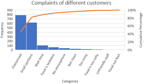
在这里的图表中,橙色的帕累托线表示 (789 + 621) / 1722,即大约 80% 的投诉来自 10 个投诉类型中的 2 个 = 20% 的投诉类型(价格过高和小份)。
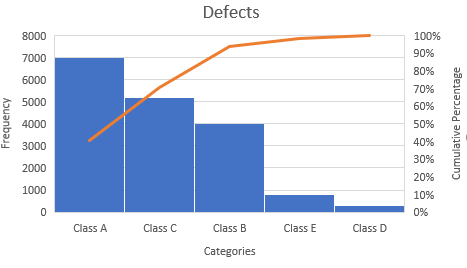
示例 2:
# x axis numbers
defect <- c(7000, 4000, 5200, 3000, 800)

# x axis titles
names(defect) <- c("Class A", "Class B", "Class C",
                   "Class D", "Class E")

pareto.chart(defect, xlab = "Categories",
                     ylab="Frequency",
             col=heat.colors(length(defect)),
             cumperc = seq(0, 100, by = 10),
             ylab2 = "Cumulative Percentage",
             main = "Defects"
)
输出: