R plot pch symbols – R 中可用的不同点形状
在本文中,我们将讨论 R 编程语言中内置形状的 Pch。
R 编程语言中的 pch(绘图字符)是我们用于绘制绘图的符号或形状。在 R 语言中,有 26 个内置形状可以用于 R 语言中的任何图形作品,可以用 0 到 25 的数字标识。前 19 个符号也称为s 兼容矢量符号,而其余 7 个称为R 特定矢量符号。数字以外的字符也可用于指定 pch,包括“+”、“*”、”-“、”.“、”#、“%”、“o”。
当我们制作一个基本的散点图时,默认情况下,它使用一个点来表示 pch=16 的数据。但是我们可以使用所需的 pch 值将其转换为任何其他形状。由于记住每个形状的 pch 值很困难,我们可以创建如下图来获取每个符号的值。
示例:显示所有 pch 符号
R
# load library tidyverse
library(tidyverse)

# create dataframe of 26 character to
# visualize the 26 characters
df <- data.frame(p=c(0:25)) %>%
            mutate(x = rep(seq_len(ceiling(n()/6)),
                  each = 6,
                  length.out = n())) %>%
                  group_by(x)%>%
                  mutate(y=1:n())

# create plot using ggplot function
# shape parameter is used to shape points
ggplot(df, aes(x = x, y = y, shape = p),) +
  scale_shape_identity() +
  geom_point( size = 6, fill = "green")+

# geom_text function is used to label data points
# with pch value
geom_text(aes(x = x - 0.3, y = y,
                label = paste0("pch =",p)), size = 3)
R
# create sample data frame
xAxis <- rnorm(100)
yAxis <- rnorm(100) + xAxis + 10

# create plot
# use pch function to shape plot points
# using pch value
plot(xAxis, yAxis, pch = "%", size=9)
R
# create sample data frame
xAxis <- rnorm(100)
yAxis <- rnorm(100) + xAxis + 10
df <- data.frame(xAxis, yAxis)

# load library ggplot2
library(ggplot2)

# create plot
# use shape argument to shape plot
# points using pch value
ggplot(df,aes(x=xAxis, y=yAxis))+
geom_point(shape = 8)
R
# create sample data frame
xAxis <- rnorm(100)
yAxis <- rnorm(100) + xAxis + 10
df <- data.frame(xAxis, yAxis)

# load library ggplot2 and gridExtra
library(ggplot2)
library(gridExtra)

# create plot
# use pch function to shape plot points
# using pch value
plot1 <-ggplot(df,aes(x=xAxis, y=yAxis))+
        geom_point(shape = "*", size=10)

plot2 <-ggplot(df,aes(x=xAxis, y=yAxis))+
        geom_point(shape = NA)

# combine plots using grid.arrange() function
grid.arrange(plot1, plot2, ncol=2)
R
# create sample data frame
xAxis <- rnorm(100)
yAxis <- rnorm(100) + xAxis + 10

# create plot
# use pch function to shape plot points
# using pch value
plot(xAxis, yAxis, pch = 21, cex=3, col="green",
     bg="yellow", lwd=4)
输出:

以下是不同形状的 Pch 值。value shape 0 square 1 circle 2 triangle point up 3 plus 4 cross 5 diamond 6 triangle point down 7 square cross 8 star 9 diamond plus 10 circle plus 11 triangles up and down 12 square plus 13 circle cross 14 square and triangle down 15 filled square 16 filled circle 17 filled triangle point-up 18 filled diamond 19 solid circle 20 bullet (smaller circle) 21 filled circle blue 22 filled square blue 23 filled diamond blue 24 filled triangle point-up blue 25 filled triangle point down blue
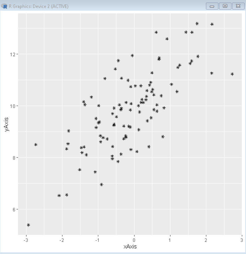
使用特殊字符作为 Pch 值
一些特殊字符也可以用作 pch 符号的值而不是数字。在 R 语言中,我们可以使用“+”、“*”、”-“、”.“、”#、“%”和“o”来绘制不同的符号。这些符号将 pch 形状完全转换为它们自己的形状。下图显示了这些符号的作用。
示例:使用特殊符号作为 Pch 值
R
# create sample data frame
xAxis <- rnorm(100)
yAxis <- rnorm(100) + xAxis + 10

# create plot
# use pch function to shape plot points
# using pch value
plot(xAxis, yAxis, pch = "%", size=9)
输出:

在 ggplot 图中使用形状
现在我们可以通过将 pch 数字置于形状值来使用所需的形状绘制散点图。我们可以在 R 语言中使用形状向量的任何地方使用这些形状。
示例:使用 pch 值为 8 的星形基本散点图
R
# create sample data frame
xAxis <- rnorm(100)
yAxis <- rnorm(100) + xAxis + 10
df <- data.frame(xAxis, yAxis)

# load library ggplot2
library(ggplot2)

# create plot
# use shape argument to shape plot
# points using pch value
ggplot(df,aes(x=xAxis, y=yAxis))+
geom_point(shape = 8)
输出:
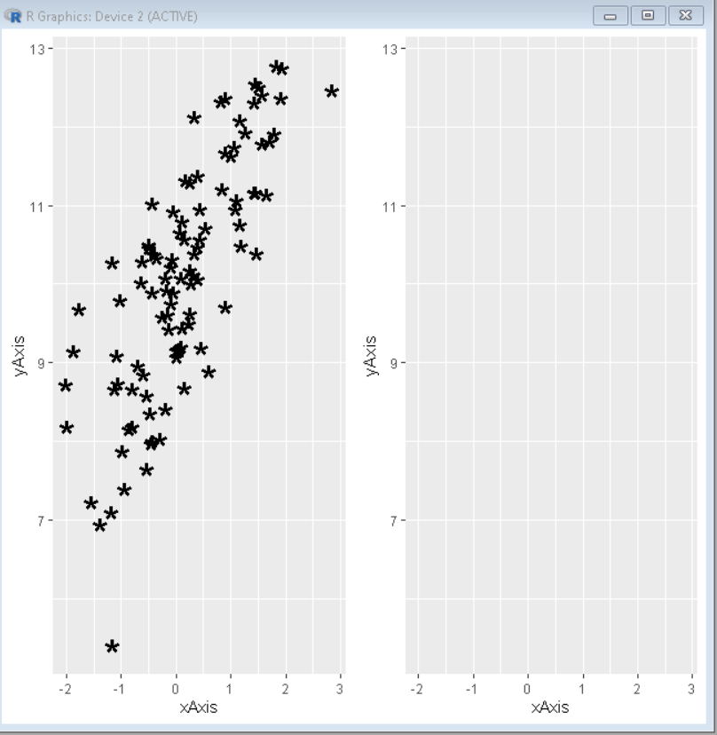
从图中省略点
要从任何图中省略或删除点,我们可以使用 NA 的 pch 值。这使得图中点的形状为零大小或不可见,给人一种删除点的印象。
句法:
plot( x, y , pch= NA )
示例:删除所有点
R
# create sample data frame
xAxis <- rnorm(100)
yAxis <- rnorm(100) + xAxis + 10
df <- data.frame(xAxis, yAxis)

# load library ggplot2 and gridExtra
library(ggplot2)
library(gridExtra)

# create plot
# use pch function to shape plot points
# using pch value
plot1 <-ggplot(df,aes(x=xAxis, y=yAxis))+
        geom_point(shape = "*", size=10)

plot2 <-ggplot(df,aes(x=xAxis, y=yAxis))+
        geom_point(shape = NA)

# combine plots using grid.arrange() function
grid.arrange(plot1, plot2, ncol=2)
输出:
颜色定制
我们可以分别使用 col、bg、cex 和 lwd 参数来改变轮廓的颜色、背景填充、符号的大小和轮廓的线宽。
Syntax:
plot( x, y, pch, cex, bg, col, lwd )
Parameter:
- col : determines the color for the outline of the shape
- bg : determines the color for the background fill of the shape
- cex : determines the size of the pch symbol
- lwd : determines the line width for the the pch symbol outline
示例:为 pch 符号添加颜色自定义
R
# create sample data frame
xAxis <- rnorm(100)
yAxis <- rnorm(100) + xAxis + 10

# create plot
# use pch function to shape plot points
# using pch value
plot(xAxis, yAxis, pch = 21, cex=3, col="green",
     bg="yellow", lwd=4)
输出:
