📌 相关文章
- RichFaces Rich:List(1)
- RichFaces Rich:List
- RichFaces Rich:Select(1)
- RichFaces Rich:Select
- RichFaces Rich:工具栏(1)
- RichFaces Rich:工具栏
- RichFaces Rich:Message
- RichFaces Rich:Message(1)
- RichFaces-Rich Tree
- RichFaces Rich:Tree
- RichFaces-Rich Tree(1)
- RichFaces Rich:Tree(1)
- RichFaces Rich:Datatable
- RichFaces Rich:Datatable(1)
- RichFaces Rich:Editor
- RichFaces Rich:Panel(1)
- RichFaces Rich:Panel
- RichFaces Rich:Editor(1)
- RichFaces Rich:工具提示
- RichFaces Rich:工具提示(1)
- RichFaces Rich:DataGrid
- RichFaces Rich:DataGrid(1)
- RichFaces Rich:Progressbar(1)
- RichFaces Rich:Progressbar
- RichFaces Rich:AutoComplete
- RichFaces Rich:AutoComplete(1)
- RichFaces Rich:Messages(1)
- RichFaces Rich:Messages
- RichFaces Rich:FileUpload(1)
📜 RichFaces Rich:日历
📅 最后修改于: 2021-01-08 12:24:28 🧑 作者: Mango
RichFaces
它用于通过弹出日历输入日期和时间。弹出日历可以浏览几个月和几年。我们还可以自定义其外观。
< rich:calendar >组件只需要一个值属性即可保存当前选定的日期。
样式类和皮肤参数
下表包含日历组件的样式类(选择器)和相应的外观参数。
| Class | Function | Skin Parameters | Mapped CSS properties |
|---|---|---|---|
| .rf-cal-extr | It is used to define the styles for a pop-up calendar exterior. | panelBorderColor | border-color |
| .rf-cal-btn | It is used to define styles for a calendar button. | No skin parameters. | |
| .rf-cal-hdr | It is used to define the styles for a calendar header. | panelBorderColor additionalBackgroundColor |
border-bottom-color background-color |
| .rf-cal-hdr-optnl | It is used to define the styles for an optional header. | additionalBackgroundColor generalSizeFont |
background-color font-size |
| .rf-cal-hdr-month | It is used to define the styles for the month header. | headerSizeFont headerFamilyFont |
font-size font-family |
| .rf-cal-ftr | It is used to define the styles for a calendar footer. | additionalBackgroundColor generalSizeFont |
background font-size |
| .rf-cal-ftr-optnl | It is used to define the styles for an optional footer. | additionalBackgroundColor generalSizeFont |
background font-size |
| .rf-cal-tl | It is used to define the styles for calendar toolbars. | headerSizeFont headerFamilyFont |
font-size font-family |
| .rf-cal-tl-ftr | It is used to define the styles for a toolbar item in the calendar footer. | generalSizeFont generalFamilyFont |
font-size font-family |
| .rf-cal-tl-btn | It is used to define styles for a toolbar button. | No skin parameters. | |
| .rf-cal-tl-btn-dis | It is used to define styles for a disabled toolbar button. | No skin parameters. | |
| .rf-cal-tl-btn-hov | It is used to define the styles for toolbar items when it is hovered over with the mouse cursor. | calendarWeekBackgroundColor generalTextColor |
background-color color |
| .rf-cal-tl-btn-press | It is used to define the styles for toolbar items when it is pressed. | panelBorderColor | border-right-color, border-bottom-color |
| .rf-cal-tl-close | It is used to define styles for a Close button in a toolbar. | No skin parameters. | |
| .rf-cal-c | It is used to define the styles for regular calendar cells. | tableBackgroundColor generalSizeFont |
background-color font-size |
| .rf-cal-c-cnt | It is used to define styles for the content of a cell. | No skin parameters. |
例
在下面的示例中,我们正在实现< rich:calendar >组件。本示例包含以下文件。
JSF文件
// calendar.xhtml
Calendar Example


Calendar
托管豆
// Calendar.java
package com.javatpoint.calendar;
import java.text.DateFormat;
import java.util.Date;
import java.util.Locale;
import javax.faces.bean.ManagedBean;
import javax.faces.bean.RequestScoped;
import javax.faces.event.ValueChangeEvent;
@ManagedBean
@RequestScoped
public class Calendar {
private static final String[] WEEK_DAY_LABELS = new String[] { "Sun *",
"Mon +", "Tue +", "Wed +", "Thu +", "Fri +", "Sat *" };
private Locale locale;
private boolean popup;
private boolean readonly;
private boolean showInput;
private boolean enableManualInput;
private String pattern;
private Date currentDate;
private Date selectedDate;
private String jointPoint;
private String direction;
private String boundary;
private boolean useCustomDayLabels;
public Locale getLocale() {
return locale;
}
public void setLocale(Locale locale) {
this.locale = locale;
}
public boolean isPopup() {
return popup;
}
public void setPopup(boolean popup) {
this.popup = popup;
}
public String getPattern() {
return pattern;
}
public void setPattern(String pattern) {
this.pattern = pattern;
}
public Calendar() {
locale = Locale.US;
popup = true;
pattern = "MMM d, yyyy";
jointPoint = "bottomleft";
direction = "bottomright";
readonly = true;
enableManualInput=false;
showInput=true;
boundary = "inactive";
}
public boolean isShowInput() {
return showInput;
}
public void setShowInput(boolean showInput) {
this.showInput = showInput;
}
public boolean isEnableManualInput() {
return enableManualInput;
}
public void setEnableManualInput(boolean enableManualInput) {
this.enableManualInput = enableManualInput;
}
public boolean isReadonly() {
return readonly;
}
public void setReadonly(boolean readonly) {
this.readonly = readonly;
}
public void selectLocale(ValueChangeEvent event) {
String tLocale = (String) event.getNewValue();
if (tLocale != null) {
String lang = tLocale.substring(0, 2);
String country = tLocale.substring(3);
locale = new Locale(lang, country, "");
}
}
public boolean isUseCustomDayLabels() {
return useCustomDayLabels;
}
public void setUseCustomDayLabels(boolean useCustomDayLabels) {
this.useCustomDayLabels = useCustomDayLabels;
}
public Object getWeekDayLabelsShort() {
if (isUseCustomDayLabels()) {
return WEEK_DAY_LABELS;
} else {
return null;
}
}
public String getCurrentDateAsText() {
Date currentDate = getCurrentDate();
if (currentDate != null) {
return DateFormat.getDateInstance(DateFormat.FULL).format(
currentDate);
}
return null;
}
public Date getCurrentDate() {
return currentDate;
}
public void setCurrentDate(Date currentDate) {
this.currentDate = currentDate;
}
public Date getSelectedDate() {
return selectedDate;
}
public void setSelectedDate(Date selectedDate) {
this.selectedDate = selectedDate;
}
public String getJointPoint() {
return jointPoint;
}
public void setJointPoint(String jointPoint) {
this.jointPoint = jointPoint;
}
public void selectJointPoint(ValueChangeEvent event) {
jointPoint = (String) event.getNewValue();
}
public String getDirection() {
return direction;
}
public void setDirection(String direction) {
this.direction = direction;
}
public void selectDirection(ValueChangeEvent event) {
direction = (String) event.getNewValue();
}
public String getBoundary() {
return boundary;
}
public void setBoundary(String boundary) {
this.boundary = boundary;
}
}
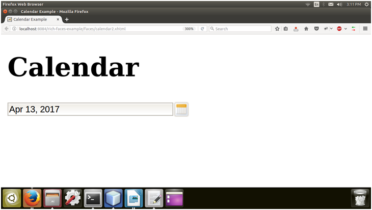
输出:

现在,单击日历图标,然后从弹出菜单中选择日期。

选择日期之后。