- 如何理解纯 CSS 响应式设计?(1)
- 如何理解纯 CSS 响应式设计?
- W3.CSS-响应式设计
- W3.CSS-响应式设计(1)
- Pure.CSS-响应式设计
- Pure.CSS-响应式设计(1)
- 用于响应式设计的 CSS 网格命令 - CSS (1)
- 用于响应式设计的 CSS 网格命令 - CSS 代码示例
- Android中的响应式UI设计
- Android中的响应式UI设计(1)
- 响应式设计和自适应设计之间的区别
- 响应式网页设计 - Html 代码示例
- 如何在 HTML 中设计响应式网页?
- 如何在 HTML 中设计响应式网页?(1)
- 响应式文本 - CSS (1)
- 响应式文本 css (1)
- css 中的响应式图像(1)
- 断点响应式设计 (1)
- 设计课(1)
- 设计课(1)
- 设计课
- 设计课
- 设计课
- 响应式网页设计工具
- 响应式网页设计工具(1)
- 响应式页面 - CSS (1)
- 响应式代码 (1)
- 响应式文本 css 代码示例
- 响应式文本 - CSS 代码示例
📅 最后修改于: 2021-01-08 05:09:02 🧑 作者: Mango
纯CSS响应式设计
Pure.CSS使用以下类创建响应式设计。
| Index | Class Name | Description |
|---|---|---|
| 1) | .pure-u-* | It is used to set the container to occupy required space on any device (compatibale for all devices). |
| 2) | .pure-u-sm-* | It is used for small screens. It sets the container to occupy required space on a device with width ? 568px. |
| 3) | .pure-u-md-* | It is used for medium screens. It sets the container to occupy required space on a device with width ? 768px. |
| 4) | .pure-u-lg-* | It is used for large screens. It sets the container to occupy required space on a device with width ? 1024px. |
| 5) | .pure-u-xl-* | It is used for extra-large screens. It sets the container to occupy required space on a device with width ? 1280px. |
例
让我们创建一个包含四列的响应式网格。列应在小屏幕上堆叠,在中型屏幕上应占用宽度:50%,在大屏幕上应占用宽度:25%。
对于小屏幕,我们添加:.pure-u-1类
对于中型屏幕,我们添加:.pure-u-md-1-2
对于大尺寸屏幕:.pure-u-lg-1-4
请参阅以下示例:
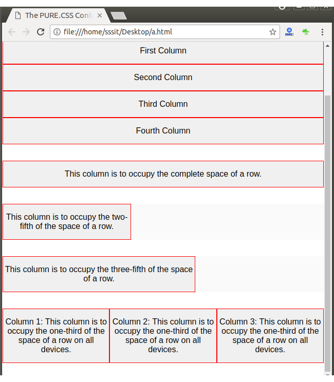
The PURE.CSS Containers
These four columns should stack on small screens,
should take up width: 50% on medium-sized screens, and should
take up width: 25% on large screens.
First Column
Second Column
Third Column
Fourth Column
This column is to occupy the complete space of a row.
This column is to occupy the two-fifth of the space of a row.
This column is to occupy the three-fifth of the space of a row.
Column 1: This column is to occupy the one-third of the
space of a row on all devices.
Column 2: This column is to occupy the one-third of the space
of a row on all devices.
Column 3: This column is to occupy the one-third of the space of a
row on all devices.
看起来像这样:
输出: