在 Plotly 中更改标记边框颜色 – Python
在本文中,我们将讨论如何使用Python中的plotly模块更改标记边框颜色。
Plotly绝对是可视化的必备工具,因为它非常强大,易于使用,并且具有交互性的巨大优势,我们能够导出可视化,能够在浏览器上运行,使用 DASH 构建,DASH 是基于 Web 的Python界面,它消除了在这种类型的分析 Web 应用程序中需要 javascript,我们也可以离线运行这些绘图。在本文中,我们将使用plotly 的模块 plotly.express ,它是高级Python可视化库,它向复杂图表公开简单的语法,它是 plotly.py 的包装器。
安装:
可以使用以下命令安装此模块:
pip install plotly在本文中,我们将借助plotly.express.scatter.update_traces()和plotly.express.scatter_3d.update_traces()()方法更改 maker 边框颜色。
循序渐进的方法:
- 导入plotly和pandas库。
- 首先,我们必须在pandas库的帮助下加载我们要在其上绘制图形的数据集。
- 为了绘制图形,我们将使用plotly.scatter()作为散点图并将其放入变量 let name 中
- 然后我们使用具有标记属性的fig.update_traces函数,我们可以从中更改标记的边框。
我们将在各种示例中使用以下iris数据集:
Python3
# importing library
import plotly.express as px

# importing iris dataset from plotly
df = px.data.iris()

# display dataset
df
Python
# importing library
import plotly.express as px

# importing iris dataset from plotly
df = px.data.iris()

# plotting the scatter plot on sepal_width
# and sepal_length and giving color with
# respect to species
fig = px.scatter(df, x='sepal_width',
                 y='sepal_length',
                 color='species')

# showing the plot with default settings
fig.show()
Python
# importing library
import plotly.express as px

# importing iris dataset from plotly
df = px.data.iris()

# plotting the scatter plot on sepal_width
# and sepal_length and giving color
# with respect to species
fig = px.scatter(df, x='sepal_width',
                 y='sepal_length',
                 color='species')

# setting up marker and in line
# Attribute giving the width and color of border
fig.update_traces(marker=dict(size=10,
                              line=dict(width=3,
                                        color='blue')))

# showing the plot with default settings
fig.show()
Python
# importing library
import plotly.express as px

# importing iris dataset from plotly
df = px.data.iris()

# plotting the scatter 3d plot by giving
# three axis, petal length, petal width
# and sepal length
# giving color with respect to species
fig = px.scatter_3d(df,x='petal_length',
                    y='petal_width',
                    z='sepal_length',
                    color='species')

# showing the plot with default settings
fig.show()
Python
# importing library
import plotly.express as px

# importing iris dataset from plotly
df = px.data.iris()

# plotting the scatter_3d plot by
# giving three axis on petal_length,
# petal_width and sepal_length
# and giving color with respect to species
fig = px.scatter_3d(df,x='petal_length',
                    y='petal_width',
                    z='sepal_length',
                    color='species')

# setting up marker and in line Attribute
# giving the width and color of border
fig.update_traces(marker=dict(size=10,
                              line=dict(width=10,
                                        color='red')))

# showing the plot
fig.show()
输出:

示例 1:在iris数据集上绘制默认散点图。
Python
# importing library
import plotly.express as px

# importing iris dataset from plotly
df = px.data.iris()

# plotting the scatter plot on sepal_width
# and sepal_length and giving color with
# respect to species
fig = px.scatter(df, x='sepal_width',
                 y='sepal_length',
                 color='species')

# showing the plot with default settings
fig.show()
输出:

在 iris 数据集上绘制散点图并更改标记边框颜色。
Python
# importing library
import plotly.express as px

# importing iris dataset from plotly
df = px.data.iris()

# plotting the scatter plot on sepal_width
# and sepal_length and giving color
# with respect to species
fig = px.scatter(df, x='sepal_width',
                 y='sepal_length',
                 color='species')

# setting up marker and in line
# Attribute giving the width and color of border
fig.update_traces(marker=dict(size=10,
                              line=dict(width=3,
                                        color='blue')))

# showing the plot with default settings
fig.show()
输出:
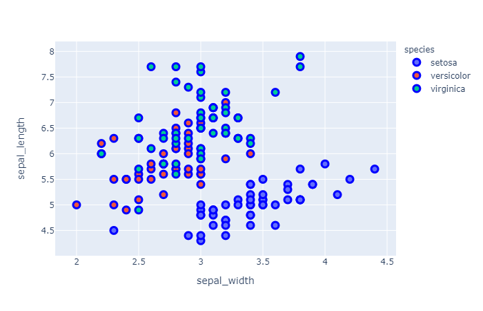
在上面的代码中,我们使用了update_traces()函数,因为我们在该属性中指定了标记属性来创建边界,我们传递了字典,其中传递了 size=10 来为圆圈提供大小,而在行中我们传递了字典,其中传递了宽度和颜色,宽度是指边框的宽度,颜色是指边框的颜色。
示例 3:在iris数据集上绘制默认的 scatter_3d图。
Python
# importing library
import plotly.express as px

# importing iris dataset from plotly
df = px.data.iris()

# plotting the scatter 3d plot by giving
# three axis, petal length, petal width
# and sepal length
# giving color with respect to species
fig = px.scatter_3d(df,x='petal_length',
                    y='petal_width',
                    z='sepal_length',
                    color='species')

# showing the plot with default settings
fig.show()
输出:
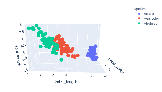
示例 4:在带有标记边框颜色的 iris 数据集上绘制 scatter_3d 图。
Python
# importing library
import plotly.express as px

# importing iris dataset from plotly
df = px.data.iris()

# plotting the scatter_3d plot by
# giving three axis on petal_length,
# petal_width and sepal_length
# and giving color with respect to species
fig = px.scatter_3d(df,x='petal_length',
                    y='petal_width',
                    z='sepal_length',
                    color='species')

# setting up marker and in line Attribute
# giving the width and color of border
fig.update_traces(marker=dict(size=10,
                              line=dict(width=10,
                                        color='red')))

# showing the plot
fig.show()
输出:
