📌 相关文章
- 如何在 R 中绘制分类数据?
- 如何在 R 中绘制分类数据?(1)
- Seaborn-绘制宽格式数据(1)
- Seaborn-绘制宽格式数据
- 绘制分类数据 matplotlib (1)
- 绘制分类数据 matplotlib - 任何代码示例
- 数据分类
- 数据分类(1)
- Seaborn-多面板分类图(1)
- Seaborn-多面板分类图
- 使用 Seaborn 在Python中绘制网格图
- 使用 Seaborn 在Python中绘制网格图(1)
- 使用 Seaborn 绘制图形 | Python
- 绘制数据 python (1)
- 在 seaborn 中绘制直方图 - Python (1)
- 在 seaborn 中绘制直方图 - Python 代码示例
- 桶分类(1)
- R分类(1)
- R分类
- 桶分类
- 胺的分类
- 从 seaborn 加载数据集 - Python (1)
- 如何使用 seaborn 绘制散点图 (1)
- Python Pandas-分类数据
- Python Pandas-分类数据(1)
- 绘制数据 python 代码示例
- 从 seaborn 加载数据集 - Python 代码示例
- 从 R 中的数据框列表中绘制列
- 从 R 中的数据框列表中绘制列(1)
📜 Seaborn-绘制分类数据
📅 最后修改于: 2020-11-06 06:45:00 🧑 作者: Mango
在前面的章节中,我们了解了散点图,六边形图和kde图,这些图用于分析研究中的连续变量。当所研究的变量是分类变量时,这些图不适用。
当研究中的一个或两个变量是分类变量时,我们使用诸如slotlot(),swarmplot()等图。 Seaborn提供了这样做的界面。
分类散点图
在本节中,我们将学习分类散点图。
stripplot()
当所研究的变量之一是分类变量时,将使用stripplot()。它代表沿任一轴排序的数据。
例
import pandas as pd
import seaborn as sb
from matplotlib import pyplot as plt
df = sb.load_dataset('iris')
sb.stripplot(x = "species", y = "petal_length", data = df)
plt.show()
输出
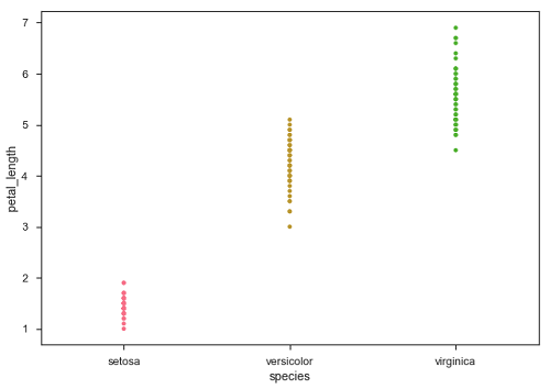
在上面的图中,我们可以清楚地看到每种物种的petal_length的差异。但是,上述散点图的主要问题是散点图上的点是重叠的。我们使用“抖动”参数来处理这种情况。
抖动会给数据增加一些随机噪声。此参数将调整沿分类轴的位置。
例
import pandas as pd
import seaborn as sb
from matplotlib import pyplot as plt
df = sb.load_dataset('iris')
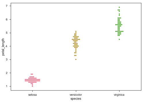
sb.stripplot(x = "species", y = "petal_length", data = df, jitter = Ture)
plt.show()
输出
现在,可以轻松看到点的分布。
Swarmplot()
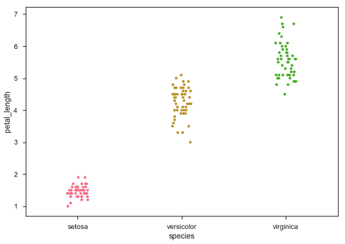
可以替代“抖动”的另一个选项是swarmplot()函数。此函数将散点图的每个点定位在分类轴上,从而避免了点重叠-
例
import pandas as pd
import seaborn as sb
from matplotlib import pyplot as plt
df = sb.load_dataset('iris')
sb.swarmplot(x = "species", y = "petal_length", data = df)
plt.show()
输出