ggplot2 中的分组、堆叠和百分比堆叠条形图
ggplot是一个用于在 R 语言中生成图形的库。我们提供数据并指定有关如何映射指定数据的美学。它是一个非常强大的库,广泛用于生成综合图形和绘图。它用于根据“图形语法”创建图形。
条形图或条形图是一种数据可视化工具,广泛用于表示数值和分类变量之间的关系。数值变量通常绘制在 Y 轴上,分类变量绘制在水平 X 轴上。条形的高度表示分类值的对应数值。当我们有多个分类变量和一个数值变量时,上述内容就派上用场了。
在本文中,我们将看到如何绘制 3 种不同类型的条形图。这 3 种不同类型的条形图是:
- 分组条形图
- 堆积条形图
- 百分比堆积条形图
这 3 个图的代码的唯一区别是 ggplot 库的 geom_bar()函数中“位置”参数的值。下面给出的是相同的实现。
例子 :
R
# importing the ggplot2 library
library(ggplot2)

# creating the cities column
# c() is used to combine vectors
# rep() is used for replication of values
cities <- c(rep("Delhi", 3), rep("Mumbai", 3),
            rep("Chennai", 3), rep("Bengaluru", 3))

# creating the humidity column
# contains 3 classes
humidity <- rep(c("High", "Medium", "Low"), 4)

# creating the temperature column
# abs() is used for getting the absolute value
# rnorm() is used for generating random variates
# in a normal distribution
# rnorm(number of samples, mean, SD)
temperature <- abs(rnorm(12, 25, 10))

# dataframe consisting of the three columns
dataframe <- data.frame(cities, humidity,
                        temperature)

# calling the dataframe
dataframe
R
# importing the ggplot2 library
library(ggplot2)

# creating data frame
cities <- c(rep("Delhi", 3), rep("Mumbai", 3),
            rep("Chennai", 3), rep("Bengaluru", 3))

humidity <- rep(c("High", "Medium", "Low"), 4)

temperature <- abs(rnorm(12, 25, 10))

dataframe <- data.frame(cities, humidity,
                        temperature)

# calling the dataframe
dataframe

# plotting the graph
ggplot(dataframe, aes(fill = humidity,
                      y = temperature, x = cities))+
geom_bar(position = "dodge", stat = "identity")+
ggtitle("Weather Data of 4 Cities !")+
theme(plot.title = element_text(hjust = 0.5))
R
# importing the ggplot2 library
library(ggplot2)

# creating data frame
cities <- c(rep("Delhi", 3), rep("Mumbai", 3),
            rep("Chennai", 3), rep("Bengaluru", 3))

humidity <- rep(c("High", "Medium", "Low"), 4)

temperature <- abs(rnorm(12, 25, 10))

dataframe <- data.frame(cities, humidity,
                        temperature)

# calling the dataframe
dataframe

# plotting graph
ggplot(dataframe, aes(fill = humidity,
                      y = temperature, x = cities))+
geom_bar(position = "stack", stat = "identity")+
ggtitle("Weather Data of 4 Cities !")+
theme(plot.title = element_text(hjust = 0.5))
R
# importing the ggplot2 library
library(ggplot2)

# creating data frame
cities <- c(rep("Delhi", 3), rep("Mumbai", 3),
            rep("Chennai", 3), rep("Bengaluru", 3))

humidity <- rep(c("High", "Medium", "Low"), 4)

temperature <- abs(rnorm(12, 25, 10))

dataframe <- data.frame(cities, humidity,
                        temperature)

# calling the dataframe
dataframe

# plotting graph
ggplot(dataframe, aes(fill = humidity,
                      y = temperature, x = cities))+
geom_bar(position = "fill", stat = "identity")+
ggtitle("Weather Data of 4 Cities !")+
theme(plot.title = element_text(hjust = 0.5))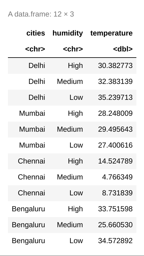
分组条形图
分组条形图或聚类条形图用于将单变量或单类别条形图的功能扩展到多变量条形图。在这些图中,条形根据其类别分组,颜色是代表其他类别变量的区分因素。条形图定位为迎合一组或主要组,颜色代表次要类别。对于分组条形图,位置参数的值指定为“dodge” 。
方法:
- 导入模块
- 创建数据框
- 绘制具有所需函数的图形
- 在 geom_bar()函数设置位置参数来躲避
- 显示图
句法 :
geom_bar(position = “dodge” , ….)
例子:
电阻
# importing the ggplot2 library
library(ggplot2)

# creating data frame
cities <- c(rep("Delhi", 3), rep("Mumbai", 3),
            rep("Chennai", 3), rep("Bengaluru", 3))

humidity <- rep(c("High", "Medium", "Low"), 4)

temperature <- abs(rnorm(12, 25, 10))

dataframe <- data.frame(cities, humidity,
                        temperature)

# calling the dataframe
dataframe

# plotting the graph
ggplot(dataframe, aes(fill = humidity,
                      y = temperature, x = cities))+
geom_bar(position = "dodge", stat = "identity")+
ggtitle("Weather Data of 4 Cities !")+
theme(plot.title = element_text(hjust = 0.5))
输出:
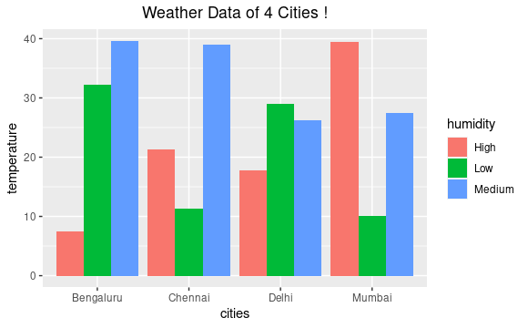
天气数据集的分组条形图
堆积条形图
堆叠条形图或堆叠条形图是标准条形图的扩展,其中我们可以在单个条形图的帮助下表示两个分类变量。在这些图中,主要分类变量的条形决定了次要分类变量的位置,并且根据颜色区分的次要分类变量的不同水平堆叠在一起。对于堆叠条形图,位置参数的值指定为“堆叠”。
方法:
- 导入模块
- 创建数据框
- 绘制具有所需函数的图形
- 在 geom_bar()函数中将位置参数设置为堆栈
- 显示图
句法 :
geom_bar(position = “stack” , …)
例子:
电阻
# importing the ggplot2 library
library(ggplot2)

# creating data frame
cities <- c(rep("Delhi", 3), rep("Mumbai", 3),
            rep("Chennai", 3), rep("Bengaluru", 3))

humidity <- rep(c("High", "Medium", "Low"), 4)

temperature <- abs(rnorm(12, 25, 10))

dataframe <- data.frame(cities, humidity,
                        temperature)

# calling the dataframe
dataframe

# plotting graph
ggplot(dataframe, aes(fill = humidity,
                      y = temperature, x = cities))+
geom_bar(position = "stack", stat = "identity")+
ggtitle("Weather Data of 4 Cities !")+
theme(plot.title = element_text(hjust = 0.5))
输出:
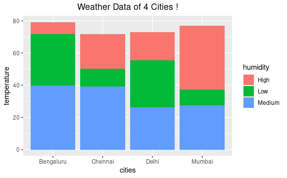
天气数据集的堆积条形图
百分比堆积条形图
百分比堆积条形图用于在累积采用主要分类变量时可视化每个分类变量的贡献或比例。整个条形填充到顶部,不同的组占据与它们在条形中的比例相对应的高度。要映射百分比堆积条形图,位置参数的值指定为“fill” 。
方法:
- 导入模块
- 创建数据框
- 绘制具有所需函数的图形
- 设置位置参数以填充geom_bar()函数
- 显示图
句法 :
geom_bar(position = “fill” , ….)
例子:
电阻
# importing the ggplot2 library
library(ggplot2)

# creating data frame
cities <- c(rep("Delhi", 3), rep("Mumbai", 3),
            rep("Chennai", 3), rep("Bengaluru", 3))

humidity <- rep(c("High", "Medium", "Low"), 4)

temperature <- abs(rnorm(12, 25, 10))

dataframe <- data.frame(cities, humidity,
                        temperature)

# calling the dataframe
dataframe

# plotting graph
ggplot(dataframe, aes(fill = humidity,
                      y = temperature, x = cities))+
geom_bar(position = "fill", stat = "identity")+
ggtitle("Weather Data of 4 Cities !")+
theme(plot.title = element_text(hjust = 0.5))
输出 :
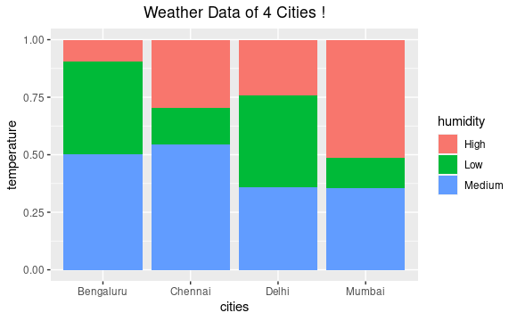
天气数据集的百分比堆积条形图