Python Bokeh – 可视化股票数据
Bokeh 是一个Python交互式数据可视化。它使用 HTML 和 JavaScript 渲染其绘图。它针对现代 Web 浏览器进行演示,提供具有高性能交互性的新颖图形的优雅、简洁构造。
散景可用于可视化股市数据。可视化是使用plotting模块完成的。在这里,我们将使用 Bokeh 提供给我们的样本股票数据集。
下载数据集:
要下载示例数据集,请在命令行上运行以下命令:
bokeh sampledata或者,我们也可以执行以下Python代码:
import bokeh
bokeh.sampledata.download()
分析数据集:
在 Bokeh 提供的样本数据中,有以下公司股票的数据集:
- AAPL,即苹果
- FB即脸书
- GOOG,即谷歌
- IBM是国际商业机器公司
- MSFT是微软公司
所有这些数据集都以 CSV 文件的形式提供。下面是 IBM.csv 文件的一瞥:
Date        Open    High    Low    Close    Volume        Adj Close
01-03-2000    102    105.5    100.06    100.25    10807800    84.48
02-03-2000    100.5    105.44    99.5    103.12    11192900    86.9
03-03-2000    107.25    110    106.06    108    10162800    91.01
06-03-2000    109.94    111    101    103.06    10747400    86.85
07-03-2000    106    107    101.69    103    10035100    86.8
该文件包含 2000 年至 2013 年之间的股票数据,包含 3000 多个条目。
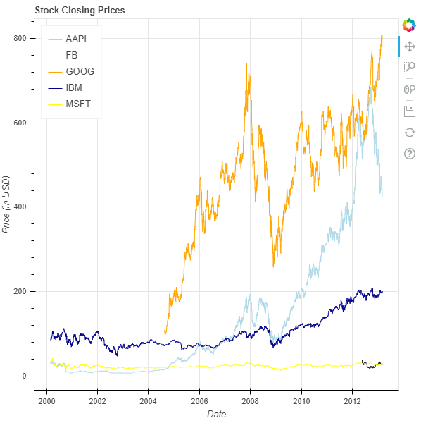
可视化股票:
我们将绘制一个折线图,跟踪所有 5 家可用公司在 2000 年至 2013 年之间的股票收盘价。
- 导入所需的模块:
- 麻木的
- 图、输出文件和显示来自 bokeh.plotting
- 来自 bokeh.sampledata.stocks 的 AAPL、FB、GOOG、IBM 和 MSFT
- 使用标题和轴类型实例化一个图形对象。
- 给 x 轴和 y 轴命名。
- 绘制所有 5 家公司的折线图。
- 显示模型。
# importing the modules
import numpy as np
from bokeh.plotting import figure, output_file, show
from bokeh.sampledata.stocks import AAPL, FB, GOOG, IBM, MSFT

# the file to save the model
output_file("gfg.html")

# instantiating the figure object
graph = figure(x_axis_type = "datetime", title = "Stock Closing Prices")

# name of the x-axis
graph.xaxis.axis_label = 'Date'

# name of the y-axis
graph.yaxis.axis_label = 'Price (in USD)'

# plotting the line graph for AAPL
x_axis_coordinates = np.array(AAPL['date'], dtype = np.datetime64)
y_axis_coordinates = AAPL['adj_close']
color = "lightblue"
legend_label = 'AAPL'
graph.line(x_axis_coordinates,
        y_axis_coordinates,
        color = color,
        legend_label = legend_label)

# plotting the line graph for FB
x_axis_coordinates = np.array(FB['date'], dtype = np.datetime64)
y_axis_coordinates = FB['adj_close']
color = "black"
legend_label = 'FB'
graph.line(x_axis_coordinates,
        y_axis_coordinates,
        color = color,
        legend_label = legend_label)

# plotting the line graph for GOOG
x_axis_coordinates = np.array(GOOG['date'], dtype = np.datetime64)
y_axis_coordinates = GOOG['adj_close']
color = "orange"
legend_label = 'GOOG'
graph.line(x_axis_coordinates,
        y_axis_coordinates,
        color = color,
        legend_label = legend_label)

# plotting the line graph for IBM
x_axis_coordinates = np.array(IBM['date'], dtype = np.datetime64)
y_axis_coordinates = IBM['adj_close']
color = "darkblue"
legend_label = 'IBM'
graph.line(x_axis_coordinates,
        y_axis_coordinates,
        color = color,
        legend_label = legend_label)

# plotting the line graph for MSFT
x_axis_coordinates = np.array(MSFT['date'], dtype = np.datetime64)
y_axis_coordinates = MSFT['adj_close']
color = "yellow"
legend_label = 'MSFT'
graph.line(x_axis_coordinates,
        y_axis_coordinates,
        color = color,
        legend_label = legend_label)

# relocating the legend table to
# avoid abstruction of the graph
graph.legend.location = "top_left"

# displaying the model
show(graph)
输出 :