在 R 中可视化 Hexabin 图
在本文中,我们将了解如何在 R 编程语言中可视化六边形图。
Hexabin 地图使用六边形将区域划分为多个部分,并为每个部分分配一种颜色。图形区域(可能是一个地理位置)被划分为一系列六边形,每个六边形中的数据点数被计算并以颜色梯度显示。
该图用于显示密度,六边形形状允许轻松创建连续区域,同时将空间分成离散的部分。
使用此链接下载数据。此数据存储美国各州的多边形数据
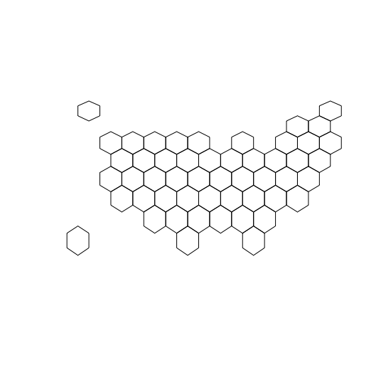
基本六边形图
为了使用 us_states_hexgrid 数据集绘制 hexabin,我们将从该数据集创建数据框,然后绘制空间数据。
R
# R library
library(tidyverse) # handle the data
library(geojsonio) # handle the geojson data
library(RColorBrewer) # for color palette
library(rgdal) # handling the spatial data

# load the geospatial data
us_data <- geojson_read("us_states_hexgrid.geojson",  what = "sp")

# polygon spatial data
us_data@data = us_data@data %>%
  mutate(google_name = gsub(" \\(United States\\)", "", google_name))

# plot the basic Hexabin Map
plot(us_data)
R
# R library
library(tidyverse) # handle the data
library(geojsonio) # handle the geojson data
library(RColorBrewer) # for color palette
library(rgdal) # handling the spatial data

# load the geospatial data
us_data <- geojson_read("us_states_hexgrid.geojson",
                        what = "sp")

# polygon spatial data
us_data@data = us_data@data %>%
  mutate(google_name = gsub(" \\(United States\\)",
                            "", google_name))


# library to convert data to a tidy data
library(broom)
us_data@data = us_data@data %>% mutate(
  google_name = gsub(" \\(United States\\)",
                     "", google_name))

us_data_fortified <- tidy(us_data,
                          region = "google_name")


# getting the US state Marriage data
data <- read.table("https://raw.githubusercontent.com\
/holtzy/R-graph-gallery/master/DATA/State_mariage_rate.csv",
                   sep = ",", na.strings="---", header = T)

# extracting the data sequence
data %>%
  # getting the data for year 2015
  ggplot( aes(x = y_2015)) +
  # preparing the histogram
  geom_histogram(bins = 10, fill='#69b3a2', color='white')

# merging the data with the spatial features from geojson file
us_data_fortified <- us_data_fortified %>%
  left_join(. , data, by=c("id"="state"))

# preparing a choropleth map
ggplot() +
  geom_polygon(data = us_data_fortified, aes(
    fill =  y_2015, x = long, y = lat, group = group)) +
  scale_fill_gradient(trans = "log") +
  coord_map()
输出:
将数据与 Choropleth Map 合并
Hexabin 用于绘制具有高密度数据的散点图,在这里我们将数据与 geojson 文件中的空间特征合并,然后使用 ggplot 绘制 hexabin。
R
# R library
library(tidyverse) # handle the data
library(geojsonio) # handle the geojson data
library(RColorBrewer) # for color palette
library(rgdal) # handling the spatial data

# load the geospatial data
us_data <- geojson_read("us_states_hexgrid.geojson",
                        what = "sp")

# polygon spatial data
us_data@data = us_data@data %>%
  mutate(google_name = gsub(" \\(United States\\)",
                            "", google_name))


# library to convert data to a tidy data
library(broom)
us_data@data = us_data@data %>% mutate(
  google_name = gsub(" \\(United States\\)",
                     "", google_name))

us_data_fortified <- tidy(us_data,
                          region = "google_name")


# getting the US state Marriage data
data <- read.table("https://raw.githubusercontent.com\
/holtzy/R-graph-gallery/master/DATA/State_mariage_rate.csv",
                   sep = ",", na.strings="---", header = T)

# extracting the data sequence
data %>%
  # getting the data for year 2015
  ggplot( aes(x = y_2015)) +
  # preparing the histogram
  geom_histogram(bins = 10, fill='#69b3a2', color='white')

# merging the data with the spatial features from geojson file
us_data_fortified <- us_data_fortified %>%
  left_join(. , data, by=c("id"="state"))

# preparing a choropleth map
ggplot() +
  geom_polygon(data = us_data_fortified, aes(
    fill =  y_2015, x = long, y = lat, group = group)) +
  scale_fill_gradient(trans = "log") +
  coord_map()
输出:
