我们使用少数媒体查询将不同的样式表传递给不同的设备,以为我们的布局和界面创建合理的断点。这些断点主要基于最小视口宽度,并允许我们随着视口的变化按比例放大元素。
Bootstrap主要在源Sass文件中为布局,网格系统和组件使用以下媒体查询范围(或断点)。
// Extra small devices (portrait phones, less than 576px)
// No media query since this is the default in Bootstrap

// Small devices (landscape phones, 576px and up)
@media (min-width: 576px) { ... }

// Medium devices (tablets, 768px and up)
@media (min-width: 768px) { ... }

// Large devices (desktops, 992px and up)
@media (min-width: 992px) { ... }

// Extra large devices (large desktops, 1200px and up)
@media (min-width: 1200px) { ... }
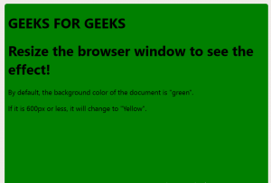
媒体查询以更改背景颜色
复制以下代码,并以.htm扩展名保存,并调整浏览器窗口大小以查看效果
例子:
GEEKS FOR GEEKS
Resize the browser window to see the effect!
By default, the background color of
the document is "green".
If it is 600px or less,
it will change to "Yellow".
调整窗口大小后,我们得到: 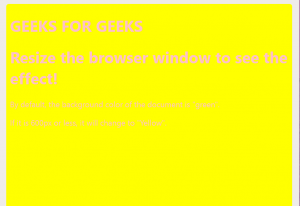
同样,媒体查询可以在不同的地方使用
- 列的媒体查询
- 菜单的媒体查询
- 通过媒体查询更改字体大小
- 方向:人像/风景等。