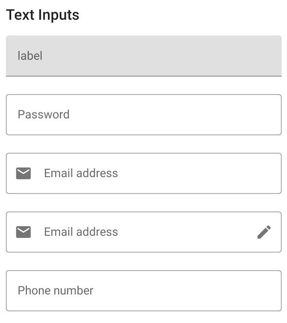
Jetpack Compose是用于构建本机Android UI的现代工具包。 Jetpack Compose使用更少的代码,强大的工具和直观的Kotlin API简化并加速了Android上的UI开发。构建Compose是为了支持材料设计原则。它的许多UI元素都是开箱即用地实现材料设计。在本文中,我们将解释如何使用Jetpack Compose创建Material design文本输入字段。下面是显示我们将要构建的示例图片。
逐步实施
步骤1:创建一个新项目
要使用Jetpack Compose在Android Studio中创建新项目,请参阅如何使用Jetpack Compose在Android Studio Canary版本中创建新项目。
步骤2:使用MainActivity.kt
转到MainActivity.kt文件,并参考以下代码。下面是MainActivity.kt文件的代码。在代码内部添加了注释,以更详细地了解代码。
Kotlin
import android.os.Bundle
import androidx.activity.ComponentActivity
import androidx.activity.compose.setContent
import androidx.compose.foundation.layout.Column
import androidx.compose.foundation.layout.fillMaxWidth
import androidx.compose.foundation.layout.padding
import androidx.compose.foundation.text.KeyboardOptions
import androidx.compose.material.*
import androidx.compose.material.MaterialTheme.typography
import androidx.compose.material.icons.Icons
import androidx.compose.material.icons.filled.Edit
import androidx.compose.material.icons.filled.Email
import androidx.compose.runtime.*
import androidx.compose.ui.Modifier
import androidx.compose.ui.graphics.Color
import androidx.compose.ui.text.InternalTextApi
import androidx.compose.ui.text.input.KeyboardType
import androidx.compose.ui.text.input.PasswordVisualTransformation
import androidx.compose.ui.text.input.TextFieldValue
import androidx.compose.ui.tooling.preview.Preview
import androidx.compose.ui.unit.dp
import com.example.jetpackcomposepractice.ui.theme.JetpackComposePracticeTheme

class MainActivity : ComponentActivity() {
    override fun onCreate(savedInstanceState: Bundle?) {
        super.onCreate(savedInstanceState)
        setContent {
            JetpackComposePracticeTheme {
                // A surface container using the 'background' color from the theme
                Surface(color = Color.White) {
                    Column {
                        // call the function which contains all the input fields
                        TextInputs()
                    }
                }
            }
        }
    }
}

@Composable
fun TextInputs() {
    Column {

        Text(text = "Text Inputs", style = typography.h6, modifier = Modifier.padding(8.dp))
        var text by remember { mutableStateOf(TextFieldValue("")) }
        // for preview add same text to all the fields

        // Normal Text Input field with floating label
        // placeholder is same as hint in xml of edit text
        TextField(
            value = text,
            onValueChange = { newValue -> text = newValue },
            modifier = Modifier
                .padding(8.dp)
                .fillMaxWidth(),
            label = { Text("label") },
            placeholder = { Text("placeholder") },
        )

        // Outlined Text Input Field
        OutlinedTextField(
            value = text,
            modifier = Modifier
                .padding(8.dp)
                .fillMaxWidth(),
            label = { Text(text = "Password") },
            placeholder = { Text(text = "12334444") },
            visualTransformation = PasswordVisualTransformation(),
            onValueChange = {
                text = it
            },
            keyboardOptions = KeyboardOptions(keyboardType = KeyboardType.Password)
        )

        // Outlined Input text with icon on the left
        // inside leadingIcon property add the icon
        OutlinedTextField(
            value = text,
            leadingIcon = { Icon(imageVector = Icons.Default.Email, contentDescription = null) },
            modifier = Modifier
                .padding(8.dp)
                .fillMaxWidth(),
            keyboardOptions = KeyboardOptions(keyboardType = KeyboardType.Text),
            label = { Text(text = "Email address") },
            placeholder = { Text(text = "Your email") },
            onValueChange = {
                text = it
            }
        )

        // Outlined Input text with icon on the left and right
        // inside leadingIcon property add the left icon
        // inside trailingIcon property add right icon
        OutlinedTextField(
            value = text,
            leadingIcon = { Icon(imageVector = Icons.Default.Email, contentDescription = null) },
            trailingIcon = { Icon(imageVector = Icons.Default.Edit, contentDescription = null) },
            modifier = Modifier
                .padding(8.dp)
                .fillMaxWidth(),
            keyboardOptions = KeyboardOptions(keyboardType = KeyboardType.Text),
            label = { Text(text = "Email address") },
            placeholder = { Text(text = "Your email") },
            onValueChange = {
                text = it
            }
        )

        var numberText by remember { mutableStateOf(TextFieldValue("")) }
        // Outlined Text input field with input type number
        // It will open the number keyboard
        OutlinedTextField(value = numberText,
            modifier = Modifier
                .padding(8.dp)
                .fillMaxWidth(),
            keyboardOptions = KeyboardOptions(keyboardType = KeyboardType.Number),
            label = { Text(text = "Phone number") },
            placeholder = { Text(text = "88888888") },
            onValueChange = {
                numberText = it
            }
        )
    }
}

@InternalTextApi
@Preview
@Composable
fun PreviewInputs() {
    Column {
        TextInputs()
    }
}
输出:
想要一个节奏更快,更具竞争性的环境来学习Android的基础知识吗?
单击此处前往由我们的专家精心策划的指南,以使您立即做好行业准备!