子图中的 Matplotlib 图例
在本文中,我们将讨论如何使用 Matplotlib 在子图中添加图例。我们可以在绘制后使用 legend()函数添加图例
句法:
axes[position].legend(loc='best')其中,loc 是位置,“最佳”将图例放置在该位置
方法:
- 使用 subplots() 方法在更大的图中创建子图。
- 使用 legend() 方法为曲线添加标签。
- 然后使用 show() 方法显示绘图。
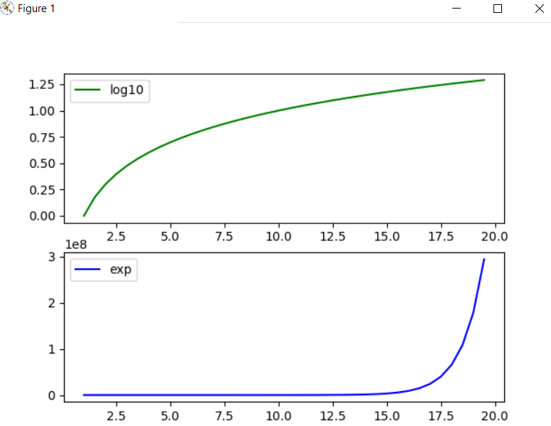
示例 1:
在此示例中,散点图是带有正弦和余弦子图的图。
Python3
# importing modules
from matplotlib import pyplot
import numpy

# assign value to x axis
x_axis = numpy.arange(1, 20, 0.5)

# get the value of log10
y_axis_log10 = numpy.log10(x_axis)

# get the value of exp
y_axix_exp = numpy.exp(x_axis)

# create subplots using subplot() method
fig, axes = pyplot.subplots(2)

# depicting the visualization
axes[0].plot(x_axis, y_axis_log10, color='green', label="log10")
axes[1].plot(x_axis, y_axix_exp, color='blue', label="exp")

# position at which legend to be added
axes[0].legend(loc='best')
axes[1].legend(loc='best')

# display the plot
pyplot.show()
Python3
# importing modules
from matplotlib import pyplot
import numpy

# assign value to x axis
x_axis = numpy.arange(-2, 2, 0.1)

# get the value of sine
y_axis_sine = numpy.sin(x_axis)

# get the value of cos
y_axix_cose = numpy.cos(x_axis)

# create subplots using subplot() method
fig, axes = pyplot.subplots(2)

# depicting the visualization(scatter)
axes[0].scatter(x_axis, y_axis_sine, color='green', marker='*', label="sine")
axes[1].scatter(x_axis, y_axix_cose, color='blue', marker='*', label="cos")

# position at which legend to be added
axes[0].legend(loc='best')
axes[1].legend(loc='best')

# display the plot
pyplot.show()
Python3
# importing modules
from matplotlib import pyplot

# assign value to x axis
x_axis = list(range(-10, 10))

# get the value of x*x
y_axis1 = [x*x for x in x_axis]

# get the value of x*x*x
y_axix2 = [x*x*x for x in x_axis]

# create subplots using subplot() method
fig, axes = pyplot.subplots(2)

# depicting the visualization
axes[0].scatter(x_axis, y_axis1, color='green', marker='*', label="y=x^2")
axes[1].scatter(x_axis, y_axix2, color='red', marker='*', label="y=x^3")

# position at which legend to be added
axes[0].legend(loc='best')
axes[1].legend(loc='best')

# display the plot
pyplot.show()
输出:
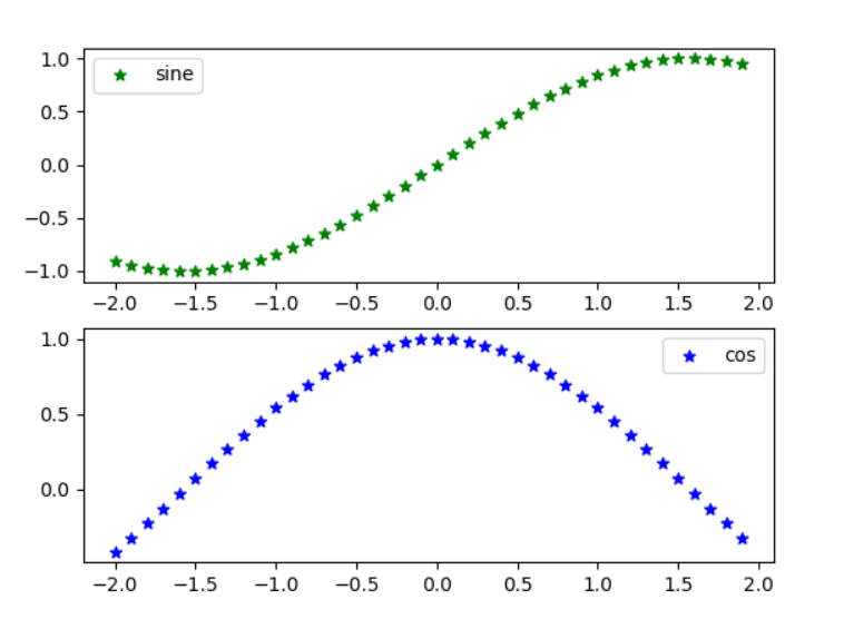
示例 2:
在此示例中,散点图绘制有 (y=x^2) 和 (y=x^3) 的子图。
Python3
# importing modules
from matplotlib import pyplot
import numpy

# assign value to x axis
x_axis = numpy.arange(-2, 2, 0.1)

# get the value of sine
y_axis_sine = numpy.sin(x_axis)

# get the value of cos
y_axix_cose = numpy.cos(x_axis)

# create subplots using subplot() method
fig, axes = pyplot.subplots(2)

# depicting the visualization(scatter)
axes[0].scatter(x_axis, y_axis_sine, color='green', marker='*', label="sine")
axes[1].scatter(x_axis, y_axix_cose, color='blue', marker='*', label="cos")

# position at which legend to be added
axes[0].legend(loc='best')
axes[1].legend(loc='best')

# display the plot
pyplot.show()
输出:
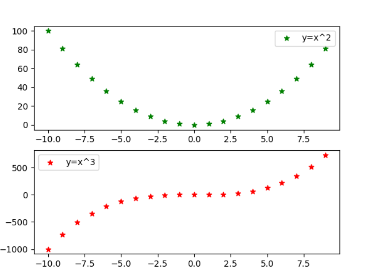
示例 3:
Python3
# importing modules
from matplotlib import pyplot

# assign value to x axis
x_axis = list(range(-10, 10))

# get the value of x*x
y_axis1 = [x*x for x in x_axis]

# get the value of x*x*x
y_axix2 = [x*x*x for x in x_axis]

# create subplots using subplot() method
fig, axes = pyplot.subplots(2)

# depicting the visualization
axes[0].scatter(x_axis, y_axis1, color='green', marker='*', label="y=x^2")
axes[1].scatter(x_axis, y_axix2, color='red', marker='*', label="y=x^3")

# position at which legend to be added
axes[0].legend(loc='best')
axes[1].legend(loc='best')

# display the plot
pyplot.show()
输出: