使用 Seaborn Clustermap 在Python中分层聚类的热图
Seaborn 是一个了不起的可视化库,用于在Python中绘制统计图形。它提供了漂亮的默认样式和调色板,使统计图更具吸引力。它建立在 matplotlib 库的顶部,并且也紧密集成到 Pandas 的数据结构中。
什么是聚类?
聚类基本上是根据数据中变量之间的关系对数据进行分组。聚类算法有助于在无监督学习中获取结构化数据。最常见的聚类类型如下所示。

Clustering_types
在这里,我们将看到层次聚类,尤其是 Agglomerative(自下而上)层次聚类。在凝聚聚类中,我们首先将每个数据点视为一个集群,然后反复将两个最近的集群组合成更大的集群,直到只剩下一个集群。我们在对数据执行凝聚聚类后绘制的图称为树状图。
绘制分层聚类的热图
谈到热图,它是数据的图形表示,其中使用颜色表示值。颜色强度的变化描述了数据如何在空间中聚集或变化。
seaborn 的clustermap ()函数绘制给定矩阵数据集的分层聚类热图。它返回一个聚集的网格索引。
下面是一些描述来自数据集的分层聚类热图的示例:
在 Flights 数据集中,数据(乘客人数)基于月份和年份进行聚类:
示例 1:
Python3
# Importing the library
import seaborn as sns
from sunbird.categorical_encoding import frequency_encoding

# Load dataset
data = sns.load_dataset('flights')

# Categorical encoding
frequency_encoding(data, 'month')

# Clustering data row-wise and
# changing color of the map.
sns.clustermap(data, figsize=(7, 7))
Python3
# Importing the library
import seaborn as sns
from sunbird.categorical_encoding import frequency_encoding

# Load dataset
data = sns.load_dataset('flights')

# Categorical encoding
frequency_encoding(data, 'month')

# Clustering data row-wise and
# changing color of the map.
sns.clustermap(data, cmap='coolwarm', figsize=(7, 7))
输出 :
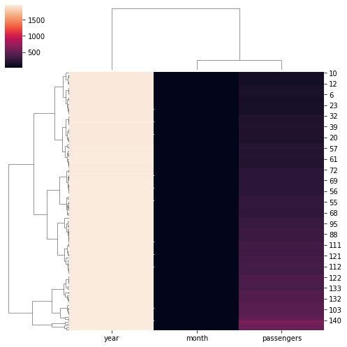
集群地图左侧的图例表示关于集群地图的信息,例如,亮色表示乘客较多,深色表示乘客较少。
示例 2:
蟒蛇3
# Importing the library
import seaborn as sns
from sunbird.categorical_encoding import frequency_encoding

# Load dataset
data = sns.load_dataset('flights')

# Categorical encoding
frequency_encoding(data, 'month')

# Clustering data row-wise and
# changing color of the map.
sns.clustermap(data, cmap='coolwarm', figsize=(7, 7))
输出:
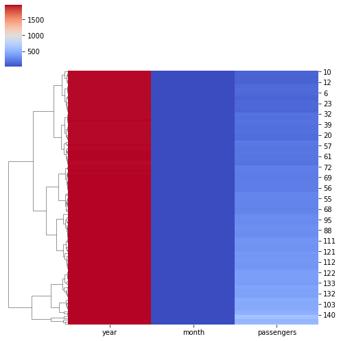
在这里,我们更改了集群地图的颜色。