Python| CAP – 累积准确度配置文件分析
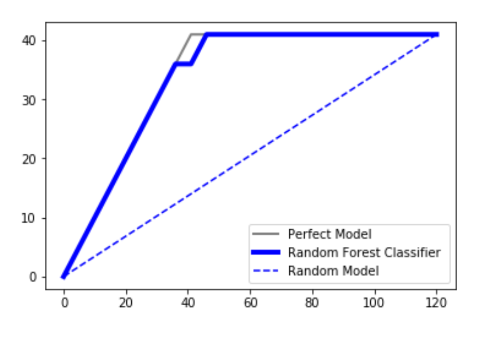
CAP 通常称为“累积准确度配置文件”,用于分类模型的性能评估。它有助于我们理解和总结分类模型的鲁棒性。为了可视化这一点,在我们的图中绘制了三个不同的曲线:
- 随机情节
- 使用 SVM 分类器或随机森林分类器获得的图
- 一个完美的情节(一条理想的线)
我们正在使用 DATA 来理解这个概念。
代码:加载数据集。
Python3
# importing libraries
import pandas as pd
import seaborn as sns
import matplotlib.pyplot as plt
import numpy as np

# loading dataset
data = pd.read_csv('C:\\Users\\DELL\\Desktop\\Social_Network_Ads.csv')

print ("Data Head : \n\n", data.head())
Python3
# Input and Output
x = data.iloc[:, 2:4]
y = data.iloc[:, 4]

print ("Input : \n", x.iloc[0:10, :])
Python3
# splitting data
from sklearn.model_selection import train_test_split
x_train, x_test, y_train, y_test = train_test_split(
        x, y, test_size = 0.3, random_state = 0)
Python3
# classifier
from sklearn.ensemble import RandomForestClassifier
classifier = RandomForestClassifier(n_estimators = 400)

# training
classifier.fit(x_train, y_train)

# predicting
pred = classifier.predict(x_test)
Python3
# Model Performance
from sklearn.metrics import accuracy_score
print("Accuracy : ", accuracy_score(y_test, pred) *  100)
Python3
# code for the random plot
import matplotlib.pyplot as plt
import numpy as np

# length of the test data
total = len(y_test)

# Counting '1' labels in test data
one_count = np.sum(y_test)

# counting '0' labels in test data
zero_count = total - one_count

plt.figure(figsize = (10, 6))

# x-axis ranges from 0 to total people contacted
# y-axis ranges from 0 to the total positive outcomes.

plt.plot([0, total], [0, one_count], c = 'b',
         linestyle = '--', label = 'Random Model')
plt.legend()
Python3
lm = [y for _, y in sorted(zip(pred, y_test), reverse = True)]
x = np.arange(0, total + 1)
y = np.append([0], np.cumsum(lm))
plt.plot(x, y, c = 'b', label = 'Random classifier', linewidth = 2)
Python3
plt.plot([0, one_count, total], [0, one_count, one_count],
         c = 'grey', linewidth = 2, label = 'Perfect Model')
输出 :
Data Head :

     User ID  Gender  Age  EstimatedSalary  Purchased
0  15624510    Male   19            19000          0
1  15810944    Male   35            20000          0
2  15668575  Female   26            43000          0
3  15603246  Female   27            57000          0
4  15804002    Male   19            76000          0
代码:数据输入输出。
Python3
# Input and Output
x = data.iloc[:, 2:4]
y = data.iloc[:, 4]

print ("Input : \n", x.iloc[0:10, :])
输出 :
Input :
    Age  EstimatedSalary
0   19            19000
1   35            20000
2   26            43000
3   27            57000
4   19            76000
5   27            58000
6   27            84000
7   32           150000
8   25            33000
9   35            65000
代码:拆分数据集进行训练和测试。
Python3
# splitting data
from sklearn.model_selection import train_test_split
x_train, x_test, y_train, y_test = train_test_split(
        x, y, test_size = 0.3, random_state = 0)
代码:随机森林分类器
Python3
# classifier
from sklearn.ensemble import RandomForestClassifier
classifier = RandomForestClassifier(n_estimators = 400)

# training
classifier.fit(x_train, y_train)

# predicting
pred = classifier.predict(x_test)
代码:查找分类器的准确性。
Python3
# Model Performance
from sklearn.metrics import accuracy_score
print("Accuracy : ", accuracy_score(y_test, pred) *  100)
输出 :
Accuracy : 91.66666666666666随机模型
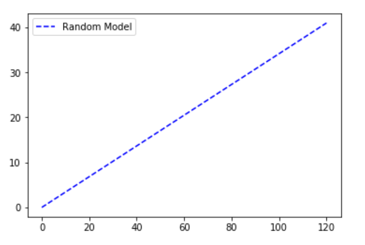
随机图是在我们绘制了从 0 到数据集中数据点总数的点的总数的假设下绘制的。 y 轴一直保留为我们数据集中的因变量的结果为 1 的点总数。随机图可以理解为线性增加的关系。一个例子是一个模型,该模型根据性别、年龄、收入等因素预测每个人是否从一组人(分类参数)中购买产品(积极结果)。如果随机联系组成员,累计售出的产品数量将线性上升至对应于该组内购买者总数的最大值。这种分布称为“随机”CAP 。
代码:随机模型
Python3
# code for the random plot
import matplotlib.pyplot as plt
import numpy as np

# length of the test data
total = len(y_test)

# Counting '1' labels in test data
one_count = np.sum(y_test)

# counting '0' labels in test data
zero_count = total - one_count

plt.figure(figsize = (10, 6))

# x-axis ranges from 0 to total people contacted
# y-axis ranges from 0 to the total positive outcomes.

plt.plot([0, total], [0, one_count], c = 'b',
         linestyle = '--', label = 'Random Model')
plt.legend()
输出 :
随机森林分类器线
代码:随机森林分类算法应用于随机分类器线图的数据集。
Python3
lm = [y for _, y in sorted(zip(pred, y_test), reverse = True)]
x = np.arange(0, total + 1)
y = np.append([0], np.cumsum(lm))
plt.plot(x, y, c = 'b', label = 'Random classifier', linewidth = 2)
输出 :
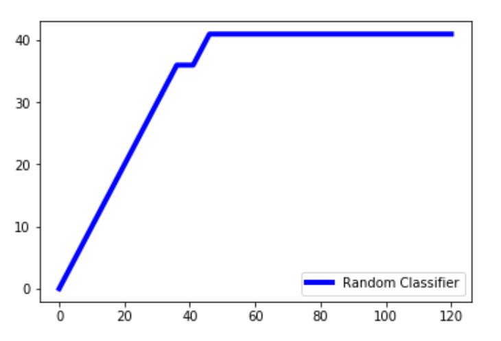
解释: pred 是随机分类器做出的预测。我们压缩预测值和测试值,并以相反的顺序对其进行排序,以便首先出现较高的值,然后是较低的值。我们只提取数组中的y_test值并将其存储在lm中。 np.cumsum()创建一个值数组,同时将数组中的所有先前值累积添加到当前值。 x 值的范围是从 0 到总数 + 1。我们将总数加一,因为arange()不包含 1 到数组中,我们希望 x 轴的范围从 0 到总数。
完美模型
然后我们绘制完美的情节(或理想的线)。一个完美的预测准确地确定了哪些组成员将购买该产品,从而以最少的电话次数达到销售的最大产品数量。这会在 CAP 曲线上产生一条陡峭的线,一旦达到最大值,它就会保持平坦(联系所有其他组成员不会导致销售更多产品),这就是“完美”的 CAP 。
Python3
plt.plot([0, one_count, total], [0, one_count, one_count],
         c = 'grey', linewidth = 2, label = 'Perfect Model')
输出 :
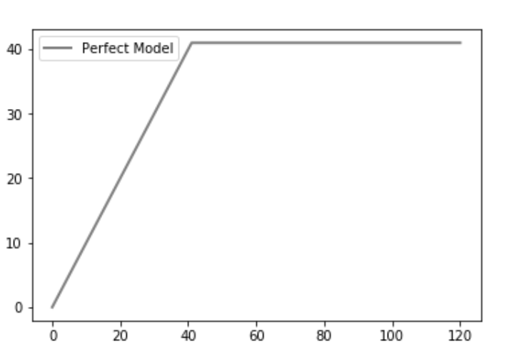
解释:一个完美的模型会在与积极结果的数量相同的尝试次数中找到积极的结果。我们的数据集中共有 41 个积极的结果,因此恰好在 41 个时,达到了最大值。
最终分析:
在任何情况下,我们的分类器算法都不应该产生位于随机线下方的线。在这种情况下,它被认为是一个非常糟糕的模型。由于绘制的分类器线接近理想线,我们可以说我们的模型非常适合。取完美情节下的区域并将其称为 aP。取预测模型下的区域并将其称为aR 。然后将比率作为aR/aP 。这个比率称为准确率。值越接近 1,模型越好。这是分析它的一种方法。
另一种分析它的方法是从预测模型上的轴约 50% 处投影一条线,并将其投影到 y 轴上。假设我们获得了作为 X% 的投影值。
-> 60%        : it is a really bad model
-> 60% 70% 80% 90%
所以根据这个分析,我们可以确定我们的模型有多准确。
参考:- wikipedia.org