R中的并排条形图
在本文中,我们将讨论如何在 R 编程语言中并排绘制条形图。
方法一:使用par()函数
要并排绘制图形,使用 par()函数。
Syntax:
par(mfrow, mar, mgp, las)
Parameters:
- mfrow- A numeric vector of length 2, which sets the rows and column in which frame has to be divided.
- mar – A numeric vector of length 4, which sets the margin sizes in the following order: bottom, left, top, and right.
- mgp – A numeric vector of length 3, which sets the axis label locations relative to the edge of the inner plot window.
- las – A numeric value indicating the orientation of the tick mark labels and any other text added to a plot after its initialization.
这些图是正常绘制的,独立于其他图。为了并排绘制它们,传递行数和列数,就像定义网格一样。
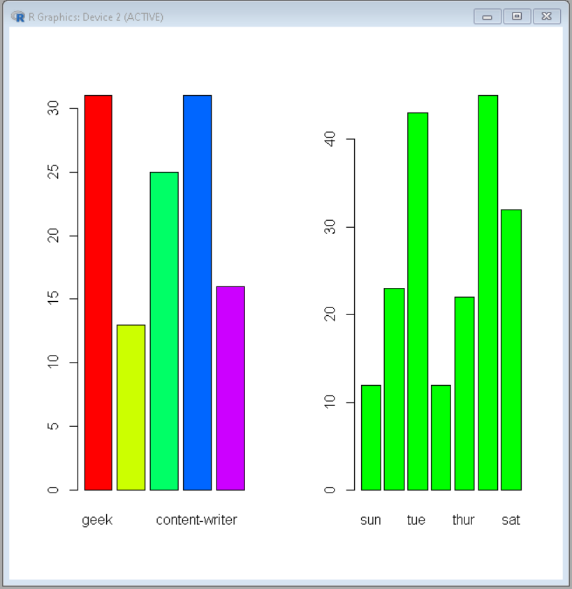
示例:使用基本 R 并排绘制条形图
R
# Define data-set columns
x1 <- c(31,13,25,31,16)
x2 <- c(12,23,43,12,22,45,32)

label1 <- c('geek','geek-i-knack','technical-scipter',
            'content-writer','problem-setter')
label2 <- c('sun','mon','tue','wed','thur','fri','sat')

# set the plotting area into a 1*2 array
par(mfrow=c(1,2))

# Draw the two bar chart using above datasets
barplot(x1, names.arg = label1,col=rainbow(length(x1)))
barplot(x2, names.arg = label2,col ="green")
R
# Define data-set columns
x1 <- c(31,13,25,31,16)
x2 <- c(12,23,43,12,22,45,32)
x3 <- c(234,123,210)

label1 <- c('geek','geek-i-knack','technical-scipter',
            'content-writer','problem-setter')
label2 <- c('sun','mon','tue','wed','thur','fri','sat')
label3 <- c('solved','attempted','unsolved')

# Create data frame using above
# data column
data1 <- data.frame(x1,label1)
data2 <- data.frame(x2,label2)
data3 <- data.frame(x3,label3)

# set the plotting area into a 1*3 array
par(mfrow=c(1,3))

# import library ggplot2 and gridExtra
library(ggplot2)
library(gridExtra)

# Draw the three bar chart using above datasets
plot1<-ggplot(data1, aes(x=label1, y=x1)) +
geom_bar(stat="identity", width=1, color="white",
         fill=rgb(0.1,0.4,0.5,0.7))

plot2<-ggplot(data2, aes(x=label2, y=x2)) +
geom_bar(stat="identity", width=1, color="white",
         fill=rgb(0.1,0.8,0.1,0.7))

plot3<-ggplot(data3, aes(x=label3, y=x3)) +
geom_bar(stat="identity", width=1, color="white",
         fill=rgb(0.8,0.4,0.1,0.7))

# Use grid.arrange to put plots in columns
grid.arrange(plot1, plot2, plot3, ncol=3)
输出:
方法二:使用ggplot2
在此 grid.arrange() 中用于在框架上排列图。
Syntax:
grid.arrange(plot, nrow, ncol)
Parameter:
- plot- ggplot2 plot which we want to arrange
- nrow- Number of rows
- ncol- Number of columns
在这里,绘图是正常且独立地绘制的。然后,以定义网格的方式使用这些图以及行数和列数调用该函数。
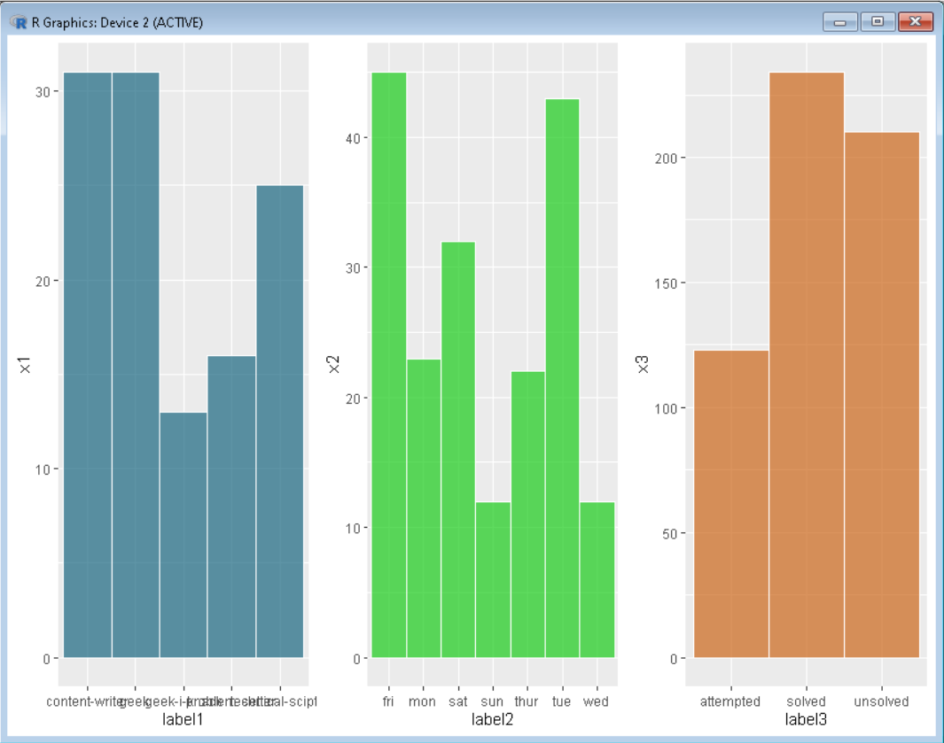
示例:使用 ggplot 并排绘制多个图。
电阻
# Define data-set columns
x1 <- c(31,13,25,31,16)
x2 <- c(12,23,43,12,22,45,32)
x3 <- c(234,123,210)

label1 <- c('geek','geek-i-knack','technical-scipter',
            'content-writer','problem-setter')
label2 <- c('sun','mon','tue','wed','thur','fri','sat')
label3 <- c('solved','attempted','unsolved')

# Create data frame using above
# data column
data1 <- data.frame(x1,label1)
data2 <- data.frame(x2,label2)
data3 <- data.frame(x3,label3)

# set the plotting area into a 1*3 array
par(mfrow=c(1,3))

# import library ggplot2 and gridExtra
library(ggplot2)
library(gridExtra)

# Draw the three bar chart using above datasets
plot1<-ggplot(data1, aes(x=label1, y=x1)) +
geom_bar(stat="identity", width=1, color="white",
         fill=rgb(0.1,0.4,0.5,0.7))

plot2<-ggplot(data2, aes(x=label2, y=x2)) +
geom_bar(stat="identity", width=1, color="white",
         fill=rgb(0.1,0.8,0.1,0.7))

plot3<-ggplot(data3, aes(x=label3, y=x3)) +
geom_bar(stat="identity", width=1, color="white",
         fill=rgb(0.8,0.4,0.1,0.7))

# Use grid.arrange to put plots in columns
grid.arrange(plot1, plot2, plot3, ncol=3)
输出: