Matplotlib – 设置刻度和刻度标签
在本文中,我们将讨论如何在图中设置 Ticks 和 Tick 标签。
刻度是表示轴上数据点的标记,刻度标签是刻度的名称。默认情况下, matplotlib本身标记轴上的数据点,但它也为我们提供了设置自己的轴,并带有他们选择的刻度和刻度标签。
使用的方法:
- plt.axes(*args, emit=True, **kwargs):用于设置我们绘图的轴,参数rect 为 [left,bottom,width,height]用于设置轴位置。
- plt.axes().set_xticks()和plt.axes().set_yticks() :分别用于在 x 轴和 y 轴上设置刻度。将列表形式的数据设置为参数。
- plt.axes().set_xlabels()和plt.axes().set_ylabels() :使用列表形式的参数设置刻度的标签。
下面是一些描述如何在图中添加刻度和刻度标签的示例:
示例 1:
Python3
# import required module
import matplotlib.pyplot as plt

# assign coordinates
x = y = [i for i in range(0, 10)]
ax = plt.axes()

# depict illustration
plt.plot(x, y, color="lime")

# setting ticks for x-axis
ax.set_xticks([2, 4, 6, 8, 10])

# setting ticks for y-axis
ax.set_yticks([1, 3, 5, 7, 9])

plt.show()
Python3
# import required module
import matplotlib.pyplot as plt

# assign coordinates
x = y = [i for i in range(0, 10)]
ax = plt.axes()

# depict illustration
plt.plot(x, y, color="lime")

# setting ticks for x-axis
ax.set_xticks([2, 4, 6, 8, 10])

# setting label for x tick
ax.set_xticklabels(['Geeks', 'for', 'geeks', '!'])

# setting ticks for y-axis
ax.set_yticks([1, 3, 5, 7, 9])

# setting label for y tick
ax.set_yticklabels(['A', 'B', 'C', 'D'])

plt.show()
Python3
# import required modules
import matplotlib.pyplot as plt
import numpy as np
import math

# assign coordinates
x = np.arange(0, math.pi*2, 0.05)
y = np.sin(x)
ax = plt.axes()

# depict illustration
plt.plot(x, y, color="lime")

# setting ticks for x-axis
ax.set_xticks([0, 2, 4, 6])

# setting ticks for y-axis
ax.set_yticks([-1, 0, 1])

plt.show()
Python3
# import required modules
import matplotlib.pyplot as plt
import numpy as np
import math

# assign coordinates
x = np.arange(0, math.pi*2, 0.05)
y = np.sin(x)
ax = plt.axes()
plt.xlabel("x-axis")
plt.ylabel("y-axis")

# depict illustration
plt.plot(x, y, color="lime")

# setting ticks for x-axis
ax.set_xticks([0, 2, 4, 6])

# setting ticks for y-axis
ax.set_yticks([-1, 0, 1])

# setting label for y tick
ax.set_yticklabels(["sin(-90deg)", "sin(0deg)", "sin(90deg)"])

plt.show()
输出:

示例 2:
蟒蛇3
# import required module
import matplotlib.pyplot as plt

# assign coordinates
x = y = [i for i in range(0, 10)]
ax = plt.axes()

# depict illustration
plt.plot(x, y, color="lime")

# setting ticks for x-axis
ax.set_xticks([2, 4, 6, 8, 10])

# setting label for x tick
ax.set_xticklabels(['Geeks', 'for', 'geeks', '!'])

# setting ticks for y-axis
ax.set_yticks([1, 3, 5, 7, 9])

# setting label for y tick
ax.set_yticklabels(['A', 'B', 'C', 'D'])

plt.show()
输出:

示例 3:
蟒蛇3
# import required modules
import matplotlib.pyplot as plt
import numpy as np
import math

# assign coordinates
x = np.arange(0, math.pi*2, 0.05)
y = np.sin(x)
ax = plt.axes()

# depict illustration
plt.plot(x, y, color="lime")

# setting ticks for x-axis
ax.set_xticks([0, 2, 4, 6])

# setting ticks for y-axis
ax.set_yticks([-1, 0, 1])

plt.show()
输出:

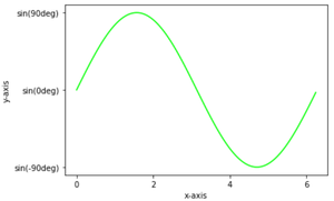
示例 4:
蟒蛇3
# import required modules
import matplotlib.pyplot as plt
import numpy as np
import math

# assign coordinates
x = np.arange(0, math.pi*2, 0.05)
y = np.sin(x)
ax = plt.axes()
plt.xlabel("x-axis")
plt.ylabel("y-axis")

# depict illustration
plt.plot(x, y, color="lime")

# setting ticks for x-axis
ax.set_xticks([0, 2, 4, 6])

# setting ticks for y-axis
ax.set_yticks([-1, 0, 1])

# setting label for y tick
ax.set_yticklabels(["sin(-90deg)", "sin(0deg)", "sin(90deg)"])

plt.show()
输出: