- Flutter的图标类(1)
- Flutter 图标包 (1)
- Flutter的图标类(1)
- Flutter的图标类
- Flutter的图标类
- Flutter 图标包 - 任何代码示例
- Flutter – 更改应用程序图标
- Flutter – 更改应用程序图标
- Flutter – 更改应用程序图标(1)
- Flutter – 更改应用程序图标(1)
- 图标 (1)
- flutter 表
- Flutter(1)
- flutter 卡(1)
- Flutter
- flutter 表(1)
- flutter 卡
- Flutter
- flutter 添加外部图标 - Dart (1)
- flutter 添加外部图标 - Dart 代码示例
- flutter appbar 图标中心 (1)
- 头图标html(1)
- 元图标 html (1)
- html中的点图标(1)
- CSS |图标(1)
- 后图标 css (1)
- CSS |图标(1)
- CSS |图标
- CSS |图标
📅 最后修改于: 2021-01-02 05:03:56 🧑 作者: Mango
flutter 图标
图标是代表应用程序或任何包含用户含义的特定实体的图形图像。它可以是可选的,也可以是非可选的。例如,公司的徽标是不可选择的。有时它还包含一个超链接,可以转到另一个页面。它也可以代替实际实体的详细说明。
Flutter提供了一个图标小部件来在我们的应用程序中创建图标。我们可以使用内置图标或自定义图标在Flutter中创建图标。 Flutter提供了Icons类中所有图标的列表。在本文中,我们将学习如何在应用程序中使用Flutter图标。
图标小部件属性
Flutter icons小部件具有用于自定义图标的不同属性。这些属性说明如下:
| Property | Descriptions |
|---|---|
| icon | It is used to specify the icon name to display in the application. Generally, Flutter uses material design icons that are symbols for common actions and items. |
| color | It is used to specify the color of the icon. |
| size | It is used to specify the size of the icon in pixels. Usually, icons have equal height and width. |
| textDirection | It is used to specify to which direction the icon will be rendered. |
让我们使用不同的示例了解Flutter图标。
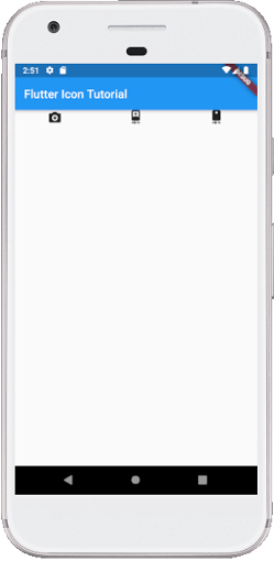
范例1:
在此示例中,我们将看到具有默认值的基本图标小部件。首先,在IDE中创建一个项目,导航到lib文件夹,然后打开main.dart文件。现在,将以下代码替换为main.dart文件:
import 'package:flutter/material.dart';

void main() => runApp(MyApp());

class MyApp extends StatelessWidget {
  // This widget is the root of your application.
  @override
  Widget build(BuildContext context) {
    return MaterialApp(
      theme: ThemeData(
        primarySwatch: Colors.blue,
      ),
      home: MyIconPage(),
    );
  }
}

class MyIconPage extends StatefulWidget {
  @override
  _MyIconPageState createState() => _MyIconPageState();
}

class _MyIconPageState extends State {
  @override
  Widget build(BuildContext context) {
    return Scaffold(
      appBar: AppBar(
        title: Text('Flutter Icon Tutorial'),
      ),
      body: Row(
        mainAxisAlignment: MainAxisAlignment.spaceAround,
          children: [
            Icon(Icons.camera_enhance),
            Icon(Icons.camera_front),
            Icon(Icons.camera_rear),
      ]),
    );
  }
}
输出:
当我们运行该项目时,它将在我们正在使用的仿真器或设备中显示类似于以下屏幕截图的UI:
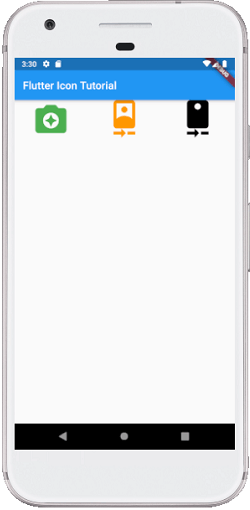
范例2:
在此示例中,我们将看到如何自定义图标。在这里,我们将使用size属性根据需要调整图标大小。我们还将看到color属性来更改图标的默认颜色。因此,打开main.dart文件,并将其替换为以下代码:
import 'package:flutter/material.dart';

void main() => runApp(MyApp());

class MyApp extends StatelessWidget {
  // This widget is the root of your application.
  @override
  Widget build(BuildContext context) {
    return MaterialApp(
      theme: ThemeData(
        primarySwatch: Colors.blue,
      ),
      home: MyIconPage(),
    );
  }
}

class MyIconPage extends StatefulWidget {
  @override
  _MyIconPageState createState() => _MyIconPageState();
}

class _MyIconPageState extends State {
  @override
  Widget build(BuildContext context) {
    return Scaffold(
      appBar: AppBar(
        title: Text('Flutter Icon Tutorial'),
      ),
      body: Row(
        mainAxisAlignment: MainAxisAlignment.spaceAround,
          children: [
            Icon(
              Icons.camera_enhance,
              size: 70,
              color:Colors.green
            ),
            Icon(
              Icons.camera_front,
              size: 70,
              color:Colors.orange
            ),
            Icon(
              Icons.camera_rear,
              size: 70,
              color:Colors.black
            ),
      ]),
    );
  }
}
输出:
当我们运行该项目时,它将在我们正在使用的仿真器或设备中显示类似于以下屏幕截图的UI:
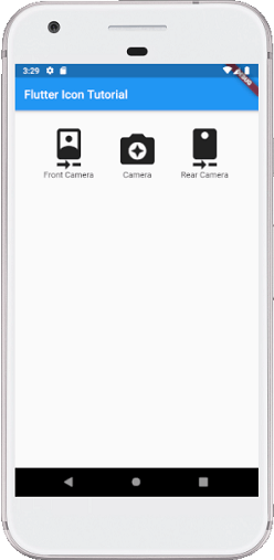
范例3:
大多数时候,我们已经看到图标在我们的应用程序中始终在其下方包含一个文本。在此示例中,我们将看到如何将文本窗口小部件与图标窗口小部件一起使用。因此,打开main.dart文件,并将其替换为以下代码:
import 'package:flutter/material.dart';

void main() => runApp(MyApp());

class MyApp extends StatelessWidget {
  @override
  Widget build(BuildContext context) {
    return MaterialApp(
      theme: ThemeData(
        primarySwatch: Colors.blue,
      ),
      home: MyIconPage(),
    );
  }
}

class MyIconPage extends StatefulWidget {
  @override
  _MyIconPageState createState() => _MyIconPageState();
}

class _MyIconPageState extends State {
  @override
  Widget build(BuildContext context) {
    return Scaffold(
      appBar: AppBar(
        title: Text('Flutter Icon Tutorial'),
      ),
      body: Column(children: [
        //icon with label below it
        Container(
          padding: EdgeInsets.all(30),
          child: Row(
              mainAxisAlignment: MainAxisAlignment.spaceAround,
              children: [
                Column(children: [
                  Icon(
                    Icons.camera_front,
                    size: 70
                  ),
                  Text('Front Camera'),
                ]),
                Column(children: [
                  Icon(
                      Icons.camera_enhance,
                      size: 70
                  ),
                  Text('Camera'),
                ]),
                Column(children: [
                  Icon(
                      Icons.camera_rear,
                      size: 70
                  ),
                  Text('Rear Camera'),
                ]),
              ]
            ),
          )
        ],
      )
    );
  }
}
输出:
当我们运行该项目时,它将在我们正在使用的仿真器或设备中显示类似于以下屏幕截图的UI: