- XAML-控件
- XAML-控件(1)
- XAML-自定义控件
- XAML-自定义控件(1)
- Windows 10开发教程
- Windows 10开发人员-XAML性能
- Windows 10开发人员-XAML性能(1)
- Windows 10开发-资源(1)
- Windows 10开发-资源
- Windows 10开发-简介
- Windows 10开发-简介(1)
- Windows 10开发-云服务
- Windows 10开发-云服务(1)
- Windows 10开发-服务(1)
- Windows 10开发-服务
- Windows 10开发-导航(1)
- Windows 10开发-导航
- 讨论Windows 10开发(1)
- 讨论Windows 10开发
- XAML与C#代码
- XAML与C#代码(1)
- Windows 10开发-联网
- Windows 10开发-联网(1)
- Windows 10开发-生命周期
- Windows 10开发-生命周期(1)
- Windows 10开发-第一个应用程序(1)
- Windows 10开发-第一个应用程序
- Windows 10开发-商店
- Windows 10开发-商店(1)
📅 最后修改于: 2020-11-18 10:04:38 🧑 作者: Mango
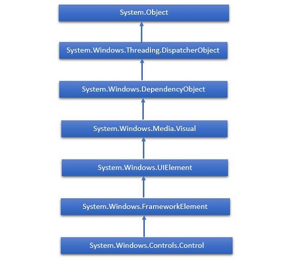
XAML代表可扩展的应用程序标记语言。它是一个用户界面框架,它提供了广泛的控件库,这些控件库支持Windows的UI开发。其中一些具有视觉表示,例如Button,Textbox和TextBlock等;而其他控件则用作其他控件或内容(例如图像)的容器。所有XAML控件均继承自“ System.Windows.Controls.Control” 。
XAML新兴故事
XAML用于许多重要的Microsoft平台,例如Windows Presentation Foundation(WPF),Silverlight和现在的Windows应用程序。现在,Microsoft Office 2016也是UWP应用程序家族。 XAML是一个丰富的平台,它提供了非常酷的功能和控件,可以在UWP应用程序中使用。
控件的完整继承层次结构如下所示。
布局控件
控件的布局对于应用程序的可用性非常重要且至关重要。它用于在应用程序中安排一组GUI元素。选择布局面板时,需要考虑某些重要事项-
- 子元素的位置。
- 子元素的大小。
- 重叠的子元素彼此层叠。
布局控件列表如下-
| S.No. | Controls & Description |
|---|---|
| 1 |
StackPanel StackPanel is a simple and useful layout panel in XAML. In stack panel, child elements can be arranged in a single line either horizontally or vertically based on orientation property. |
| 2 |
WrapPanel In WrapPanel, child elements are positioned in sequential order from left to right or from top to bottom based on the orientation property. The only difference between StackPanel and WrapPanel is that it does not stack all the child elements into a single line but it wraps the remaining elements to another line if there is no space left. |
| 3 |
DockPanel DockPanel defines an area to arrange child elements relative to each other, either horizontally or vertically. With DockPanel you can easily dock child elements to top, bottom, right, left and center with Dock property. With LastChildFill property, the last child element fill the remaining space regardless of any other dock value when set for that element. |
| 4 |
Canvas Canvas is the basic layout panel in which child elements can be positioned explicitly using coordinates that are relative to any side such as left, right, top and bottom. Typically Canvas is used for 2D graphic elements (such as Ellipse, Rectangle etc.) but not for UI elements because specifying absolute coordinates give trouble while resizing, localizing or scaling in an XAML application. |
| 5 |
Grid Grid provides a flexible area, which consists of rows and columns. In Grid, child elements can be arranged in a tabular form. Elements can be added to any specific row and column by using Grid.Row and Grid.Column properties. |
| 6 |
SplitView SplitView represents a container with two views; one view for the main content and another view that is typically used for navigation commands. |
| 7 |
RelativePanel RelativePanel defines an area within which you can position and align child objects in relation to each other or the parent panel. |
| 8 |
ViewBox ViewBox defines a content decorator that can stretch and scale a single child to fill the available space. |
| 9 |
FlipView FlipView represents an item’s control that displays one item at a time, and enables “flip” behavior for traversing its collection of items. |
| 10 |
GridView GridView is a control that presents a collection of items in rows and columns and can be scrolled horizontally. |
UI控件
这是UI控件的列表,这些控件对最终用户可见。
| S.No. | UI Controls & Description |
|---|---|
| 1 |
Button A control that responds to user input |
| 2 |
Calendar Represents a control that enables a user to select a date by using a visual calendar display. |
| 3 |
CheckBox A control that a user can select or clear. |
| 4 |
ComboBox A drop-down list of items, a user can select from. |
| 5 |
ContextMenu Gets or sets the context menu element that should appear whenever the context menu is requested through user interface (UI) from within this element. |
| 6 |
DataGrid Represents a control that displays data in a customizable grid. |
| 7 |
DatePicker A control that lets a user select a date. |
| 8 |
Dialogs An application may also display additional windows to do the user to gather or display important information. |
| 9 |
Flyout Represents a control that displays lightweight UI that is either information, or requires user interaction. Unlike a dialog, a Flyout can be light dismissed by clicking or tapping outside of it, pressing the device’s back button, or pressing the ‘Esc’ key. |
| 10 |
Image A control that presents an image. |
| 11 |
ListBox A control that presents an inline list of items that the user can select from. |
| 12 |
Menus Represents a Windows menu control that enables you to hierarchically organize the elements associated with commands and event handlers. |
| 13 |
MenuFlyout Represents a flyout that displays a menu of commands. |
| 14 |
PasswordBox A control for entering passwords. |
| 15 |
Popup Displays content on top of the existing content, within the bounds of the application window. |
| 16 |
ProgressBar A control that indicates the progress by displaying a bar. |
| 17 |
ProgressRing A control that indicates the indeterminate progress by displaying a ring. |
| 18 |
RadioButton A control that allows a user to select a single option from a group of options. |
| 19 |
RichEditBox A control that lets a user edit rich text documents with content like formatted text, hyperlinks, and images. |
| 20 |
ScrollViewer A container control that lets the user pan and zoom its content. |
| 21 |
SearchBox A control that lets a user enter search queries. |
| 22 |
Slider A control that lets the user select from a range of values by moving a Thumb control along a track. |
| 23 |
TextBlock A control that displays the text. |
| 24 |
TimePicker A control that lets a user set a time value. |
| 25 |
ToggleButton A button that can be toggled between 2 states. |
| 26 |
ToolTip A pop-up window that displays information for an element. |
| 27 |
Window The root window which provides minimize/maximize option, Title bar, border and close button. |
下面给出一个示例,该示例在SplitView中包含不同类型的控件。在XAML文件中,将创建具有某些属性和事件的不同控件。
下面给出的是C#中的Events实现。
using Windows.UI.Xaml;
using Windows.UI.Xaml.Controls;
using Windows.UI.Xaml.Media;

// The Blank Page item template is documented at
   http://go.microsoft.com/fwlink/?LinkId=402352&clcid=0x409

namespace UWPControlsDemo {

   ///
      /// An empty page that can be used on its own or navigated to within a Frame.
   ///

   public sealed partial class MainPage : Page {

      public MainPage() {
         this.InitializeComponent();
      }

      private void HandleCheck(object sender, RoutedEventArgs e) {
         splitView.IsPaneOpen = true;
      }

      private void HandleUnchecked(object sender, RoutedEventArgs e) {
         splitView.IsPaneOpen = false;
      }

   }

}
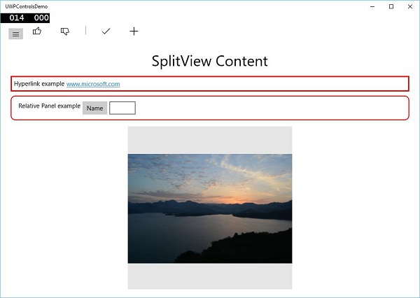
编译并执行上述代码后,您将看到以下窗口-
当您单击左上方的汉堡包按钮时,它将打开/关闭SplitView窗格。
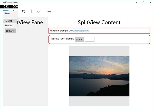
在SplitView窗格中,您可以看到Flyout , MenuFlyout和FlipView控件。
在SplitView内容中,您可以看到“超链接”,“相对面板”,“视图框”以及其他按钮和文本框控件。