Power BI – 时间序列、聚合和过滤器
先决条件: Power BI - 在层次结构中向下钻取和向上钻取
本文讨论 Power BI 的各种重要概念及其实现。这里将讨论以下概念:
- 时间序列
- 聚合
- 过滤器
了解数据集:
使用的数据集是'Long-Term-Unemployment-Stats' 。请参阅数据集以跟随本文的以下给定部分 – 数据集
数据以这样的方式,每行,我们可以找到的数量格式化Unemployed people在特定的Age组和Gender的特别是在当前Period 。 (请参阅下面给出的数据集图像。)数据集的结构侧重于机器理解的效率,而不是人类。
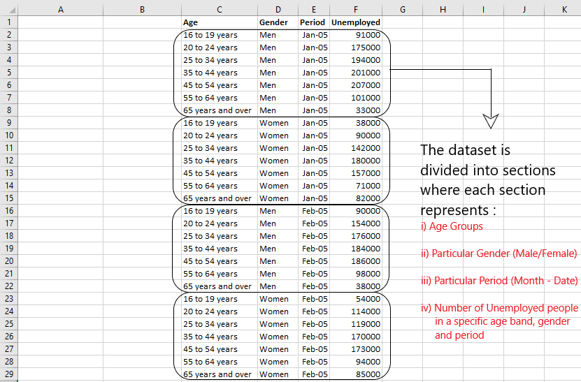
使用的数据集快照
创建折线图:
为了理解时间序列的概念,我们需要在 Power BI 中为我们的数据创建一个折线图。
Steps Involved:

Step 1 - Upload your dataset.
Step 2 - Drag and Drop 'Period' and 'Unemployed' from Fields.
Step 3 - Click on your graph and select Line Chart from the visualization panel.
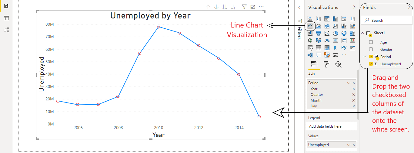
Power BI:折线图
在上面的折线图中,
- 对于每一年,我们都有一个单独的点代表那一年的失业人数。
- 每个数据点代表该特定年份所有失业人员的总数或总和。
时间序列:
时间序列预测是机器学习中使用的一种技术,它分析数据和时间序列以预测未来事件。它是按天、小时、月和年定期收集数据。
我们将使用 2 种方法实现时间序列:
方法 1:使用显示下一级钻孔。
在这种方法中,我们不将数据视为一组连续的点,而是将它们视为分类变量。
我们取的是一年中不同季度的平均失业率,而不是总和。
当我们查看时间序列数据的平均值以获取有价值的信息时,使用显示下一个级别。
Steps Involved:

Step 1 - Click on your line chart. Go to values section and right click on 'Unemployed' and select Average.
(Doing this will convert your line chart from sum to average as shown in Fig 1)

Step 2 - Go to 'Switch to next level' and press it to drill data points to lower level.
Example : Average of Unemployed by [Year --> Quarter --> Month] (Shown in Fig 2)

图 1:从总失业人数到平均失业人数的转换(步骤 1)

图 2:切换到下一级别(第 2 步)
Here, we observe that following things in the given Time Series:

1. The average unemployment in the third quarter was the highest.
2. The average unemployment in the months of June and July are the lowest.
方法 2:使用扩展到下一级钻孔。
在这种方法中,我们将数据视为一组连续的点。 (不是分类变量)。随着我们深入到下一个级别,数据点会增加。在某种程度上,它转换为连续的时间序列数据。
Steps Involved:

Step 1 - Convert your 'unemployed' column back to sum from average.

Step 2 - Step 2 - Go to 'Expand all down one level' and press it to drill data points to lower level.
Example: Unemployed by [Year --> Quarter --> Month] (Shown in Fig 3)
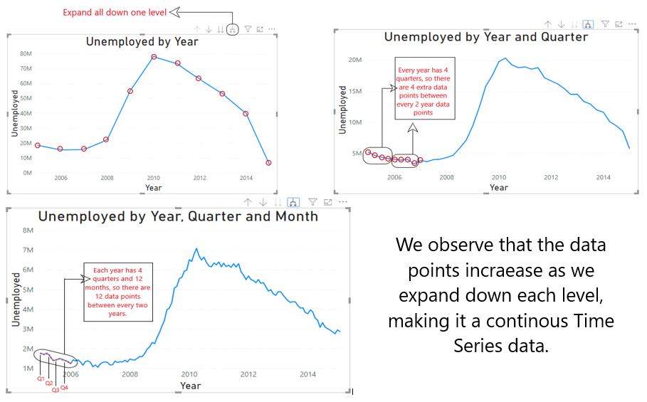
图 3:全部向下展开一层(步骤 2)
聚合和粒度:
当您组合数据中的值时,它称为聚合。该数学运算的结果是一个聚合。我们使用 sum、average、min/max 等来聚合数据中的值。相反,粒度是数据点的隔离。当我们增加聚合率时,粒度率会降低。
Steps Involved:

Step 1 - Go to 'Expand all down one level' and press it to drill data points to the month level. (Shown in Fig 4)
Step 2 - Put values like 'Gender' and 'Age' into the legend tab one by one. (Shown in Fig 5)

Using the legends shown above the line chart, observe as the granularity of data increases.

图 4:从 [Year] –> [Year, Quarter and Month] 展开全部(步骤 1)

图 5:向折线图添加图例(步骤 2)
堆积面积图:
在理解Filters和Slicer的概念之前,我们需要创建一个堆积面积图。
Steps Involved:

Step 1 - Select the line chart 'Unemployed by Year, Quarter, Month and Age'. (Shown in Fig 5)
Step 2 - Go to visualization panel and select 'Stacked Area Chart'. (Shown in Fig 6)
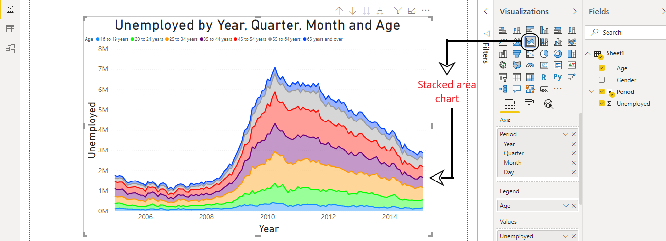
图 6:Power BI:堆积面积图
过滤器:
Power BI 中的筛选器用于根据某些选定条件对数据和信息进行排序。使用它,我们可以从数据中提取特定信息。例如,我们有5家公司一周的股市数据。使用过滤器,我们可以选择要显示数据的特定公司和特定日期。
Steps Involved:

Step 1 - Select your Stacked Area Chart Visualization created above.
Step 2 - Drag and Drop 'Gender' column into Filter Pane as shown in Fig 7.
Step 3 - Now you can select between Male and Female or both, for the section of the data you want to display.
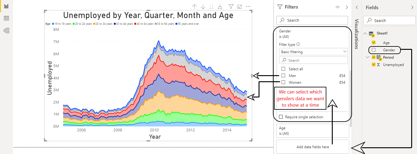
图 7:Power BI:过滤
切片机:
Power BI 中的切片器是“画布上的视觉筛选器”。切片器与过滤器一样,使用户能够过滤数据并查看所需的信息。与过滤器不同,切片器在报告中显示为视觉对象,让用户在分析报告时选择值。可以在一页上创建多个切片器。 (如图8所示)
Steps Involved:

Step 1 - Unselect any visualization. (if selected)
Step 2 - Select 'Slicer' from visualization panel. You will se a blank panel appear in the Report View.
Step 3 - Select specific data segments from 'Gender' and 'Age' slicer to get the filtered data as shown in Fig 8.
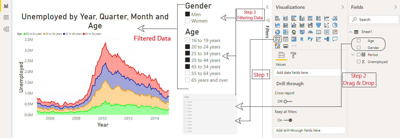
图 8:Power BI:切片器
这些是在制作涉及大型商业智能决策的报告时必须了解的一些重要概念。这些工具有助于制作信息丰富且用户友好的报告。它们在许多实际应用中被企业广泛使用。如有任何疑问/疑问,请在下面发表评论。