📌 相关文章
- transform-origin (1)
- transform-origin - 任何代码示例
- css transform y - CSS (1)
- css transform y - CSS 代码示例
- CSS text-transform 属性(1)
- CSS text-transform 属性
- CSS mask-origin 属性
- CSS mask-origin 属性(1)
- Lodash _.transform() 方法(1)
- Lodash _.transform() 方法
- css transform 平移和旋转 - CSS (1)
- Web API URL.origin 属性(1)
- Web API URL.origin 属性
- css transform 平移和旋转 - CSS 代码示例
- CSS |左属性(1)
- CSS |左属性
- transform:translateX() - CSS (1)
- HTML DOM Window origin 属性
- HTML DOM Window origin 属性(1)
- Pandas DataFrame.transform(1)
- Pandas DataFrame.transform
- transform:translateX() - CSS 代码示例
- git set origin - C# (1)
- Python| Pandas DataFrame.transform(1)
- Python| Pandas DataFrame.transform
- origin git - Shell-Bash 代码示例
- css 属性 - CSS (1)
- HTML |画布 transform() 方法(1)
- HTML |画布 transform() 方法
📜 CSS transform origin属性
📅 最后修改于: 2020-11-05 02:10:05 🧑 作者: Mango
CSS transform origin
此CSS属性用于更改变换后的元素的位置。在这一点上将应用转换。它确定了元素转换的起源。它可以应用于2D和3D旋转。
必须将transform-origin属性与transform属性一起使用。 2d变换可以更改元素的x轴和y轴,而3D变换可以更改z轴以及x轴和y轴。
可以使用一个,两个或三个值来指定此属性。第一个值影响水平位置,第二个值影响垂直位置,第三个值指示z轴的位置。第三个值也可以用于3D转换,并且不能使用百分比定义。
- 如果仅指定一个值,则该值必须是长度或百分比,或者是left,center,right,top和bottom之一的关键字值。
- 如果我们指定两个值,则第一个值必须是长度或百分比,或者是left,right和center的关键字值。第二个值必须是长度或百分比,或者是关键字值center,top和bottom之一。
- 当我们指定三个值时,前两个值与二值语法相同,但是第三个值表示z偏移,因此它必须是长度。
transform-origin属性的默认值为50%50%,它表示元素的中心。
句法
transform-origin: x-axis y-axis z-axis | initial | inherit;
此属性的值列表如下。
| Values | Description |
|---|---|
| x-axis | It represents the horizontal position. This value specifies the position of the view at x-axis. Its possible values are length, percentage, left, right, and center. |
| y-axis | It represents the vertical position. This value specifies the position of the view at y-axis. Its possible values are length, percentage, top, bottom, and center. |
| z-axis | This value is used with the 3D transformations. This value specifies the position of the view at z-axis. It can be defined using the length values. It does not allow the percentage values. |
| initial | It sets the property to its default value. |
| inherit | It inherits the property from its parent element. |
让我们通过使用一些插图来了解此属性。
例
在此示例中,我们将transform-origin属性与长度和百分比值一起应用。两个元件的旋转角度均为45度。这里是元素的2D转换。
Example of the CSS transform-origin Property
transform-origin: 5% 2%;
transform-origin: 100px 200px;
输出量
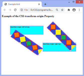
现在,在下一个示例中,我们将使用关键字值指定位置。
例
在此示例中,我们将transform-origin属性与关键字值一起应用。
Example of the CSS transform-origin Property
transform-origin: left bottom;
transform-origin: right top;
输出量
现在,让我们将transform-origin属性应用于具有3D变换的元素。
例
在此示例中,我们将transform-origin属性应用于3D变换后的元素。
Example of the CSS transform-origin Property
transform-origin: 70% 10% 150px;
transform-origin: bottom right 200px;
输出量