在本文中,我们将了解如何仅使用 HTML 和 CSS 创建 GeeksforGeeks 徽标。
第 1 步:要创建 GFG 徽标,首先我们取两个 div(内联)并用它们制作圆圈。但是 div 元素是块级的,这就是为什么我们用包装器 div 包装两个 div 并使该 div(包装器)显示flex 。应用带有 10px 纯色绿色的边框。你会得到这样的东西。
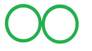
第 2 步:现在使用伪元素: “ after”和绝对位置属性在两个圆上创建一个三角形。应用三角形后,我们将得到这样的形状。
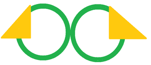
这里三角形的背景颜色是黄色的,这只是为了说明。将三角形的背景颜色更改为白色。
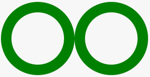
将白色背景颜色应用到三角形后,结果是:
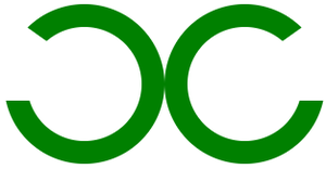
第 3 步:现在使用伪元素:before和 position absolute属性,创建一个正方形。您可以将此规则应用于任何圈子。生成的徽标如下所示:
用代码实现:
步骤 1:创建两个类名为circle1和circle2 的div,并将它们包装到具有名为wrapper 的类的父 div 中。
HTML
CSS
.circle1{
    height: 100px;
    width: 100px;
    border: 20px solid green;
    border-radius: 100px;
    position: relative;
}

.circle2{
    height: 100px;
    width: 100px;
    border: 20px solid green;
    border-radius: 200px;
    position: relative;
}
CSS
.circle1:after{
    content: "";
    position: absolute;
    border-top: 100px solid transparent;
    border-left: 140px solid white;
    left: -50px;
    top: -35px;
}

.circle2:after{
    content: "";
    position: absolute;
    border-top: 100px solid transparent;
    border-right: 140px solid white;
    right: -50px;
    top: -35px;
}
CSS
.circle1:before{
    content: "";
    height: 20px;
    width: 276px;
    position: absolute;
    background: green;
    left: -18px;
    top: 45px;
    z-index: 1;
}
HTML
HTML
现在将 CSS 属性分配给包装类。
.wrapper{
   display: flex;
}
并设计两个圆圈
CSS
.circle1{
    height: 100px;
    width: 100px;
    border: 20px solid green;
    border-radius: 100px;
    position: relative;
}

.circle2{
    height: 100px;
    width: 100px;
    border: 20px solid green;
    border-radius: 200px;
    position: relative;
}
直到现在我们的标志看起来像这样
第 2 步:使用伪元素将不可见三角形添加到两个圆圈中:after
CSS
.circle1:after{
    content: "";
    position: absolute;
    border-top: 100px solid transparent;
    border-left: 140px solid white;
    left: -50px;
    top: -35px;
}

.circle2:after{
    content: "";
    position: absolute;
    border-top: 100px solid transparent;
    border-right: 140px solid white;
    right: -50px;
    top: -35px;
}
由此产生的标志看起来像这样——
第 3 步:现在使用 before伪元素在 logo 上添加正方形(我们没有使用 after(伪元素),因为我们已经使用它来创建三角形)。
CSS
.circle1:before{
    content: "";
    height: 20px;
    width: 276px;
    position: absolute;
    background: green;
    left: -18px;
    top: 45px;
    z-index: 1;
}
由此产生的标志是:
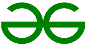
完整代码:
HTML
可以优化代码:
您可以看到您使用了许多对两个圆都相同的属性。如果我们对两个圆圈使用相同的 id,那么我们可以将公共属性写入该 id 并将不同的属性写入类。
以下是上述标志的优化代码:
HTML
输出:
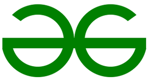