媒体查询用于创建响应式网页设计,以制作用户友好的网站。这意味着网页的视图因屏幕或媒体类型而异。媒体允许我们为平板电脑、台式机、手机等特定设备重塑和设计网站的用户查看页面。
媒体查询可用于检查以下许多内容
- 视口的宽度和高度
- 设备的宽度和高度
- 方向
- 解析度
媒体查询由一种媒体类型组成,该媒体类型可以包含一个或多个表达式,这些表达式可以是true或false 。如果指定的媒体与显示文档的设备类型匹配,则查询结果为真。如果媒体查询为真,则应用样式。
句法:
@media not | only mediatype and (expression)
{
    // Code content
}
HTML代码:
这里的文件名是 index.html
HTML
        GeeksForGeeks CSS Media Query


            GeeksForGeeks
HTML
*{
  margin: 0;
  padding: 0;
}

/* Default Design*/
.gfg-div{
  /* To make all elements center */
  display: flex;
  justify-content: center;
  align-items: center;
  /* Default Styling */
  margin: 20px auto;
  padding: 30px;
  font-size: 30px;
  width: 300px;
  height: 300px;
  background-color:darkseagreen;
  color: black;
}

/* For Desktop View */
@media screen
  and (min-width: 1024px){
    .gfg-div{
      background-color: #63c971;
      color: #fff;
    }
}

/* For Tablet View */
@media screen
  and (min-device-width: 768px)
  and (max-device-width: 1024px){
    .gfg-div{
      width: 400px;
      height: 400px;
      background-color: orange;
      color: black;
    }
}

/* For Mobile Portrait View */
@media screen
  and (max-device-width: 480px)
  and (orientation: portrait){
    .gfg-div{
      width: 200px;
      height: 200px;
      background-color: red;
      color: #fff;
    }
}

/* For Mobile Landscape View */
@media screen
  and (max-device-width: 640px)
  and (orientation: landscape){
    .gfg-div{
      width: 400px;
      height: 200px;
      background-color: cyan;
      color: black;
    }
}

/* For Mobile Phones Portrait or Landscape View */
@media screen
  and (max-device-width: 640px){
    .gfg-div{
      width: 400px;
      height: 200px;
      background-color: chartreuse;
      color: black;
    }
}

/* For iPhone 4 Portrait or Landscape View */
@media screen
  and (min-device-width: 320px)
  and (-webkit-min-device-pixel-ratio: 2){
    .gfg-div{
      width: 400px;
      height: 400px;
      background-color:brown;
      color: black;
    }
}

/* For iPhone 5 Portrait or Landscape View */
@media (device-height: 568px)
  and (device-width: 320px)
  and (-webkit-min-device-pixel-ratio: 2){
    .gfg-div{
      width: 400px;
      height: 400px;
      background-color:cornflowerblue;
      color: black;
    }
}

/* For iPhone 6 and 6 plus Portrait or Landscape View */
@media (min-device-height: 667px)
  and (min-device-width: 375px)
  and (-webkit-min-device-pixel-ratio: 3){
    .gfg-div{
      width: 400px;
      height: 400px;
      background-color:darkgoldenrod;
      color: black;
    }
}
CSS 代码:以下是上述 HTML 代码中使用的文件“gfg-style.css”的代码。
HTML
*{
  margin: 0;
  padding: 0;
}

/* Default Design*/
.gfg-div{
  /* To make all elements center */
  display: flex;
  justify-content: center;
  align-items: center;
  /* Default Styling */
  margin: 20px auto;
  padding: 30px;
  font-size: 30px;
  width: 300px;
  height: 300px;
  background-color:darkseagreen;
  color: black;
}

/* For Desktop View */
@media screen
  and (min-width: 1024px){
    .gfg-div{
      background-color: #63c971;
      color: #fff;
    }
}

/* For Tablet View */
@media screen
  and (min-device-width: 768px)
  and (max-device-width: 1024px){
    .gfg-div{
      width: 400px;
      height: 400px;
      background-color: orange;
      color: black;
    }
}

/* For Mobile Portrait View */
@media screen
  and (max-device-width: 480px)
  and (orientation: portrait){
    .gfg-div{
      width: 200px;
      height: 200px;
      background-color: red;
      color: #fff;
    }
}

/* For Mobile Landscape View */
@media screen
  and (max-device-width: 640px)
  and (orientation: landscape){
    .gfg-div{
      width: 400px;
      height: 200px;
      background-color: cyan;
      color: black;
    }
}

/* For Mobile Phones Portrait or Landscape View */
@media screen
  and (max-device-width: 640px){
    .gfg-div{
      width: 400px;
      height: 200px;
      background-color: chartreuse;
      color: black;
    }
}

/* For iPhone 4 Portrait or Landscape View */
@media screen
  and (min-device-width: 320px)
  and (-webkit-min-device-pixel-ratio: 2){
    .gfg-div{
      width: 400px;
      height: 400px;
      background-color:brown;
      color: black;
    }
}

/* For iPhone 5 Portrait or Landscape View */
@media (device-height: 568px)
  and (device-width: 320px)
  and (-webkit-min-device-pixel-ratio: 2){
    .gfg-div{
      width: 400px;
      height: 400px;
      background-color:cornflowerblue;
      color: black;
    }
}

/* For iPhone 6 and 6 plus Portrait or Landscape View */
@media (min-device-height: 667px)
  and (min-device-width: 375px)
  and (-webkit-min-device-pixel-ratio: 3){
    .gfg-div{
      width: 400px;
      height: 400px;
      background-color:darkgoldenrod;
      color: black;
    }
}
输出:

移动人像视图

移动景观视图
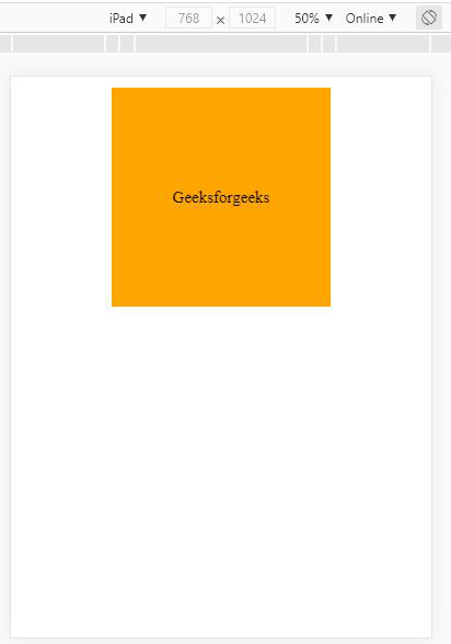
平板设备视图
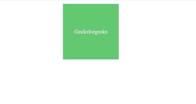
桌面视图