在本文中,我们将使用 HTML 和 CSS 设计一个动画印度国旗。众所周知,我们的印度国旗有藏红花、白色和绿色三种颜色,白色部分的中心还有一个轮子。所以让我们制作印度国旗。在这里,我们还将创建一根旗帜。因此,首先创建一个包装器 div(名为 wrapper 的类),其中包含两个名为 stick 和 flag 的 div 类。
HTML
CSS
.wrapper {
    display: flex;
}

.stick {
    height: 450px;
    width: 10px;
    background: black;
    border-top-left-radius: 10px;
    border-bottom-left-radius: 5px;
    border-bottom-right-radius: 5px;
}

.flag {
    width: 270px;
    height: 180px;
    box-shadow: 0px 0px 90px 1px #989;
    background-color: transparent;
    position: relative;
}
HTML
CSS
.top {
    height: 60px;
    background-color: #ff9933
}

.middle {
    height: 60px;
    background-color: white
}

.bottom {
    height: 60px;
    background-color: green
}
HTML
CSS
.wheel {
    height: 43px;
    width: 43px;
    border: 1px solid darkblue;
    border-radius: 45px;
    position: relative;
    margin: 0 auto
}

.wheel .line {
    height: 100%;
    width: 1px;
    display: inline-block;
    position: absolute;
    left: 50%;
    background: darkblue;
}

.line:nth-child(1) {
    transform: rotate(15deg)
}

.line:nth-child(2) {
    transform: rotate(30deg)
}

.line:nth-child(3) {
    transform: rotate(45deg)
}

.line:nth-child(4) {
    transform: rotate(60deg)
}

.line:nth-child(5) {
    transform: rotate(75deg)
}

.line:nth-child(6) {
    transform: rotate(90deg)
}

.line:nth-child(7) {
    transform: rotate(105deg)
}

.line:nth-child(8) {
    transform: rotate(120deg)
}

.line:nth-child(9) {
    transform: rotate(135deg)
}

.line:nth-child(10) {
    transform: rotate(150deg)
}

.line:nth-child(11) {
    transform: rotate(165deg)
}

.line:nth-child(12) {
    transform: rotate(180deg)
}
CSS
.wheel {
    animation-name: wheel;
    animation-iteration-count: infinite;
    animation-duration: 5s;
    animation-timing-function: linear;
}

@keyframes wheel {
    0% {
        transform: rotate(0deg);
    }
    100% {
        transform: rotate(360deg);
    }
}
CSS
.wave {
    position: absolute;
    height: 100%;
    width: 100%;
    background-image: linear-gradient(
        128deg, rgba(89, 72, 21, 0) 39%,
        rgba(250, 245, 245, 0.8474025974025974)
        46%, rgba(89, 72, 21, 0) 53%);
    animation-name: wavy;
    animation-duration: 10s;
    animation-iteration-count: infinite;
    animation-timing-function: linear;
}

@keyframes wavy {
    0% {
        background-position: -400px 0px,
        -400px 0px, -400px 0px, -400px 0px;
    }
    100% {
        background-position: 800px 0px,
        800px 0px, 800px 0px, 800px 0px;
    }
}
HTML
CSS
.wrapper {
      display: flex;
  }

  .stick {
      height: 450px;
      width: 10px;
      background: black;
      border-top-left-radius: 10px;
      border-bottom-left-radius: 5px;
      border-bottom-right-radius: 5px;
  }

  .flag {
      width: 270px;
      height: 180px;
      box-shadow: 0px 0px 90px 1px #989;
      background-color: transparent;
      position: relative;
  }

  .top {
      height: 60px;
      background-color: #ff9933
  }

  .middle {
      height: 60px;
      display: flex;
      justify-content: center;
      align-items: center;
  }

  .bottom {
      height: 60px;
      background-color: green
  }

  .wheel {
      height: 43px;
      width: 43px;
      border: 1px solid darkblue;
      border-radius: 45px;
      position: relative;
      margin: 0 auto;
      animation-name: wheel;
      animation-iteration-count: infinite;
      animation-duration: 5s;
      animation-timing-function: linear;
  }

  .wheel .line {
      height: 100%;
      width: 1px;
      display: inline-block;
      position: absolute;
      left: 50%;
      background: darkblue;
  }

  .line:nth-child(1) {
      transform: rotate(15deg)
  }

  .line:nth-child(2) {
      transform: rotate(30deg)
  }

  .line:nth-child(3) {
      transform: rotate(45deg)
  }

  .line:nth-child(4) {
      transform: rotate(60deg)
  }

  .line:nth-child(5) {
      transform: rotate(75deg)
  }

  .line:nth-child(6) {
      transform: rotate(90deg)
  }

  .line:nth-child(7) {
      transform: rotate(105deg)
  }

  .line:nth-child(8) {
      transform: rotate(120deg)
  }

  .line:nth-child(9) {
      transform: rotate(135deg)
  }

  .line:nth-child(10) {
      transform: rotate(150deg)
  }

  .line:nth-child(11) {
      transform: rotate(165deg)
  }

  .line:nth-child(12) {
      transform: rotate(180deg)
  }

  @keyframes wheel {
    0%{
      transform: rotate(0deg);
    }
    100%{
      transform: rotate(360deg);
    }
  }
  .wave{
    position: absolute;
    height: 100%;
    width: 100%;
    background-image: linear-gradient(
        128deg, rgba(89,72,21,0) 39%,
        rgba(250,245,245,0.8474025974025974)
        46%, rgba(89,72,21,0) 53%);
    animation-name: wavy;
    animation-duration: 10s;
    animation-iteration-count: infinite;
    animation-timing-function: linear;
  }

  @keyframes wavy {
     0%{
      background-position:
      -400px 0px, -400px 0px,
      -400px 0px,-400px 0px;
     }
     100%{
      background-position: 800px 0px,
      800px 0px, 800px 0px, 800px 0px;
     }
   }
棒和标志应该是内联的,所以我们使包装器 div 的显示属性可以弯曲。并为棒添加一些高度、宽度、背景颜色、边框样式,并在标志中添加高度、宽度、框阴影、背景颜色和位置属性。
CSS
.wrapper {
    display: flex;
}

.stick {
    height: 450px;
    width: 10px;
    background: black;
    border-top-left-radius: 10px;
    border-bottom-left-radius: 5px;
    border-bottom-right-radius: 5px;
}

.flag {
    width: 270px;
    height: 180px;
    box-shadow: 0px 0px 90px 1px #989;
    background-color: transparent;
    position: relative;
}
直到现在它看起来像这样:

现在设计标志部分。标志部分由三部分组成,因此创建三个 div 和名为 top、middle 和 bottom 的类。
HTML
现在将 height 和 background-color 属性添加到顶部、中间和底部 div。
CSS
.top {
    height: 60px;
    background-color: #ff9933
}

.middle {
    height: 60px;
    background-color: white
}

.bottom {
    height: 60px;
    background-color: green
}
现在我们的标志看起来像这样:

现在是时候创建一个轮子了,轮子只不过是 div 中的一个 div,名为 middle 的类。在轮子中,我们创建了 12 个名为‘line’ 的span 元素类。
HTML
为了给轮子设置样式,首先我们必须使用 flex 属性将轮子完美地居中在中间 div 中。并通过添加高度、宽度、边框、边框半径、位置来设计轮子 div。并且还通过添加高度宽度、位置、“左”、背景等属性来设计跨度元素。并使用 :nth-child(n) 选择器和 transform: rotate(angle) 属性旋转每个行项目,每次旋转应相差 15 度。
CSS
.wheel {
    height: 43px;
    width: 43px;
    border: 1px solid darkblue;
    border-radius: 45px;
    position: relative;
    margin: 0 auto
}

.wheel .line {
    height: 100%;
    width: 1px;
    display: inline-block;
    position: absolute;
    left: 50%;
    background: darkblue;
}

.line:nth-child(1) {
    transform: rotate(15deg)
}

.line:nth-child(2) {
    transform: rotate(30deg)
}

.line:nth-child(3) {
    transform: rotate(45deg)
}

.line:nth-child(4) {
    transform: rotate(60deg)
}

.line:nth-child(5) {
    transform: rotate(75deg)
}

.line:nth-child(6) {
    transform: rotate(90deg)
}

.line:nth-child(7) {
    transform: rotate(105deg)
}

.line:nth-child(8) {
    transform: rotate(120deg)
}

.line:nth-child(9) {
    transform: rotate(135deg)
}

.line:nth-child(10) {
    transform: rotate(150deg)
}

.line:nth-child(11) {
    transform: rotate(165deg)
}

.line:nth-child(12) {
    transform: rotate(180deg)
}
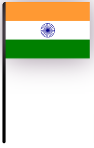
现在我们完整的印度国旗看起来像这样:
添加一些动画:直到现在我们已经创建了一个完整但静态的标志,现在是时候创建一些动画了。这里我们将添加两个动画,第一个是 ss 轮旋转动画,第二个是波浪动画。
添加轮子旋转动画:要添加轮子旋转,我们使用transform:rotate(angle) 属性,使动画持续时间为10 秒,动画计时函数线性,并无限次运行动画。
CSS
.wheel {
    animation-name: wheel;
    animation-iteration-count: infinite;
    animation-duration: 5s;
    animation-timing-function: linear;
}

@keyframes wheel {
    0% {
        transform: rotate(0deg);
    }
    100% {
        transform: rotate(360deg);
    }
}
现在我们的印度国旗是这样的:
添加波浪动画:现在添加波浪动画。对于这个动画,我们创建了一个单独的 div 并将其添加到标志 div 中(因为我们仅将这个 div 覆盖在标志 div 中,而不是在“stick”中)。添加位置:绝对、高度和宽度设置为 100%,并添加渐变背景图像并将背景位置更改为动画。
CSS
.wave {
    position: absolute;
    height: 100%;
    width: 100%;
    background-image: linear-gradient(
        128deg, rgba(89, 72, 21, 0) 39%,
        rgba(250, 245, 245, 0.8474025974025974)
        46%, rgba(89, 72, 21, 0) 53%);
    animation-name: wavy;
    animation-duration: 10s;
    animation-iteration-count: infinite;
    animation-timing-function: linear;
}

@keyframes wavy {
    0% {
        background-position: -400px 0px,
        -400px 0px, -400px 0px, -400px 0px;
    }
    100% {
        background-position: 800px 0px,
        800px 0px, 800px 0px, 800px 0px;
    }
}
完整代码:设计印度国旗的完整HTML和CSS代码。
HTML
CSS
.wrapper {
      display: flex;
  }

  .stick {
      height: 450px;
      width: 10px;
      background: black;
      border-top-left-radius: 10px;
      border-bottom-left-radius: 5px;
      border-bottom-right-radius: 5px;
  }

  .flag {
      width: 270px;
      height: 180px;
      box-shadow: 0px 0px 90px 1px #989;
      background-color: transparent;
      position: relative;
  }

  .top {
      height: 60px;
      background-color: #ff9933
  }

  .middle {
      height: 60px;
      display: flex;
      justify-content: center;
      align-items: center;
  }

  .bottom {
      height: 60px;
      background-color: green
  }

  .wheel {
      height: 43px;
      width: 43px;
      border: 1px solid darkblue;
      border-radius: 45px;
      position: relative;
      margin: 0 auto;
      animation-name: wheel;
      animation-iteration-count: infinite;
      animation-duration: 5s;
      animation-timing-function: linear;
  }

  .wheel .line {
      height: 100%;
      width: 1px;
      display: inline-block;
      position: absolute;
      left: 50%;
      background: darkblue;
  }

  .line:nth-child(1) {
      transform: rotate(15deg)
  }

  .line:nth-child(2) {
      transform: rotate(30deg)
  }

  .line:nth-child(3) {
      transform: rotate(45deg)
  }

  .line:nth-child(4) {
      transform: rotate(60deg)
  }

  .line:nth-child(5) {
      transform: rotate(75deg)
  }

  .line:nth-child(6) {
      transform: rotate(90deg)
  }

  .line:nth-child(7) {
      transform: rotate(105deg)
  }

  .line:nth-child(8) {
      transform: rotate(120deg)
  }

  .line:nth-child(9) {
      transform: rotate(135deg)
  }

  .line:nth-child(10) {
      transform: rotate(150deg)
  }

  .line:nth-child(11) {
      transform: rotate(165deg)
  }

  .line:nth-child(12) {
      transform: rotate(180deg)
  }

  @keyframes wheel {
    0%{
      transform: rotate(0deg);
    }
    100%{
      transform: rotate(360deg);
    }
  }
  .wave{
    position: absolute;
    height: 100%;
    width: 100%;
    background-image: linear-gradient(
        128deg, rgba(89,72,21,0) 39%,
        rgba(250,245,245,0.8474025974025974)
        46%, rgba(89,72,21,0) 53%);
    animation-name: wavy;
    animation-duration: 10s;
    animation-iteration-count: infinite;
    animation-timing-function: linear;
  }

  @keyframes wavy {
     0%{
      background-position:
      -400px 0px, -400px 0px,
      -400px 0px,-400px 0px;
     }
     100%{
      background-position: 800px 0px,
      800px 0px, 800px 0px, 800px 0px;
     }
   }
输出: 