字体大小可以用vw(视口)单位设置,即视口宽度。视口是浏览器窗口大小。 1vw = 视口宽度的 1%。如果视口宽 50 厘米,则 1vw 为 0.5 厘米。这样字体大小将遵循浏览器窗口的大小。
句法:
element {
    font-size: #vw;
    // CSS Property
}
其中 # 是一个相对于容器大小的数字。
示例 1:
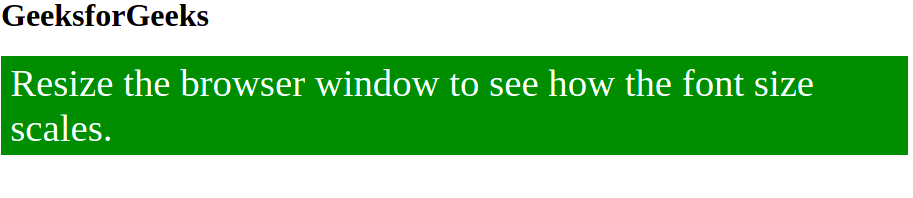
html
Font Scaling
GeeksforGeeks
Resize the browser window to see how the font size scales.
html
Font Scaling
Font size automatically adjusting
according to the width of the container
Change the width of the browser window
to see the font scaling automatically according to the
container size.
输出:
示例 2:媒体查询可用于在特定屏幕尺寸上更改元素的字体大小。
html
Font Scaling
Font size automatically adjusting
according to the width of the container
Change the width of the browser window
to see the font scaling automatically according to the
container size.
输出:

注意:更改浏览器窗口的大小以查看字体大小的更改。