- Tk-概述(1)
- Tk-概述
- Tk-选择小部件
- Tk-选择小部件(1)
- Tk-布局小部件
- Tk-画布小部件
- Tk-画布小部件(1)
- Tk-字体
- Tk-字体(1)
- Tk-环境(1)
- Tk-环境
- Tk-活动(1)
- Tk-活动
- Tk-图片(1)
- Tk-图片
- tk table python (1)
- tkinter 小部件概述 - TypeScript (1)
- tkinter 小部件概述 - TypeScript 代码示例
- tk table python 代码示例
- 在 tk 中制作按钮 - Python (1)
- R-概述(1)
- R-概述
- C#-概述
- F#-概述(1)
- 坞站概述
- C++概述(1)
- F#-概述
- C++概述
- 在 tk 中制作按钮 - Python 代码示例
📅 最后修改于: 2020-10-16 06:33:23 🧑 作者: Mango
基于Tk的应用程序的基本组件称为小部件。组件有时也称为窗口,因为在Tk中,“窗口”和“小部件”通常可以互换使用。 Tk是一个软件包,提供了丰富的图形组件集,可用于使用Tcl创建图形应用程序。
Tk提供了一系列的小部件,从基本的GUI小部件(如按钮和菜单)到数据显示小部件。这些小部件具有很高的可配置性,因为它们具有默认配置,因此易于使用。
Tk应用程序遵循小部件层次结构,其中可以将任意数量的小部件放置在另一个小部件中,而那些小部件则放置在另一个小部件中。 Tk程序中的主窗口小部件称为根窗口小部件,可以通过创建TkRoot类的新实例来创建。
创建小部件
下面给出了创建小部件的语法。
type variableName arguments options
这里的类型是指小部件类型,如按钮,标签等。根据每个小部件的个别语法,参数可以是可选的,也可以是必需的。选项范围从大小到每个组件的格式。
小部件命名约定
窗口小部件使用类似于命名包的结构。在Tk中,根窗口用句点(。)命名,窗口中的元素(例如button)命名为.myButton1。变量名称应以小写字母,数字或标点符号(句点除外)开头。在第一个字符,其他字符可以是大写或小写字母,数字或标点符号(句点除外)。建议使用小写字母开头标签。
颜色命名约定
可以使用诸如红色,绿色等名称来声明颜色。它也可以使用以#表示的十六进制。十六进制数字的数量可以是3、6、9或12。
尺寸惯例
默认单位是像素,当我们不指定尺寸时使用。其他尺寸是i表示英寸,m表示毫米,c表示厘米,p表示点。
常用选项
所有小部件都有很多可用的常用选项,下表中列出了这些选项-
| Sr.No. | Syntax & Description |
|---|---|
| 1 |
-background color Used to set background color for widget. |
| 2 |
-borderwidth width Used to draw with border in 3D effects. |
| 3 |
-font fontDescriptor Used to set font for widget. |
| 4 |
-foreground color Used to set foreground color for widget. |
| 5 |
-height number Used to set height for widget. |
| 6 |
-highlightbackground color Used to set the color rectangle to draw around a widget when the widget does not have input focus. |
| 7 |
-highlightcolor color Used to set the color rectangle to draw around a widget when the widget has input focus. |
| 8 |
-padx number Sets the padx for the widget. |
| 9 |
-pady number Sets the pady for the widget. |
| 10 |
-relief condition Sets the 3D relief for this widget. The condition may be raised, sunken, flat, ridge, solid, or groove. |
| 11 |
-text text Sets the text for the widget. |
| 12 |
-textvariable varName Variable associated with the widget. When the text of widget changes, the variable is set with text of widget. |
| 13 |
-width number Sets the width for widget. |
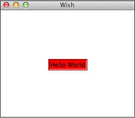
一个简单的选项示例如下所示。
#!/usr/bin/wish

grid [label .myLabel -background red -text "Hello World" -relief ridge -borderwidth 3]
   -padx 100 -pady 100
当我们运行上面的程序时,我们将得到以下输出。
可用小部件的列表分类如下-
基本小部件
| Sr.No. | Widget & Description |
|---|---|
| 1 |
Label Widget for displaying single line of text. |
| 2 |
Button Widget that is clickable and triggers an action. |
| 3 |
Entry Widget used to accept a single line of text as input. |
| 4 |
Message Widget for displaying multiple lines of text. |
| 5 |
Text Widget for displaying and optionally edit multiple lines of text. |
| 6 |
Toplevel Window with all borders and decorations provided by the Window manager. |
布局小部件
| Sr.No. | Widget & Description |
|---|---|
| 1 |
Frame Container widget to hold other widgets. |
| 2 |
Place Widget to hold other widgets in specific place with coordinates of its origin and an exact size. |
| 3 |
Pack Simple widget to organize widgets in blocks before placing them in the parent widget. |
| 4 |
Grid Widget to nest widgets packing in different directions. |
选择小部件
| Sr.No. | Widget & Description |
|---|---|
| 1 |
Radiobutton Widget that has a set of on/off buttons and labels, one of which may be selected. |
| 2 |
Checkbutton Widget that has a set of on/off buttons and labels, many of which may be selected.. |
| 3 |
Menu Widget that acts as holder for menu items. |
| 4 |
Listbox Widget that displays a list of cells, one or more of which may be selected. |
巨型小工具
| Sr.No. | Widget & Description |
|---|---|
| 1 |
Dialog Widget for displaying dialog boxes. |
| 2 |
Spinbox Widget that allows users to choose numbers. |
| 3 |
Combobox Widget that combines an entry with a list of choices available to the use. |
| 4 |
Notebook Tabbed widget that helps to switch between one of several pages, using an index tab. |
| 5 |
Progressbar Widget to provide visual feedback to the progress of a long operation like file upload. |
| 6 |
Treeview Widget to display and allow browsing through a hierarchy of items more in form of tree. |
| 7 |
Scrollbar Scrolling widgets without a text or canvas widgets. |
| 8 |
Scale Scale widget to choose a numeric value through sliders. |
其他小工具
| Sr.No. | Widget & Description |
|---|---|
| 1 |
Canvas Drawing widget for displaying graphics and images.. |
在接下来的章节中,我们将介绍所有这些小部件。