Bootstrap 4中的.pull-left和.pull-right类已替换为.float-left和.float-right类。这些实用程序类用于根据各种视口大小将元素向左或向右浮动。在引导网格上。它可以使用CSS float属性工作。
使用.pull-left和.pull-right类
这些类有助于浮动元素:
- .pull-left类用于将元素向左浮动。
- .pull-right类用于将元素向右浮动。
例子:
    Bootstrap Floating utility class


          GeeksforGeeks

        Bootstrap Floating utility class


          This div floats to the left.


          This div floats to the right.
输出: 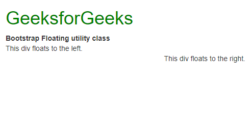
基类
有三个类可帮助浮动元素:
- .float-left类用于将元素向左浮动。
- .float-right类用于将元素向右浮动。
- .float-none类用于禁用浮动。
这些类将适用于所有视口大小,除非使用其响应版本指定。
例子:
      Bootstrap 4 Floating utility class


          GeeksforGeeks

        Bootstrap 4 Floating utility class


          This div floats to the left.


          This div floats to the right.


          This div does not float.
输出: 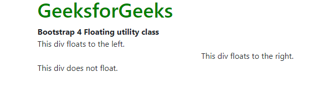
基于视口大小的响应式浮动
基类的响应变体可用于仅在指定的视口大小上应用浮动。可以使用四种视口大小变化。
- sm:这是个小断点。使用该类的所有类将在较小或较宽的视口上浮动。
- md:这是中等的断点。使用该类的所有类将在中等或更大尺寸的视口上浮动。
- lg:这是很大的断点。所有使用该类的类将在大小较大或较宽的视口上浮动。
- xl:这是超大断点。所有使用此类的类都将在尺寸更大或更大的视口上浮动。
例子:
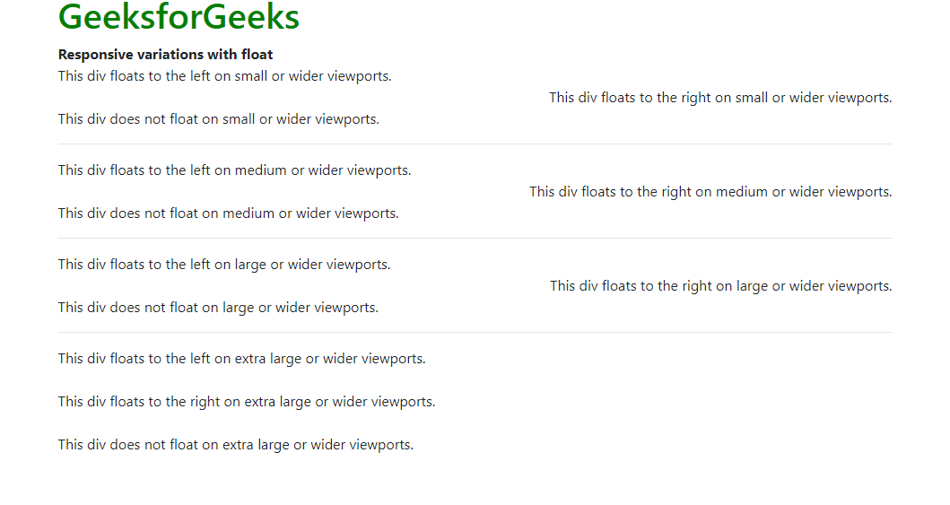
    Responsive variations
      with float


        GeeksforGeeks
        Responsive variations with float


          This div floats to the left on small or wider viewports.


          This div floats to the right on small or wider viewports.


          This div does not float on small or wider viewports.


          This div floats to the left on medium or wider viewports.


          This div floats to the right on medium or wider viewports.


          This div does not float on medium or wider viewports.


          This div floats to the left on large or wider viewports.


          This div floats to the right on large or wider viewports.


          This div does not float on large or wider viewports.


          This div floats to the left on extra large or wider viewports.


          This div floats to the right on extra large or wider viewports.


          This div does not float on extra large or wider viewports.
输出: