Angular Material是一个由Angular团队开发的UI组件库,用于为台式机和移动Web应用程序构建设计组件。为了安装它,我们需要在项目中安装angular,一旦安装,您可以输入以下命令并下载。当我们有多个选项卡要显示时, mat-tab-group主要用于满足导航栏要求。
安装:
ng add @angular/material方法:
- 首先,使用上述命令安装角材。
- 完成安装后,从app.module.ts文件中的’@ angular / material / tabs’导入’MatTabsModule’。
- 然后,使用
标记对这个group标记内的所有项目进行分组。 - 在
标记内,我们需要为每个项目使用 标记。 - 我们还可以根据位置(如开始,居中和结束)来设置标签样式。为此,我们需要使用一个名为mat-align-tabs的属性。
- 如果要更改主题,则可以使用color属性进行更改。从角度上讲,我们有3个主题,它们是主要主题,重音主题和警告主题。
- 完成上述步骤后,即可服务或启动项目。
例子:
app.module.ts
import { NgModule } from '@angular/core';
import { BrowserModule } from '@angular/platform-browser';
import { FormsModule } from '@angular/forms';
import { MatTabsModule } from '@angular/material/tabs';

import { AppComponent } from './app.component';
import { BrowserAnimationsModule } from
'@angular/platform-browser/animations';


@NgModule({
  imports:
  [ BrowserModule,
    FormsModule,
    MatTabsModule,
    BrowserAnimationsModule],
  declarations: [ AppComponent ],
  bootstrap: [ AppComponent ]
})

export class AppModule { }
app.component.html
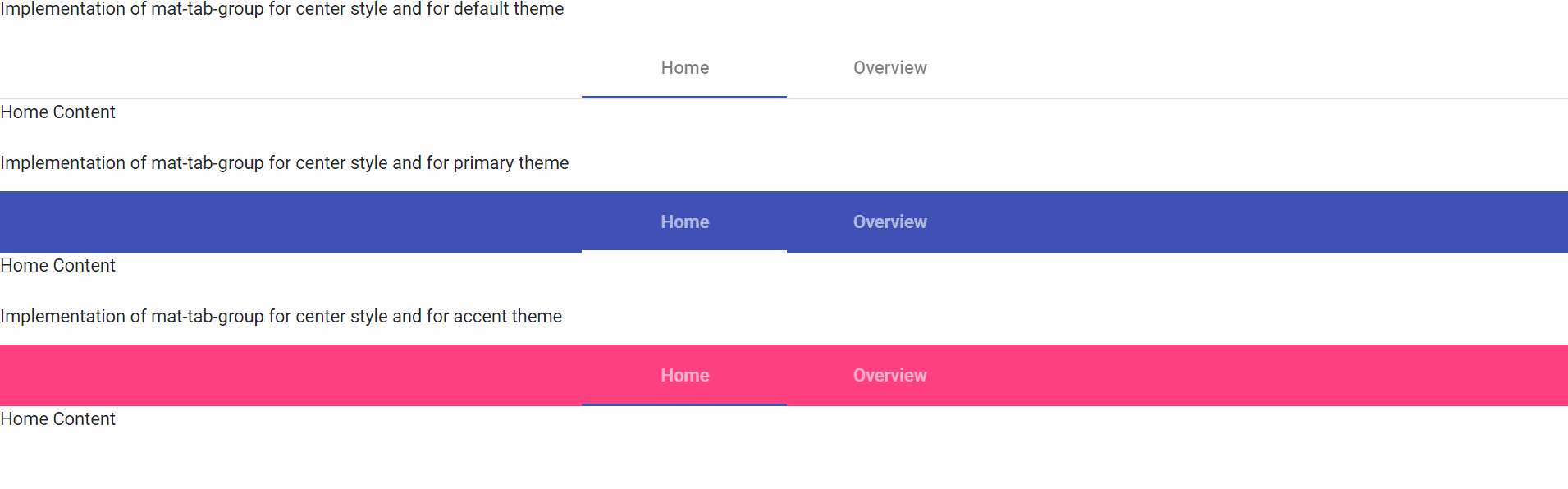
   Implementation of mat-tab-group for
   center style and for default theme


  Home Content
  Overview Content


  Implementation of mat-tab-group for center
  style and for primary theme


  Home Content
  Overview Content


  Implementation of mat-tab-group for center
  style and for accent theme


  Home Content
  Overview Content
app.component.html
   Implementation of mat-tab-group for
   center style and for default theme


  Home Content
  Overview Content


  Implementation of mat-tab-group for center
  style and for primary theme


  Home Content
  Overview Content


  Implementation of mat-tab-group for center
  style and for accent theme


  Home Content
  Overview Content
输出: