横幅小部件内置有flutter API。它有点类似于调试横幅,就像我们习惯于在调试模式下在fluter应用程序的右上角看到的那样。它使我们能够在任何其他小部件顶部显示消息或文本。下面我们将借助示例及其所有属性来查看其实现。
Banner类的构造函数:
const Banner(
{Key key,
Widget child,
@required String message,
TextDirection textDirection,
@required BannerLocation location,
TextDirection layoutDirection,
Color color: _kColor,
TextStyle textStyle: _kTextStyle}
)
横幅小部件的属性:
- 子级:此属性将小部件作为对象放置在横幅中。
- color:此属性通过将Color类作为对象来为横幅分配背景色。
- layoutDirection:此属性将TextDirection类作为对象,确定子控件将在Banner控件中放置的方向。
- location:此属性通过将BannerLocation枚举作为对象来控制横幅的位置。
- 消息:此属性将String值作为对象来确定要在横幅中显示的文本。
- textDirection:此属性再次将TextDirection作为对象来确定文本的方向,该文本的方向可以是rtl到ltr 。
- textStyle:此属性负责横幅小部件中文本的样式。它以TexStyle类为对象。
例子:
Dart
import 'package:flutter/material.dart';

//Material design liberary
void main() {
  runApp(
    //widget tree starts here
    MaterialApp(
      home: Scaffold(
        appBar: AppBar(
          title: Text('GeeksforGeeks'),
          backgroundColor: Colors.greenAccent[400],
          centerTitle: true,
        ), //AppBar
        body: Center(
          child: Container(
            margin: const EdgeInsets.all(10.0),
            child: ClipRect(
              /** Banner Widget **/
              child: Banner(
                message: "20% off !!",
                location: BannerLocation.bottomStart,
                color: Colors.red,
                child: Container(
                  color: Colors.green[100],
                  height: 300,
                  child: Padding(
                    padding: EdgeInsets.fromLTRB(10, 20, 10, 20),
                    child: Column(
                      children: [
                        Image.network(
                            'https://media.geeksforgeeks.org/wp-content/cdn-uploads/20190806131525/forkPython.jpg'), //Image.network
                        SizedBox(height: 10),
                        Text(
                          'GeeksforGeeks',
                          style: TextStyle(
                              color: Colors.green,
                              fontSize: 40,
                              fontWeight: FontWeight.bold), //TextStyle
                        ),
                        SizedBox(
                          height: 5,
                        ), //SizedBox
                        Text(
                          'Fork Python Course',
                          style: TextStyle(
                              color: Colors.green,
                              fontSize: 20,
                              fontWeight: FontWeight.bold), //TextStyle
                        ), //Text
                        SizedBox(height: 20),
                        RaisedButton(
                          child: Text('Register'),
                          color: Colors.greenAccent[400],
                          onPressed: () {},
                        ) //RaisedButton
                      ], //[]
                    ), //Column
                  ), //Padding
                ), //Container
              ), //Banner
            ), //ClipRect
          ), //container
        ), //Center
      ), //Scaffold
    ), //MaterialApp
  );
}
输出:
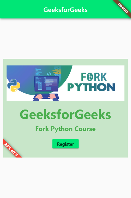
说明:在该flutter应用程序中, Banner窗口小部件是ClipRect类的子级,该类裁剪掉超出框的部分。标语中的消息显示文本’20%off !!’,颜色为红色,并且位置设置为bottomStart 。其余部分由Banner小部件的child属性保留。从横幅小部件到列的层次结构是横幅>容器>填充>列。在Colum小部件内,我们有一个小部件列表作为children属性的对象。列中的第一个元素是来自互联网的图像,然后我们有两个Text部件和一个RaisedButton,它们均由SizedBox部件分隔。
想要一个节奏更快,更具竞争性的环境来学习Android的基础知识吗?
单击此处前往由我们的专家精心策划的指南,以使您立即做好行业准备!