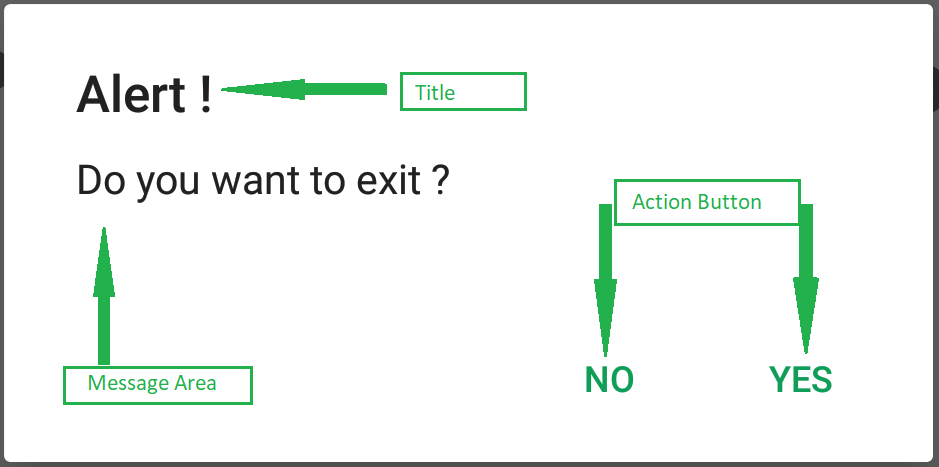
AlertDialog显示警报消息,并以是或否的形式给出答案。 “警报对话框”显示警告您的消息,然后根据您的响应进行下一步。 Android Alert对话框是使用三个字段构建的:标题,消息区域,操作按钮。
我们在许多应用程序中都看到过AlertDialog,它用于向用户显示一种消息。在本文中,我们将看到使用Jetpack Compose在Android中实现“警报对话框”。
AlertDialog的属性
|
Attributes |
Description |
|---|---|
| onDismissRequest | to check if the alert dialog is open or not. |
| title | to add title in our alert dialog. |
| text | to add a text description to our Alert Dialog. |
| confirmButton | to set a button for confirmation in Alert Dialog. |
| dismissButton | to set a dismiss dialog button in Alert Dialog. |
| backgroundColor | to set a background color of an alert dialog. |
| contentColor | to set a color for our content of Alert Dialog. |
分步实施
步骤1:创建一个新项目
要在Android Studio Canary版本中创建新项目,请参阅如何使用Jetpack Compose在Android Studio Canary版本中创建新项目。
步骤2:使用MainActivity.kt文件
导航到应用程序> Java >您的应用程序的程序包名称,然后打开MainActivity.kt文件。在该文件内,添加以下代码。在代码内部添加了注释,以更详细地了解代码。
Kotlin
import android.graphics.drawable.shapes.Shape
import android.media.Image
import android.os.Bundle
import android.widget.Toast
import androidx.appcompat.app.AppCompatActivity
import androidx.compose.foundation.*
import androidx.compose.foundation.Text
import androidx.compose.foundation.layout.*
import androidx.compose.foundation.shape.CircleShape
import androidx.compose.foundation.shape.RoundedCornerShape
import androidx.compose.foundation.text.KeyboardOptions
import androidx.compose.material.*
import androidx.compose.material.Icon
import androidx.compose.material.icons.Icons
import androidx.compose.material.icons.filled.AccountCircle
import androidx.compose.material.icons.filled.Info
import androidx.compose.material.icons.filled.Menu
import androidx.compose.material.icons.filled.Phone
import androidx.compose.runtime.*
import androidx.compose.runtime.savedinstancestate.savedInstanceState
import androidx.compose.ui.Alignment
import androidx.compose.ui.layout.ContentScale
import androidx.compose.ui.platform.setContent
import androidx.compose.ui.res.imageResource
import androidx.compose.ui.tooling.preview.Preview
import androidx.compose.ui.unit.dp
import com.example.gfgapp.ui.GFGAppTheme
import androidx.compose.ui.Modifier
import androidx.compose.ui.draw.clip
import androidx.compose.ui.graphics.Color
import androidx.compose.ui.graphics.SolidColor
import androidx.compose.ui.platform.ContextAmbient
import androidx.compose.ui.platform.testTag
import androidx.compose.ui.res.colorResource
import androidx.compose.ui.text.TextStyle
import androidx.compose.ui.text.font.FontFamily
import androidx.compose.ui.text.input.*
import androidx.compose.ui.unit.Dp
import androidx.compose.ui.unit.TextUnit

class MainActivity : AppCompatActivity() {
    override fun onCreate(savedInstanceState: Bundle?) {
        super.onCreate(savedInstanceState)
        setContent {
            ScrollableColumn {
                // A surface container using the
                  // 'background' color from the theme
                Surface(color = MaterialTheme.colors.background) {
                    // at below line we are calling our
                      // function for alert dialog.
                    AlertDialogComponent();
                }
            }
        }
    }
}

@Preview(showBackground = true)
@Composable
fun DefaultPreview() {
    GFGAppTheme {
        AlertDialogComponent();
    }
}

@Composable
fun AlertDialogComponent() {
    // below line is use to get
    // the context for our app.
    val context = ContextAmbient.current

    // below line is use to set our state
    // of dialog box to open as true.
    val openDialog = remember { mutableStateOf(true) }

    // below line is to check if the
    // dialog box is open or not.
    if (openDialog.value) {
        // below line is use to
        // display a alert dialog.
        AlertDialog(
            // on dialog dismiss we are setting
            // our dialog value to false.
            onDismissRequest = { openDialog.value = false },

            // below line is use to display title of our dialog
            // box and we are setting text color to white.
            title = { Text(text = "Geeks for Geeks", color = Color.White) },

            // below line is use to display
            // description to our alert dialog.
            text = { Text("Hello! This is our Alert Dialog..", color = Color.White) },

            // in below line we are displaying
            // our confirm button.
            confirmButton = {
                // below line we are adding on click
                // listener for our confirm button.
                TextButton(
                    onClick = {
                        openDialog.value = false
                        Toast.makeText(context, "Confirm Button Click", Toast.LENGTH_LONG).show()
                    }
                ) {
                    // in this line we are adding
                    // text for our confirm button.
                    Text("Confirm", color = Color.White)
                }
            },
            // in below line we are displaying
            // our dismiss button.
            dismissButton = {
                // in below line we are displaying
                // our text button
                TextButton(
                    // adding on click listener for this button
                    onClick = {
                        openDialog.value = false
                        Toast.makeText(context, "Dismiss Button Click", Toast.LENGTH_LONG).show()
                    }
                ) {
                    // adding text to our button.
                    Text("Dismiss", color = Color.White)
                }
            },
            // below line is use to add background color to our alert dialog
            backgroundColor = colorResource(id = R.color.teal_200),

            // below line is use to add content color for our alert dialog.
            contentColor = Color.White
        )
    }
}
现在运行您的应用程序,并查看该应用程序的输出:
输出:
想要一个节奏更快,更具竞争性的环境来学习Android的基础知识吗?
单击此处前往由我们的专家精心策划的指南,以使您立即做好行业准备!