Python中的图形绘图 |设置 1
本系列将向您介绍使用 Matplotlib 在Python中进行绘图,它可以说是Python最流行的绘图和数据可视化库。
安装
安装 matplotlib 最简单的方法是使用 pip。在终端中输入以下命令:
pip install matplotlib或者,您可以从此处下载并手动安装。
开始(绘制一条线)
Python
# importing the required module
import matplotlib.pyplot as plt

# x axis values
x = [1,2,3]
# corresponding y axis values
y = [2,4,1]

# plotting the points
plt.plot(x, y)

# naming the x axis
plt.xlabel('x - axis')
# naming the y axis
plt.ylabel('y - axis')

# giving a title to my graph
plt.title('My first graph!')

# function to show the plot
plt.show()
Python
import matplotlib.pyplot as plt

# line 1 points
x1 = [1,2,3]
y1 = [2,4,1]
# plotting the line 1 points
plt.plot(x1, y1, label = "line 1")

# line 2 points
x2 = [1,2,3]
y2 = [4,1,3]
# plotting the line 2 points
plt.plot(x2, y2, label = "line 2")

# naming the x axis
plt.xlabel('x - axis')
# naming the y axis
plt.ylabel('y - axis')
# giving a title to my graph
plt.title('Two lines on same graph!')

# show a legend on the plot
plt.legend()

# function to show the plot
plt.show()
Python
import matplotlib.pyplot as plt

# x axis values
x = [1,2,3,4,5,6]
# corresponding y axis values
y = [2,4,1,5,2,6]

# plotting the points
plt.plot(x, y, color='green', linestyle='dashed', linewidth = 3,
         marker='o', markerfacecolor='blue', markersize=12)

# setting x and y axis range
plt.ylim(1,8)
plt.xlim(1,8)

# naming the x axis
plt.xlabel('x - axis')
# naming the y axis
plt.ylabel('y - axis')

# giving a title to my graph
plt.title('Some cool customizations!')

# function to show the plot
plt.show()
Python
import matplotlib.pyplot as plt

# x-coordinates of left sides of bars
left = [1, 2, 3, 4, 5]

# heights of bars
height = [10, 24, 36, 40, 5]

# labels for bars
tick_label = ['one', 'two', 'three', 'four', 'five']

# plotting a bar chart
plt.bar(left, height, tick_label = tick_label,
        width = 0.8, color = ['red', 'green'])

# naming the x-axis
plt.xlabel('x - axis')
# naming the y-axis
plt.ylabel('y - axis')
# plot title
plt.title('My bar chart!')

# function to show the plot
plt.show()
Python
import matplotlib.pyplot as plt

# frequencies
ages = [2,5,70,40,30,45,50,45,43,40,44,
        60,7,13,57,18,90,77,32,21,20,40]

# setting the ranges and no. of intervals
range = (0, 100)
bins = 10

# plotting a histogram
plt.hist(ages, bins, range, color = 'green',
        histtype = 'bar', rwidth = 0.8)

# x-axis label
plt.xlabel('age')
# frequency label
plt.ylabel('No. of people')
# plot title
plt.title('My histogram')

# function to show the plot
plt.show()
Python
import matplotlib.pyplot as plt

# x-axis values
x = [1,2,3,4,5,6,7,8,9,10]
# y-axis values
y = [2,4,5,7,6,8,9,11,12,12]

# plotting points as a scatter plot
plt.scatter(x, y, label= "stars", color= "green",
            marker= "*", s=30)

# x-axis label
plt.xlabel('x - axis')
# frequency label
plt.ylabel('y - axis')
# plot title
plt.title('My scatter plot!')
# showing legend
plt.legend()

# function to show the plot
plt.show()
Python
import matplotlib.pyplot as plt

# defining labels
activities = ['eat', 'sleep', 'work', 'play']

# portion covered by each label
slices = [3, 7, 8, 6]

# color for each label
colors = ['r', 'y', 'g', 'b']

# plotting the pie chart
plt.pie(slices, labels = activities, colors=colors,
        startangle=90, shadow = True, explode = (0, 0, 0.1, 0),
        radius = 1.2, autopct = '%1.1f%%')

# plotting legend
plt.legend()

# showing the plot
plt.show()
Python
# importing the required modules
import matplotlib.pyplot as plt
import numpy as np

# setting the x - coordinates
x = np.arange(0, 2*(np.pi), 0.1)
# setting the corresponding y - coordinates
y = np.sin(x)

# plotting the points
plt.plot(x, y)

# function to show the plot
plt.show()
输出:
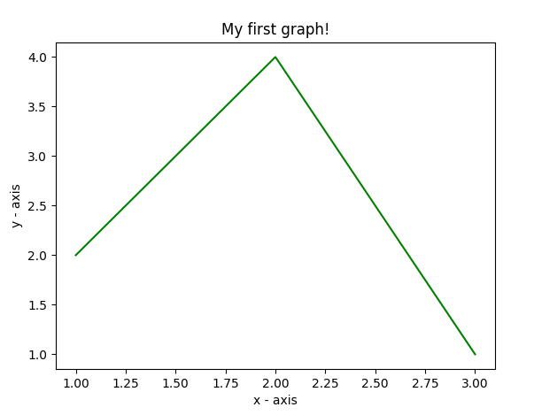
该代码似乎不言自明。遵循以下步骤:
- 将 x 轴和相应的 y 轴值定义为列表。
- 使用.plot()函数在画布上绘制它们。
- 使用.xlabel()和.ylabel()函数为 x 轴和 y 轴命名。
- 使用.title() 函数给你的情节一个标题。
- 最后,要查看您的绘图,我们使用.show()函数。
在同一图上绘制两条或多条线
Python
import matplotlib.pyplot as plt

# line 1 points
x1 = [1,2,3]
y1 = [2,4,1]
# plotting the line 1 points
plt.plot(x1, y1, label = "line 1")

# line 2 points
x2 = [1,2,3]
y2 = [4,1,3]
# plotting the line 2 points
plt.plot(x2, y2, label = "line 2")

# naming the x axis
plt.xlabel('x - axis')
# naming the y axis
plt.ylabel('y - axis')
# giving a title to my graph
plt.title('Two lines on same graph!')

# show a legend on the plot
plt.legend()

# function to show the plot
plt.show()
输出:
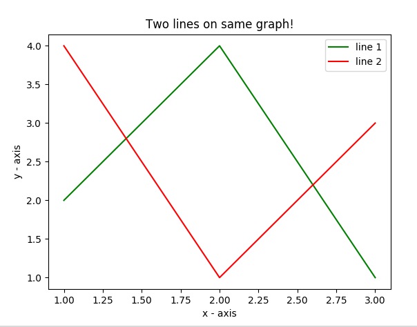
- 在这里,我们在同一张图上绘制两条线。我们通过给它们一个名称(标签)来区分它们,该名称作为 .plot()函数的参数传递。
- 提供有关线条类型及其颜色的信息的小矩形框称为图例。我们可以使用.legend()函数为我们的绘图添加一个图例。
绘图的定制
在这里,我们讨论了一些适用于几乎任何情节的基本定制。
Python
import matplotlib.pyplot as plt

# x axis values
x = [1,2,3,4,5,6]
# corresponding y axis values
y = [2,4,1,5,2,6]

# plotting the points
plt.plot(x, y, color='green', linestyle='dashed', linewidth = 3,
         marker='o', markerfacecolor='blue', markersize=12)

# setting x and y axis range
plt.ylim(1,8)
plt.xlim(1,8)

# naming the x axis
plt.xlabel('x - axis')
# naming the y axis
plt.ylabel('y - axis')

# giving a title to my graph
plt.title('Some cool customizations!')

# function to show the plot
plt.show()
输出:
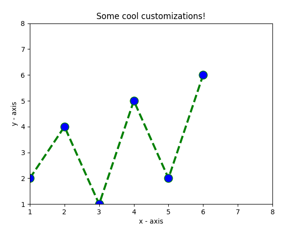
如您所见,我们已经完成了一些自定义,例如
- 设置线宽、线型、线色。
- 设置marker,marker的面颜色,marker的大小。
- 覆盖 x 和 y 轴范围。如果未完成覆盖,pyplot 模块使用自动缩放功能来设置轴范围和比例。
条形图
Python
import matplotlib.pyplot as plt

# x-coordinates of left sides of bars
left = [1, 2, 3, 4, 5]

# heights of bars
height = [10, 24, 36, 40, 5]

# labels for bars
tick_label = ['one', 'two', 'three', 'four', 'five']

# plotting a bar chart
plt.bar(left, height, tick_label = tick_label,
        width = 0.8, color = ['red', 'green'])

# naming the x-axis
plt.xlabel('x - axis')
# naming the y-axis
plt.ylabel('y - axis')
# plot title
plt.title('My bar chart!')

# function to show the plot
plt.show()
输出 :
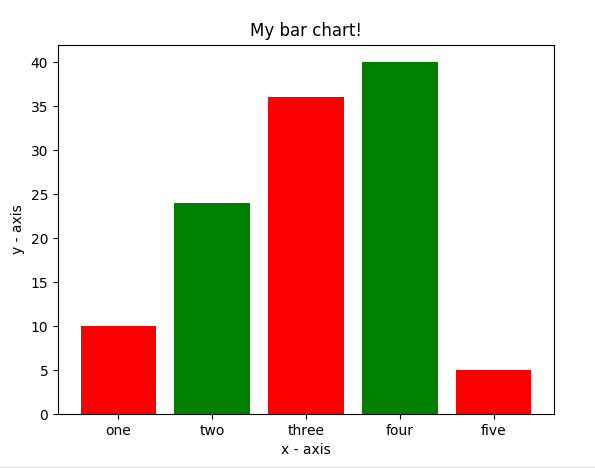
- 在这里,我们使用plt.bar()函数来绘制条形图。
- 条形左侧的 x 坐标与条形的高度一起传递。
- 您还可以通过定义tick_labels为 x 轴坐标命名
直方图
Python
import matplotlib.pyplot as plt

# frequencies
ages = [2,5,70,40,30,45,50,45,43,40,44,
        60,7,13,57,18,90,77,32,21,20,40]

# setting the ranges and no. of intervals
range = (0, 100)
bins = 10

# plotting a histogram
plt.hist(ages, bins, range, color = 'green',
        histtype = 'bar', rwidth = 0.8)

# x-axis label
plt.xlabel('age')
# frequency label
plt.ylabel('No. of people')
# plot title
plt.title('My histogram')

# function to show the plot
plt.show()
输出:
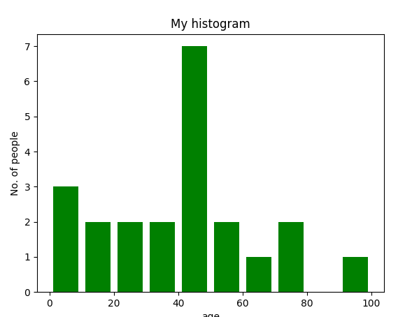
- 在这里,我们使用plt.hist()函数来绘制直方图。
- 频率作为年龄列表传递。
- 可以通过定义包含最小值和最大值的元组来设置范围。
- 下一步是对值的范围进行“分箱”——即将整个值范围划分为一系列区间——然后计算每个区间中有多少值。这里我们定义了bins = 10。所以,总共有 100/10 = 10 个区间。
散点图
Python
import matplotlib.pyplot as plt

# x-axis values
x = [1,2,3,4,5,6,7,8,9,10]
# y-axis values
y = [2,4,5,7,6,8,9,11,12,12]

# plotting points as a scatter plot
plt.scatter(x, y, label= "stars", color= "green",
            marker= "*", s=30)

# x-axis label
plt.xlabel('x - axis')
# frequency label
plt.ylabel('y - axis')
# plot title
plt.title('My scatter plot!')
# showing legend
plt.legend()

# function to show the plot
plt.show()
输出:
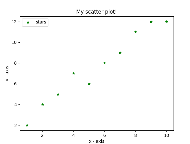
- 在这里,我们使用plt.scatter()函数绘制散点图。
- 作为一条线,我们也在此处定义 x 和相应的 y 轴值。
- 标记参数用于设置要用作标记的字符。它的大小可以使用s参数定义。
饼形图
Python
import matplotlib.pyplot as plt

# defining labels
activities = ['eat', 'sleep', 'work', 'play']

# portion covered by each label
slices = [3, 7, 8, 6]

# color for each label
colors = ['r', 'y', 'g', 'b']

# plotting the pie chart
plt.pie(slices, labels = activities, colors=colors,
        startangle=90, shadow = True, explode = (0, 0, 0.1, 0),
        radius = 1.2, autopct = '%1.1f%%')

# plotting legend
plt.legend()

# showing the plot
plt.show()
上述程序的输出如下所示:
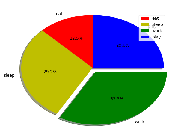
- 在这里,我们使用plt.pie()方法绘制饼图。
- 首先,我们使用一个名为活动的列表来定义标签。
- 然后,可以使用另一个名为slices的列表来定义每个标签的一部分。
- 每个标签的颜色是使用名为colors的列表定义的。
- shadow = True将在饼图中的每个标签下方显示一个阴影。
- startangle将饼图的起点从 x 轴逆时针旋转给定度数。
- explode用于设置我们偏移每个楔形的半径分数。
- autopct用于格式化每个标签的值。在这里,我们将其设置为仅显示小数点后 1 位的百分比值。
绘制给定方程的曲线
Python
# importing the required modules
import matplotlib.pyplot as plt
import numpy as np

# setting the x - coordinates
x = np.arange(0, 2*(np.pi), 0.1)
# setting the corresponding y - coordinates
y = np.sin(x)

# plotting the points
plt.plot(x, y)

# function to show the plot
plt.show()
输出
上面的程序看起来像这样:
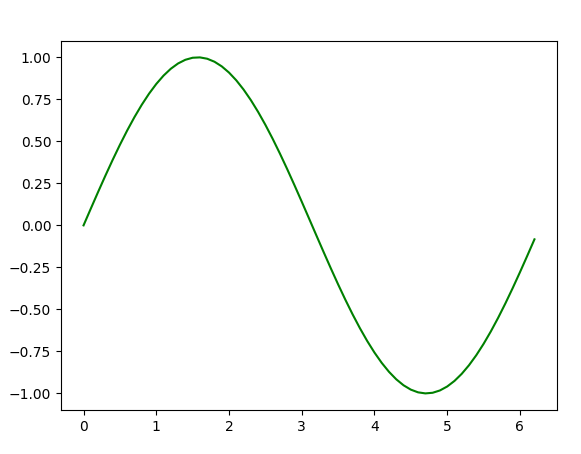
在这里,我们使用NumPy ,它是Python中的一个通用数组处理包。
- 要设置 x 轴值,我们使用 np.arange()方法,其中前两个参数用于范围,第三个参数用于逐步递增。结果是一个 NumPy 数组。
- 要获得相应的 y 轴值,我们只需在 NumPy 数组上使用预定义的np.sin()方法。
- 最后,我们通过将 x 和 y 数组传递给plt.plot()函数来绘制点。
因此,在这一部分中,我们讨论了可以在 matplotlib 中创建的各种类型的图。还有更多的情节没有涉及,但这里讨论了最重要的情节——
- Python中的图形绘图 |设置 2
- Python中的图形绘图 |设置 3